Palette Detective: Watercolor Mixes for "Chinese Lanterns" Botanical
Students frequently ask me what paints I used on a particular project
I understand. You like the finished look and you want to duplicate my results.
But here's the thing: you can be using the same exact paint colors, same brand, same line, same color, same everything and you still won't be able to completely recreate what I've done.
That's because a shopping list of paint colors isn't enough.
The magic is in the mix.
It's not the colors you use, it's how you use them.
This is why I'll be posting palette shots for each of my watercolor classes.
I've given you the supply list but that doesn't tell you what colors I've created from the paints.
Palette shots are a peek into the process. Once you know I've used Pyrrol Scarlet and Hansa Medium to make a coral color, you can then find it on my palette and see the different versions of coral I've mixed.
Chinese Lanterns:
And here's my palette:
This was clean when I started and the photo was taken right after I'd finished the last little bits of touch up work.
Now, be a palette detective-
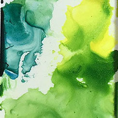
Coral colors mixed from Daniel Smith's Pyrrol Scarlet and Hansa Yellow Light.
Green colors mixed from Old Holland Sap Green Lake Extra, DS Hansa Yellow Light, and M.Graham Prussian Blue.
Violet mixture of DS Carbazole Violet and Winsor Newton Cerulean Blue (not recommended)
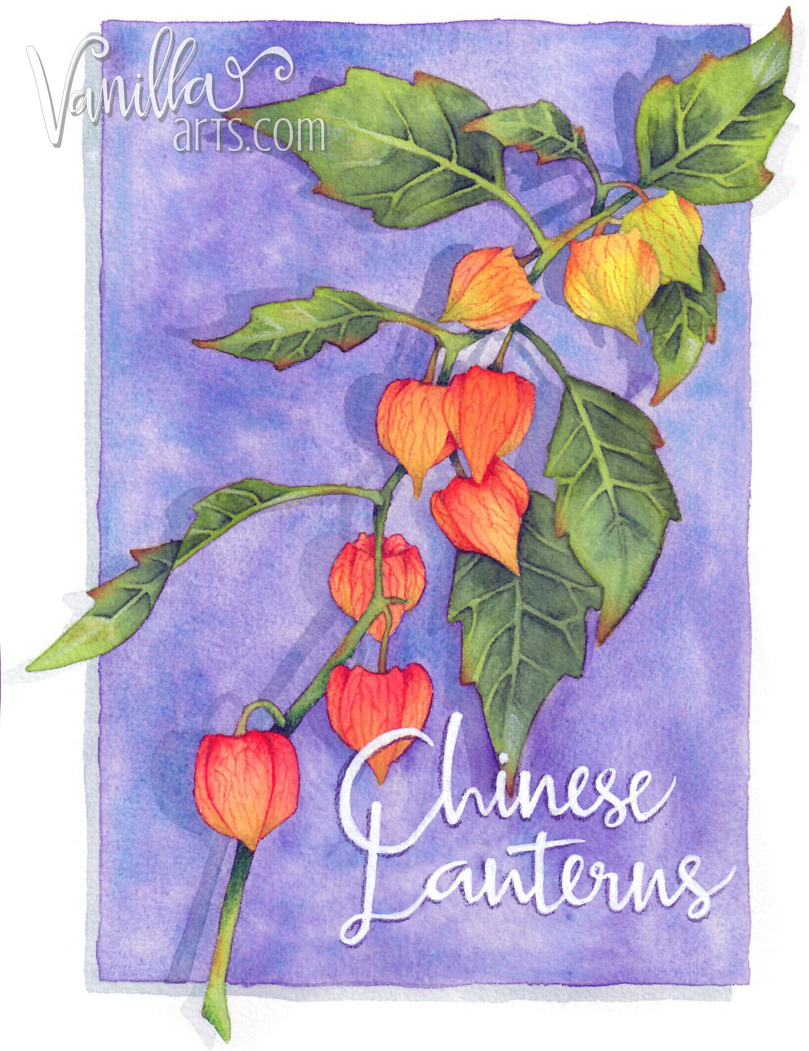
Chinese Lanterns
Designed for Watercolor but perfect for Copic or colored pencil.
This full page digital image is an original stamp used in my H2Oh! watercoloring classes in 2016. It was designed as a full page stamp (8.5" x 11") but can be scaled down if desired.
"Chinese Lanterns" has wide open areas with no texture marks and is perfect for colored pencil, alcohol markers, watercolor... your options are endless!
Lettering is not included in the digital stamp as it was hand lettered by me after the project was completed.
This stamp was taught as a watercolor class, therefore I do not have a recipe guide to include in the stamp package. You can view my “work in progress” photos for this project on Instagram here.


