Alcohol Marker + Colored Pencils: 5 Tips for Mixed Media Adult Coloring
HOW TO COMBINE COPIC MARKERS WITH COLORED PENCILS
Have you ever thought about mixing alcohol markers with colored pencils?
The two mediums are very popular and it sounds like they could work together… but how hard is it?
In her latest FREE video, professional illustrator Amy Shulke shares five tips for combining markers and pencils for amazing mixed media projects.
WATCH: FIVE TIPS FOR MIXED MEDIA COLORING
with Copic Markers and Prismacolor Colored Pencils
(supply list at end of this article)
Not playing?
If your device blocks embedded video, click here to watch at YouTube.
TIPS FOR MIXED MEDIA BEGINNERS
1. Do I need special colored pencils?
I cover this question in-depth in my latest YouTube video above. Two of the five tips explain pencil characteristics you’ll want to look for before beginning mixed media.
You’ll be surprised at my pencil brand recommendations which conveniently will save you money, time, and frustration.
2. What type of paper works best for both markers and colored pencils?
In the video, I outline the types of paper which make markers and pencils look their best, plus how to find the best paper for you.
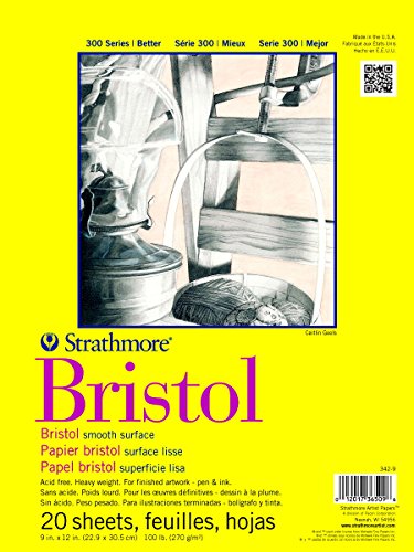
I currently work on Strathmore 300 Bristol Board and the video explains why.
3. Are there any incompatibilities between markers and pencils?
Markers are a wet medium and pencils are dry. Mixing them may not be as simple as you originally expected but once you understand the basic mixing rules, they’re extremely simple to follow.
Tips four and five cover when and how to layer markers and pencils for best results.
As with all my videos, I include lots of side facts and information, helping you grow and experiment with mixed media coloring.
LEARN MARKER + PENCIL COLORING TECHNIQUES
Marker with a dash of colored pencil…
The Blend - A 12 week online course for beginners/intermediates which focuses solely on smooth blending with Copic Markers. Learn to blend or improve your current blending technique with this intensive skill building approach to coloring.
Colored pencil with a touch of marker…
The Point - A 12 week online course for beginners/intermediates which focuses on efficient techniques for Prismacolor colored pencils. Learn to layer colors with confidence and artistry through this intensive skill building approach to coloring.
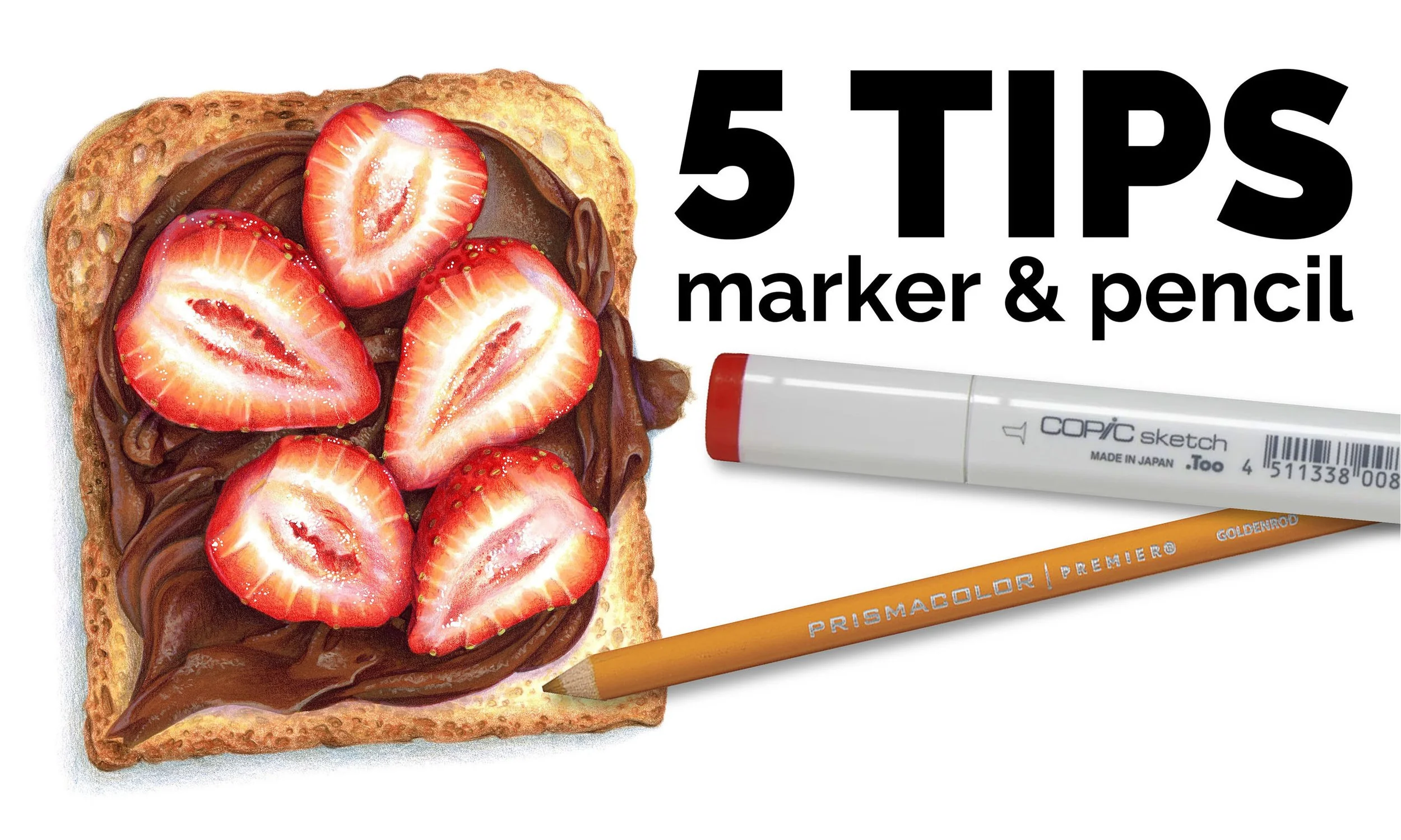
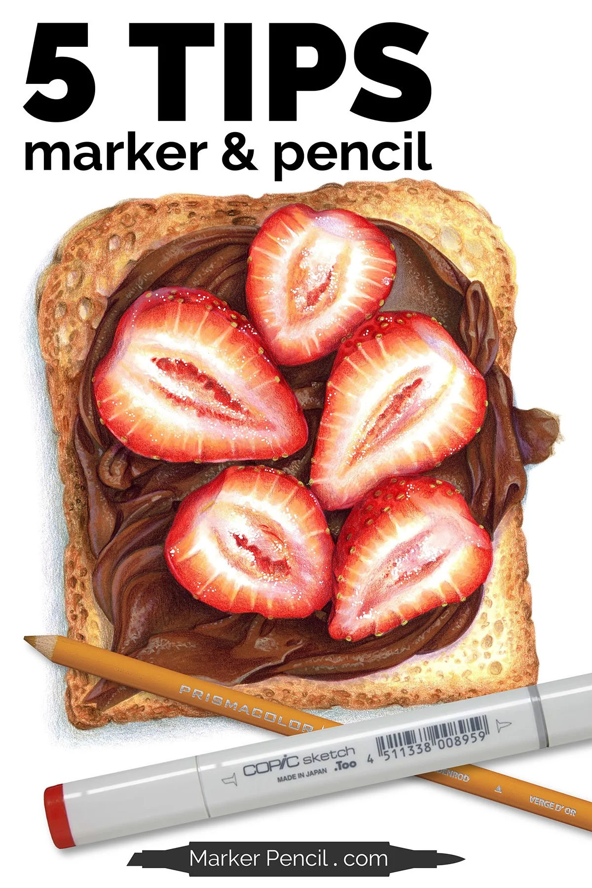
TECHNIQUES USED IN “STRAWBERRY TOAST”
The following techniques can be spotted in the 5 MIXED MEDIA TIPS video:
I always color dark to light with both markers and again with pencils. It’s easier than light to dark and insures that my shade and shadows are the correct values to create depth, dimension, and realism.
I colored the toast first. The toast uses several very pale markers which would damage the deep, dark brown areas of the hazelnut spread. For this reason, I often color the objects starting with the lightest item first and ending with the darkest.
Toast only looks like toast if you include the texture. I created the holes, nooks, and crannies with marker, then colored the spaces between them with colored pencil.
The shiny highlights of the hazelnut spread are not white. That’s a peach pencil plus lavender.
The toast and spread are very neutralized colors which really helps the red berries pop!
The same lavender pencil used to highlight the hazelnut spread is also used to shade the toast and the strawberries. Using the same colors for different purposes helps everything in the project look related and cohesive.
COLOR STRAWBERRY TOAST
Strawberry Toast is a lesson in using negative painting techniques to develop realistic texture.

