Realistic Shine and Reflections: Draw & Color - Caramel Apple
TIRED OF FAKE, FLAT GEL PEN HIGHLIGHTS?
Sometimes it seems like every marker or colored pencil project MUST end with a few dots or dashes of white gel pen.
Everyone does it, so it must look good, right?
The problem is, real highlights don’t look like painted white commas, semi-colons, and periods.
Are you coloring or punctuating?
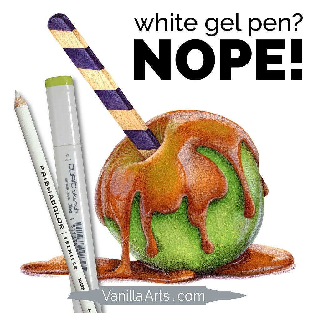
In today’s video, we’re drawing and coloring a fun fall Caramel Apple with shiny, drippy, ooey-gooey candy coating.
I’ll show you my exact process and share the reasons for my color choices.
And there’s no white gel pen!
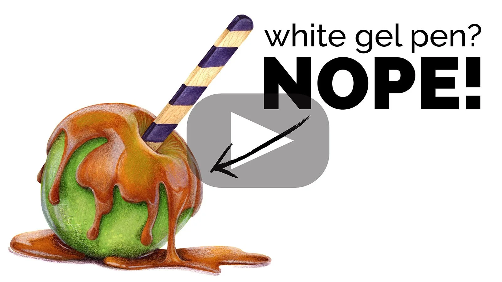
“Caramel Apple”. Copic Marker + Holbein Colored Pencil on Stillman & Birn Zeta paper. 7.5 x 7.5” by the author, Amy Shulke.
WATCH: REALISTIC SHINE AND REFLECTIONS
(project supply list at end of this article)
Video not playing?
If your device blocks embedded video, click here to watch at YouTube.
TIPS FOR COLORING REALISTIC SHINE & HIGHLIGHTS
1. Stop pretending
Honestly, the biggest hurdle is that everyone follows the same white gel pen tutorials. You’ll see the same technique in card making, scrapbooking, coloring books, and comic/manga/anime influenced illustration.
Because everyone adds dots and dashes, you do it too.
You pretend it’s “cute” or “shiny” or “realistic”.
But really? Does it look shiny or are you just going along with the crowd?
2. First, ditch the white gel pen
Simply substituting a white colored pencil is an immediate improvement.
Even if you still do the same dots, dashes, or comma shapes, at least you’re not doing them with thick white paint.
Colored pencil is softer and less reflective. It’s easier on the eyes and less in-your-face.
Later you can work on the shapes you’re making but this is an easy baby step towards greater realism.
LEARN MARKER + PENCIL COLORING TECHNIQUES
Marker with a dash of colored pencil…
The Blend - A 12 week online course for beginners/intermediates which focuses solely on smooth blending with Copic Markers. Learn to blend or improve your current blending technique with this intensive skill building approach to coloring.
Colored pencil with a touch of marker…
The Point - A 12 week online course for beginners/intermediates which focuses on efficient techniques for Prismacolor colored pencils. Learn to layer colors with confidence and artistry through this intensive skill building approach to coloring.
TECHNIQUES USED IN “CARAMEL APPLE”
The following techniques can be spotted in the REALISTIC SHINE & REFLECTIONS video:
When I drew the caramel and then as I colored it with Copic Markers, I was careful to make the caramel just as rounded as the spherical apple underneath it. Too many people try to use highlights to create shape when in truth, they’re just the icing on the cake. The realism starts with your base layers of color!
I used the same violet marker underneath the caramel markers, under the apple markers, and under the stick colors as well. This ties together the separate objects and makes them feel as if they’re all sharing the same space. Artists call this “cohesion”
I added some cute pointillism spots to the apple after seeing similar spots in my photo reference… but notice that they’re kept subtle. Too often, colorers get excited about a fun technique and let it dominate the image. Don’t let novelty techniques become a distraction!
COLOR A TASTY FALL TREAT
Caramel Apple is my latest digital line art at Sketch-Garden.com
I design line art especially for marker, colored pencil, watercolor, and mixed media colorists. The spaces are wide open with no texture marks or funky shapes which look cool as a sketch but don’t quite make sense when coloring.
Thoughtfully drawn line art allows YOUR coloring to be the star of the show!
Caramel Apple Digital Stamp package includes both gray lined and black lined PNG files. Celebrate bold black outlines or let them disappear for greater realism.
FREE PHOTO REFERENCE
I used this free photo reference to color my version of Caramel Apple. You can see the highlights plus that fun freckle texture down at the bottom.
Download your copy from Vecteezy.com
Note: I’m not sponsored or affiliated with Vecteezy in any way. I simply try to find free references for your use whenever possible.
MORE HALLOWEEN PROJECTS
(click the pic for more info)


