Color Palettes: A Beginner's Guide to Coloring with Maturity & Sophistication
Do You Have Color Instinct?
Some people have a knack for color palettes. They decorate their home with unique style rather than copying decor ideas from Pinterest. They make bold fashion statements rather than buying what's on the mannequin. Even their coloring projects look polished and professional.
Don't feel bad, most people are not born with an awesome sense of color.
For many colorers, a cohesive color palette is the hardest piece of the puzzle. You can blend like a pro and you're top-notch at the techniques...
And yet most of your projects feel juvenile or just plain loud due to color confusion.
Will it always be this way? Are you doomed to mediocre, unprofessional looking projects?
The Grab-Bag
Most colorers work their way through an image object by object.
First we color one egg, then the other, then the basket, then the rabbit, then the grass, then the sky. We grab completely new blending combinations for every item as we need them, without thinking about the larger composition or how the colors interact with each other.
Color grabbing leads to a circus or a color-riot. Disjointed coloring robs your project of a focal point. Your viewers can't tell what to look at because the eye keeps getting dragged from color to color.
It's sad to see great coloring get overshadowed by distracting color combinations.
But making cohesive color palettes can be hard!
Relax. You are not doomed. You can learn to work with color.
Introducing a new series for colorers:
You can learn to create and use artistic color palettes.
Let me show you how I approach color palettes as an artist.
Today, let's look at the easiest way to get your feet wet.
Behold, the Miracle!
Back in the stone-age before the internet tubes got to flowing, we had sit down at a desk style classes in color theory. Color theory is essential to art training because painting and drawing are visual mediums. Artists want you to want to look at our work.
Yes, color attracts your attention but it also guides your eye to key areas in the painting and color helps transmit a message or feeling.
Bad color usage drives people away. And not to be ignored: unappealing art doesn't sell well!
Color theory helps clarify the mood or theme of your art.
Sounds big, eh?
Sounds like more than a casual colorer wants to tackle, right?
Relax, I'm not about to recommend that every crafter enroll in a color theory class and I won't make you check out big confusing books from the library!
The internet has simplified the learning process for you. We now have entire websites devoted to collecting and cataloging color palettes. For free!
Websites like Design-Seeds, Sarah Renae Clark, and COLOURlovers offer color theory newbies a chance to learn by playing rather than sitting through lectures.
I heartily recommend color palette sites to students who want to improve the maturity of their projects. The thinking and the planning... all the brainy stuff about what matches and what coordinates... it's all been done for you.
The key is learning to use these sites effectively!
Start with a Plan
When you first go to a palette website, it's easy to get blown away. For anyone who loves color, these sites are mezmerizing. Hours can zip by while I'm drooling over rainbows.
The key is to enter the website knowing what you want BEFORE opening the door to temptation.
"I'm coloring an Easter stamp and I want to use a pale orange!"
That's your mission. Stick to it! Don't get sucked into looking at autumnal purple color palettes, right?
Right? Hey, stop looking at all the pretty color palettes up there.
You back with me now? Okay.
Start with a roadmap and you won't get lost.
Next Tip: Skip the Circus
Most color palette websites offer 4, 5, or 6 colors per palette. And what I"m about to say might sound a little crazy, but here goes:
Avoid all the color palettes with 4, 5, or 6 different colors!
Look, I know this kind of variety palette is really, really tempting. When it comes to color, the more color the better, eh?
But how is this palette any different than blindly grabbing five of your favorite Copics?
The color circus method isn't working for you already, so don't keep doing it!
Here's the problem, many palette websites feature a beautiful photograph. Below it, they'll give you five gorgeous colors found in the photo. But if you put your hand over the photograph and look at the palette all by itself, suddenly the palette makes no sense.
What does the tangerine color have to do with spring green or bright yellow? They don't have any relationship; there's no sense of purpose. These could have been five random crayons found in your kitchen junk drawer.
Colors in a palette need to make sense as a group.
Otherwise, they're not really a palette.
Avoid the Paint Chips
The second most common type of palette you'll find is a Value Grouping.
Here we have the same blue shown in a range of strengths. Each blue has a little more white in it but the hue never changes.
Value Groups are hard to work with
... because they don't offer many options.
This palette would work for an ocean but what color would you use for the sandy beach or the starfish that washed ashore?
It's a pretty collection of colors but it's not very useful.
And frankly, it's not all that exciting.
Sometimes you'll find Value Groupings with a pop at the end. A "pop" is a color that stands out and contrasts with the larger group. Pops add zing or interest to an otherwise ho-hum collection.
These palettes are a lot better than a straight grouping but they're almost as limiting as the original range.
If you can find a use for the Value with a Pop style palette, they can be quite striking in art... but finding the right kind of image to use them on? That's quite a challenge.
The Best of Both Worlds
What happens when you combine the joy of the color circus with a few value groups AND a pop?
This is the holy graille!
Let's call this Mixed Assets. These are the color palettes I search for and the kind I use in my projects.
And when I create my own palettes, they look a lot like this.
Here we have two major colors (tangerine and aqua) plus value versions of each and a little pop of green to spice it up.
We have lots of options here!
A floral bouquet could feature large tiger lily blossoms with tiny aqua florets and greenery. I can see a gold fish swimming in a tank with a green sentiment stamp. How about a stack of duckies?
Or wouldn't this make for the most mature and sophisticated group of bubblegum balls in an orange machine?
If you need more colors, say for a background, you can always find a third or fourth value for any of the original colors. We can add a darker aqua or a yellowy-orange so pale, that it almost reads as white. These new colors aren't shown in the original palette but because they relate, they'll fit right in.
The potential of the Mixed Asset palette is endless!
This is how you avoid the childish "I just grabbed a bunch of random colors" look. Your project won't look random because viewers can sense your color plan.
Speaking of Values...
Notice anything else about my Mixed Assets palette?
Don't fall into the Pit of Pointless Pale Pastels.
Remember how we used to decorate baby nurseries in pale pastels but that has that fallen out of fashion recently?
It's because pastels are not the least bit mentally stimulating.
There's no there there.
Do you want that card to say "HAPPY BIRTHDAY TO MY BEST FRIEND AND THE MOST AWESOMEST PERSON ON EARTH!!!!"
Or do you want it to say "Ho hum, have a pretty good day... if you feel like it, but don't go out of your way... zzzzzzz"
A lively and stimulating color palette will have a range of values. Some bold and bright, some light and airy. Find a balance of values.
Yin and yang. Salt and pepper. Sweet and sour. The bold colors help you appreciate the softs and the softies keep the bold ones in check. It's a zen thing.
If you're using Copic Markers and all your markers end in a number smaller than 3, you have a snoozer on your hands!
Adding Neutrals
Many colorers are hesitant to use pre-planned color palettes because they feel locked down and constrained.
What if you need more colors than you find in the original palette?
That's where experimentation and artistry come into play. Color palettes are a bit of guidance keeping you from that schizophrenic, disjointed look but you're not locked into coloring a sandy beach with a green pencil just because there's nothing else left in the palette!
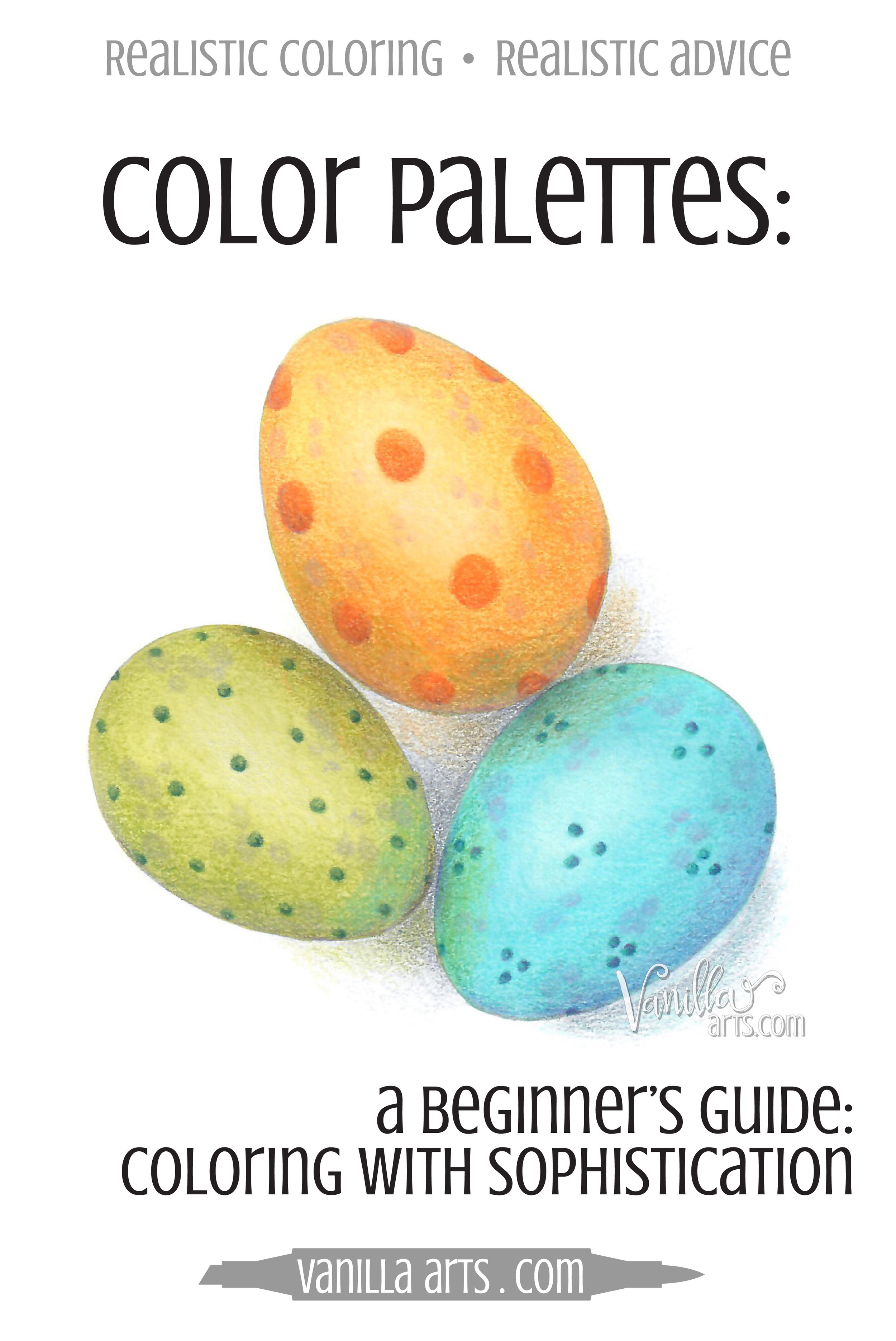
I add neutrals to my images all the time! Sandy beiges or taupes work really well. For my egg illustration, I added soft dove grays and even some muted violet and lavender.
This isn't your kindergartener's crayon box anymore! Adding neutrals amplifies the maturity of any color palette.
Experiment and Play!
Pre-made color palettes are a great way to dabble in color theory and to learn about color by physically using it.
I don't know about you but I'm a visual learner. Tell me something and I'll forget. Show me and I'm more likely to remember. But let me do it with my own hands and that knowledge is cemented for life!
Experimentation is the best way for most artistic people to learn.
And trust me, playing is a lot more fun than sitting through professorial slide shows or painting an endless series of 1" swatch tiles.
What absolutely floors me about our modern color palette websites is the endless selection available! My textbooks had about 20 samples in the back index. If I recall, there were a few books of nothing but color palettes... but as a poor art student, they were beyond my pocketbook.
Technology is a wonderful thing!
Set up a Pinterest board for color palettes which appeal to you and use them in a few upcoming projects. I guarantee they will help you add order, cohesiveness, and a sense of professionalism to your coloring.
Hang on, we're not done yet!
Join me for Part Two, where I show you how to begin creating your own custom color palettes without using the websites.


