Color Theory for Markers: Realistic Blue Flowers (Coloring Demo - Episode 8)
Color Theory for Blue Alcohol Markers
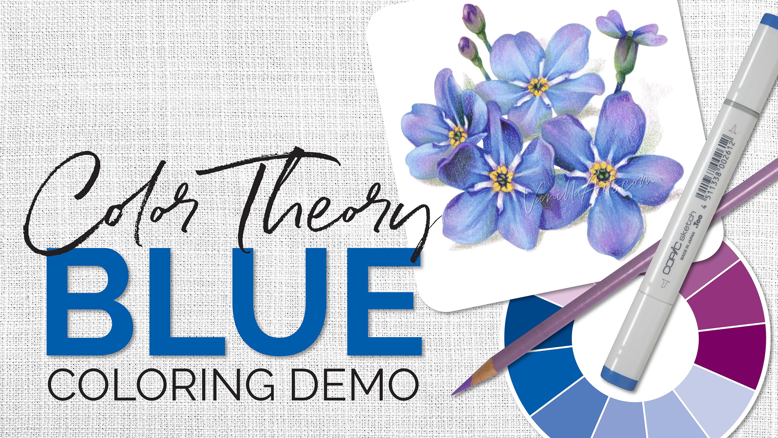
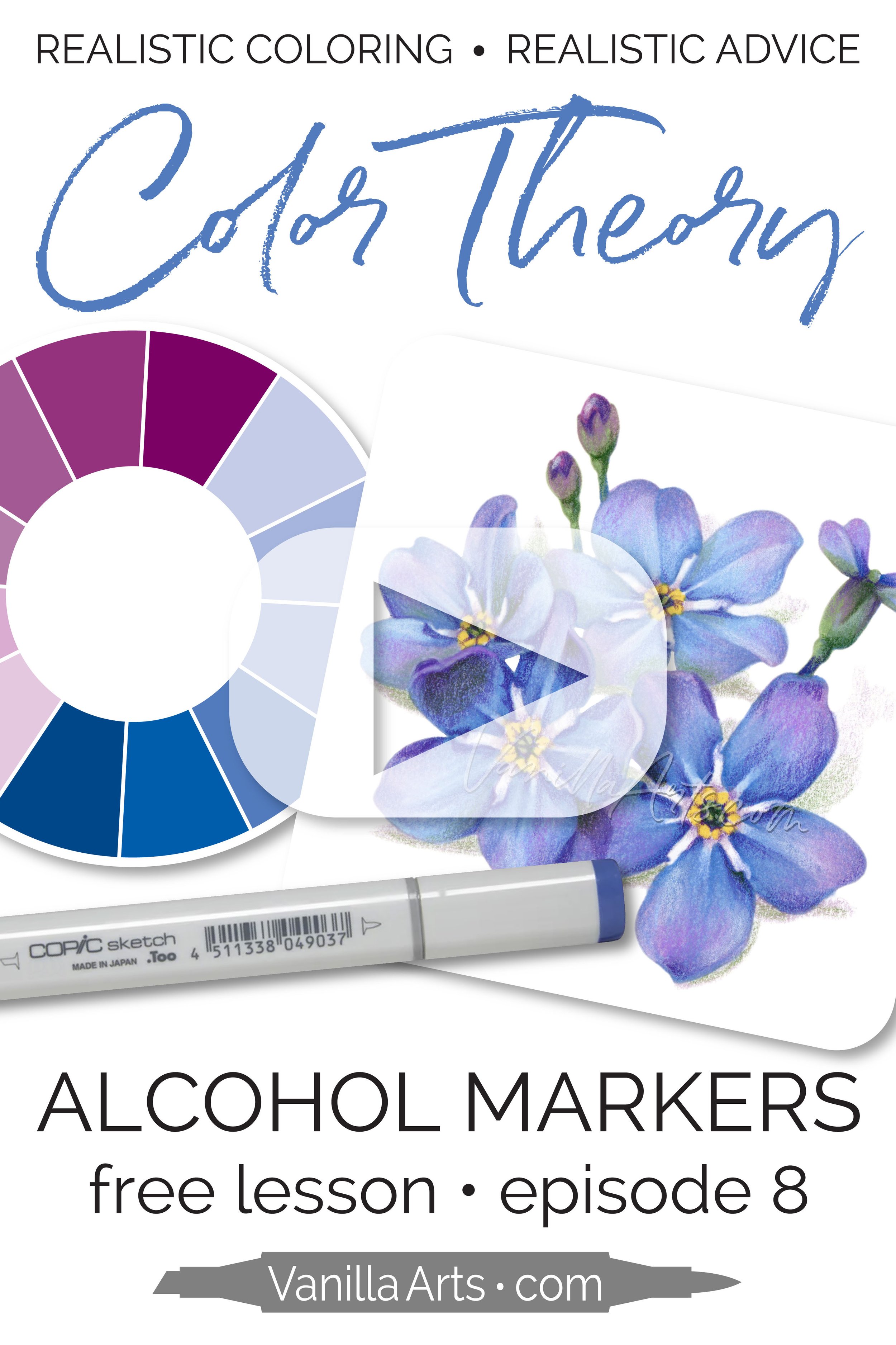
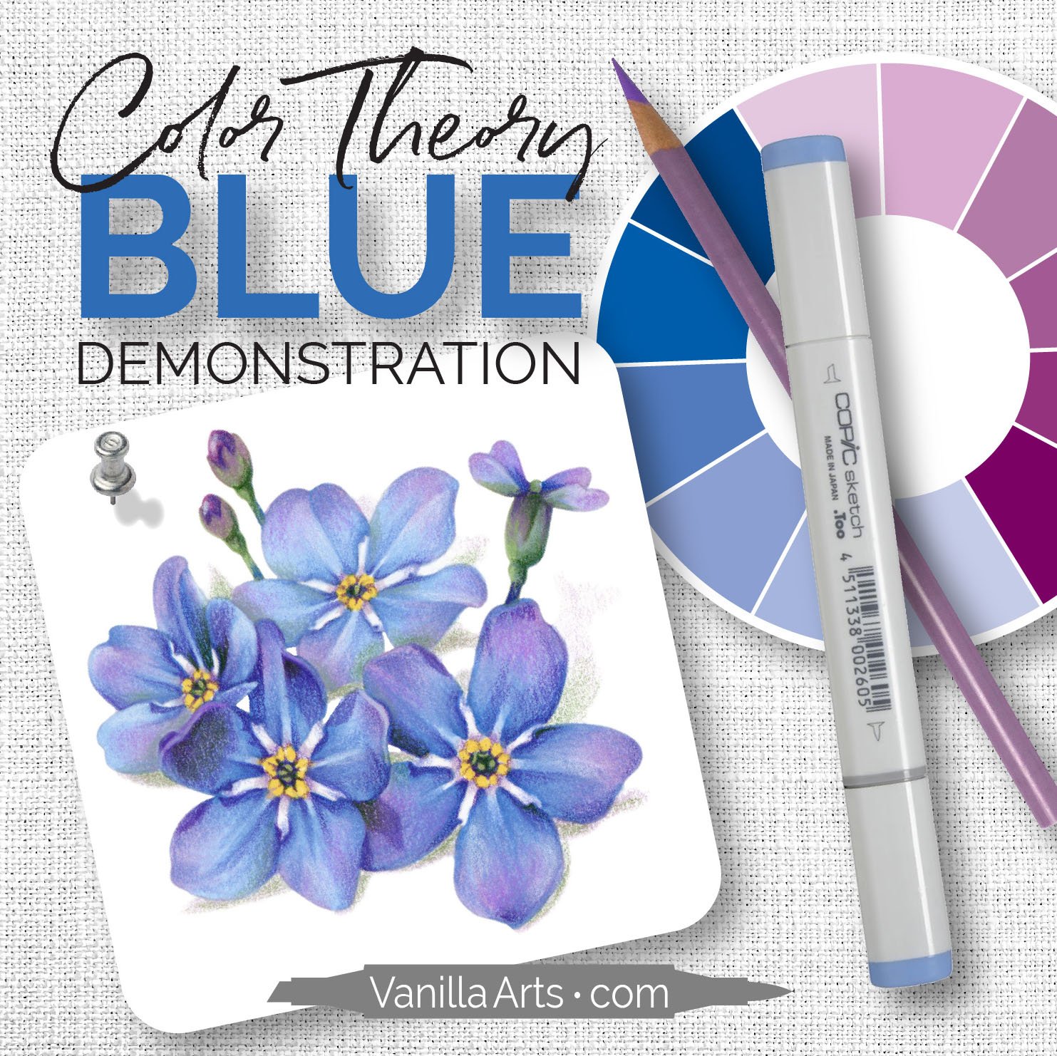
Episode 8 - Blue Forget-Me-Not Coloring Demonstration
Blue markers are easy to blend, the ink is very forgiving.
But the color theory techniques we’ve used in episodes 1-6 don’t really work for blue.
Have you looked at what’s across the color wheel from blue? Yikes!
Complementary underpainting for blue isn't as logical as with other colors. So how do we shade and underpaint blue for realistic florals, clothing, or other blue and bluish objects?
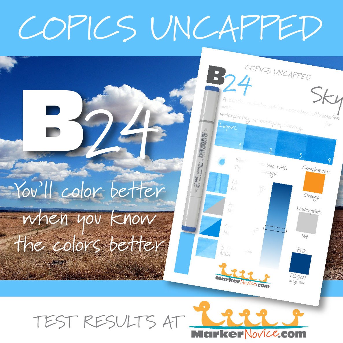
In Episode 7 of our Applied Color Theory lessons, we selected a blue blending combination with a twist plus a gorgeous underpaint.
Now in Episode 8, you can watch as Amy puts our blue marker and pencil selections to use on the Forget-Me-Not practice image.
Resources & Learning Aids
FREE video at YouTube
In this episode, Amy colors dimensional blue Forget-Me-Not blossoms using the colors we selected in Episode 7: Blue Swatching. Amy shows you how to shade and desaturate blue using a combination of violet markers and green pencils.
Supplies and colors are listed at the bottom of this page
Did you miss Episode 7? watch it here:
Amy’s 4x4 Forget-Me-Nots
TIP: Every petal is unique
One of the mistakes colorers make is to color one petal, then repeat the exact process on every petal after that.
While it’s true that Amy uses the same colors and same technique on each petal, the process must change as the petals change direction and tilt. Every petal has a unique ratio of light to dark blues and the location of the darks change slightly as a petal picks up more light or is hidden in shadow.
Realism requires you to reset your assumptions at the start of every petal.
TIP: It’s okay to be unsure
Coloring videos are usually a rehearsed presentation. In most coloring tutorials, you’re watching someone coloring below their personal skill level or using a process they’ve done a thousand times.
Beginners tend to think “when I’m advanced, I’ll color effortlessly, like my hero does on YouTube”. This is an unrealistic and unfair expectation.
No artist knows exactly what to do when they begin a piece. Coloring evolves with trial and error. On camera, this problem solving looks like dead pauses, stroke hesitations, or coloring an area several times.
Professionals stop to think. Professionals erase. Professionals start over.
Not knowing exactly what to do is perfectly normal for everyone at all levels!
At home, when you hesitate or sigh in frustration, you’re coloring like a real artist, not a YouTuber.
Purchase the Kit
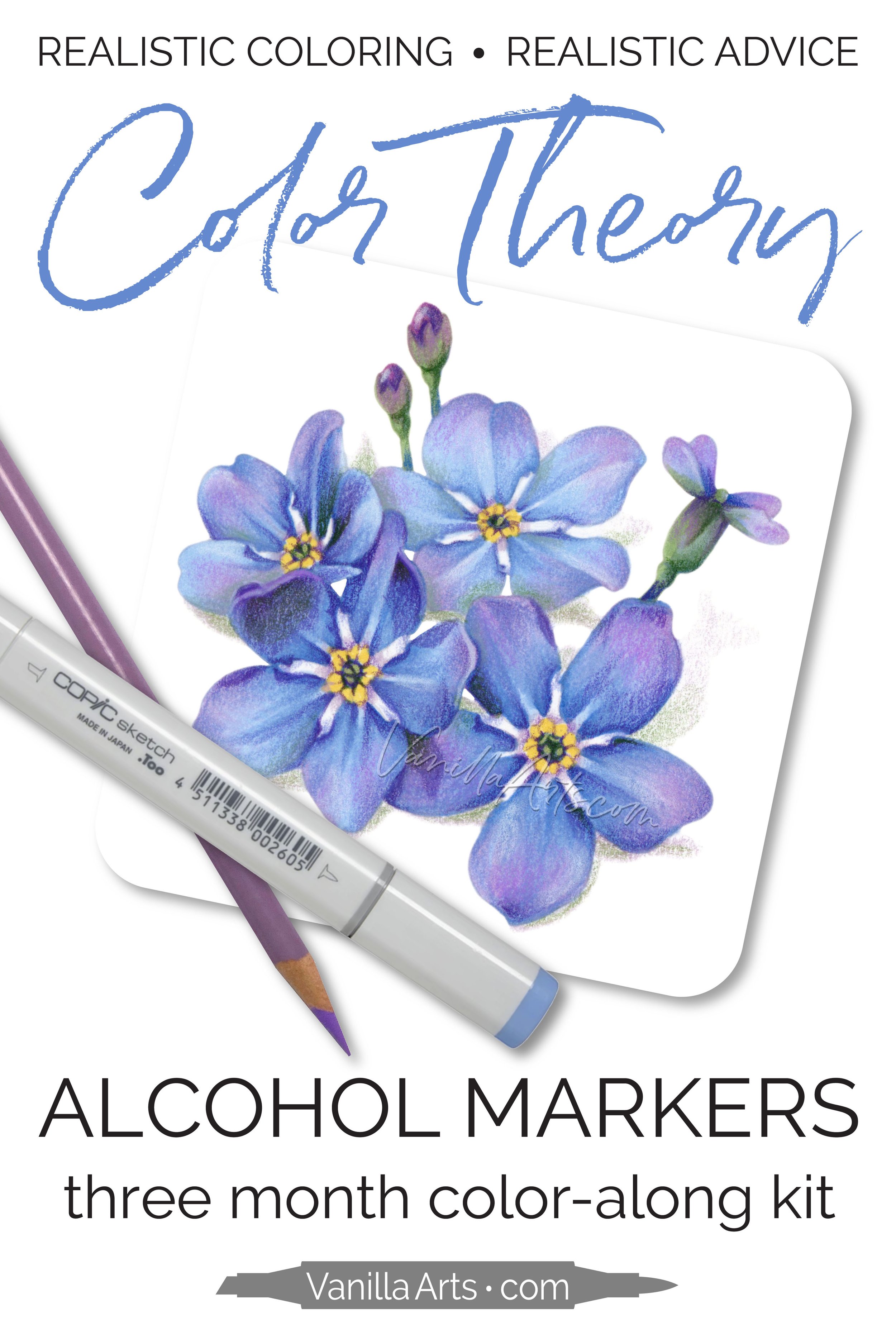
Color along with Amy - Summer 2023 Color Theory kit
This kit covers THREE months of YouTube lessons: June, July, and August.
Easy PDF digital downloads include:
3 PDF worksheets targeting specific colors from each photo reference
June Blue (episode 7)
July Purple (episode 9)
August Red (episode 11)
3 flower blossom PNG digital stamps
Forget-Me-Not (episode 8)
Iris (episode 10)
Rosebud (episode 12)
Amy’s PDF Copic color wheel
Free Photo Reference
Our forget-me-not photo reference provides lots of blue inspiration.
References are important because you can’t color realistic blue until you can see realistic blue.
Download the free photo reference from Pixabay here.
Color like an Artist
Vanilla Beans is a weekly Saturday newsletter full of coloring tips and articles about developing your artistry.
Announcements and video notifications are also sent to this mailing list. Click to subscribe.
Color with Blue
Designed for large scale, realistic coloring. Amy’s illustrations are drawn with minimal texture marks or decorations to let your marker art shine.
Take a Class
Amy has classes featuring yellow and yellow coloring technique
Or focus on blending skills
More About Blue Markers
Supply List
(to be updated after Amy selects markers and pencils in the June 16th livestream)

