Copic Marker: YG23 “New Leaf” (Everything you need to know and more)
What’s a Good Blending Combination for Copic YG23?
I’ve colored with Copic Markers professionally for almost 30 years. After all this time, I can certainly share more than a few yellow-green blending combinations with you.
But I’m always a little sad when someone asks for a marker recipe.
There’s much more to artistic coloring than pretty Copic blending combinations.
To be honest, blending combos are the least of what we do.
Today, let’s look at Copic Marker YG23 New Leaf from the artist’s perspective— how do I use this chartreuse marker in my classes and in my artwork?
Let’s get past the basic blending and find out how this marker really performs.
Copic Marker YG23 New Leaf is a pretty chartreuse color but it’s not a color you really need. YG03 And YG13 are incredibly close in color! YG23 fades extremely fast, even without direct sun. We do not recommend buying YG23 until you’re in the final stages of building a complete Copic collection.
Copic YG23 is a Bright, Classic Chartreuse
The problem is that Copic makes many bright classic chartreuse markers. We’re honestly not sure why they felt the need to make YG23 at all.
We’ll discuss this unnecessary duplication of colors farther down in this article.
YG23 is a typical acid green. It’s not florescent but it does have a nice glow.
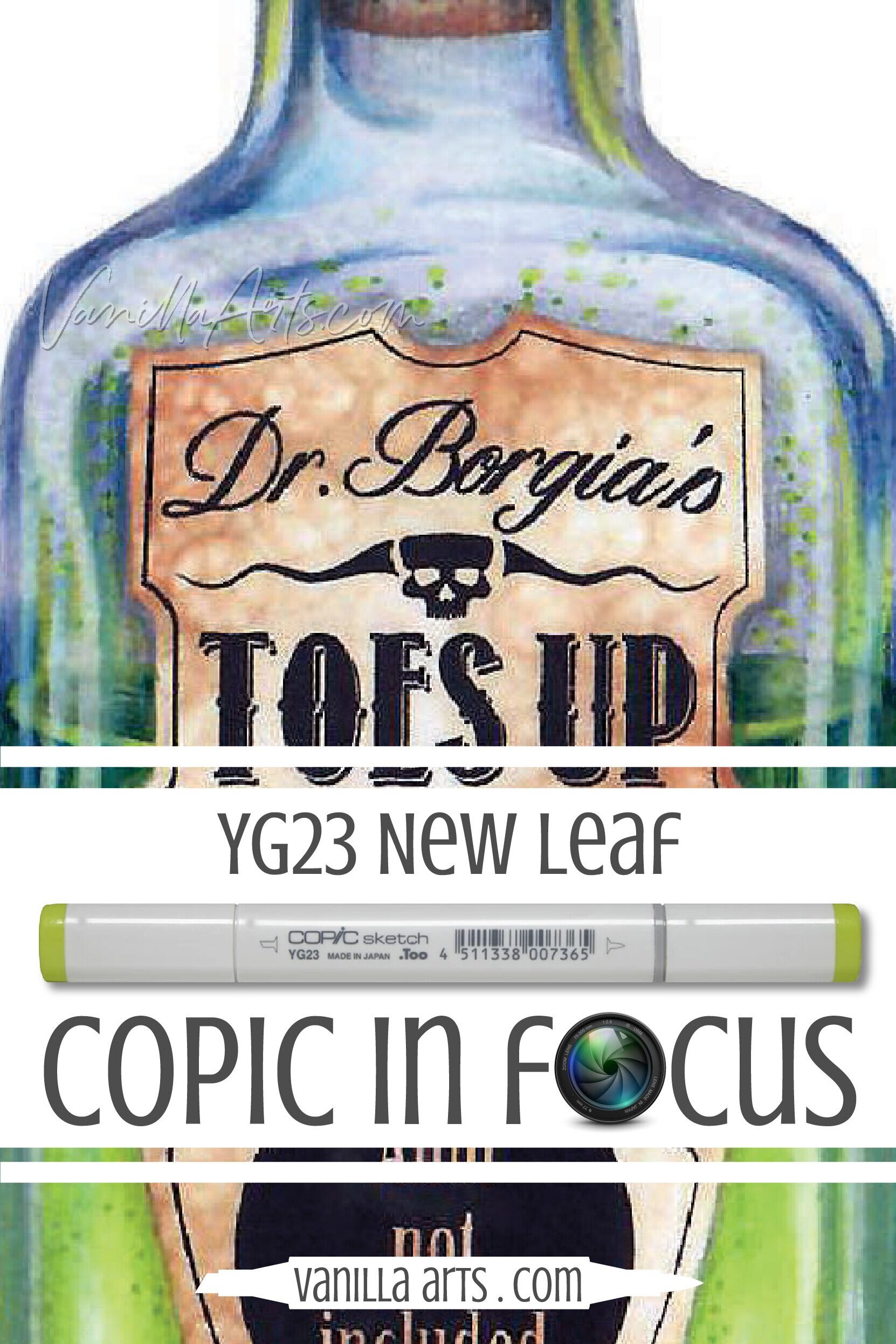
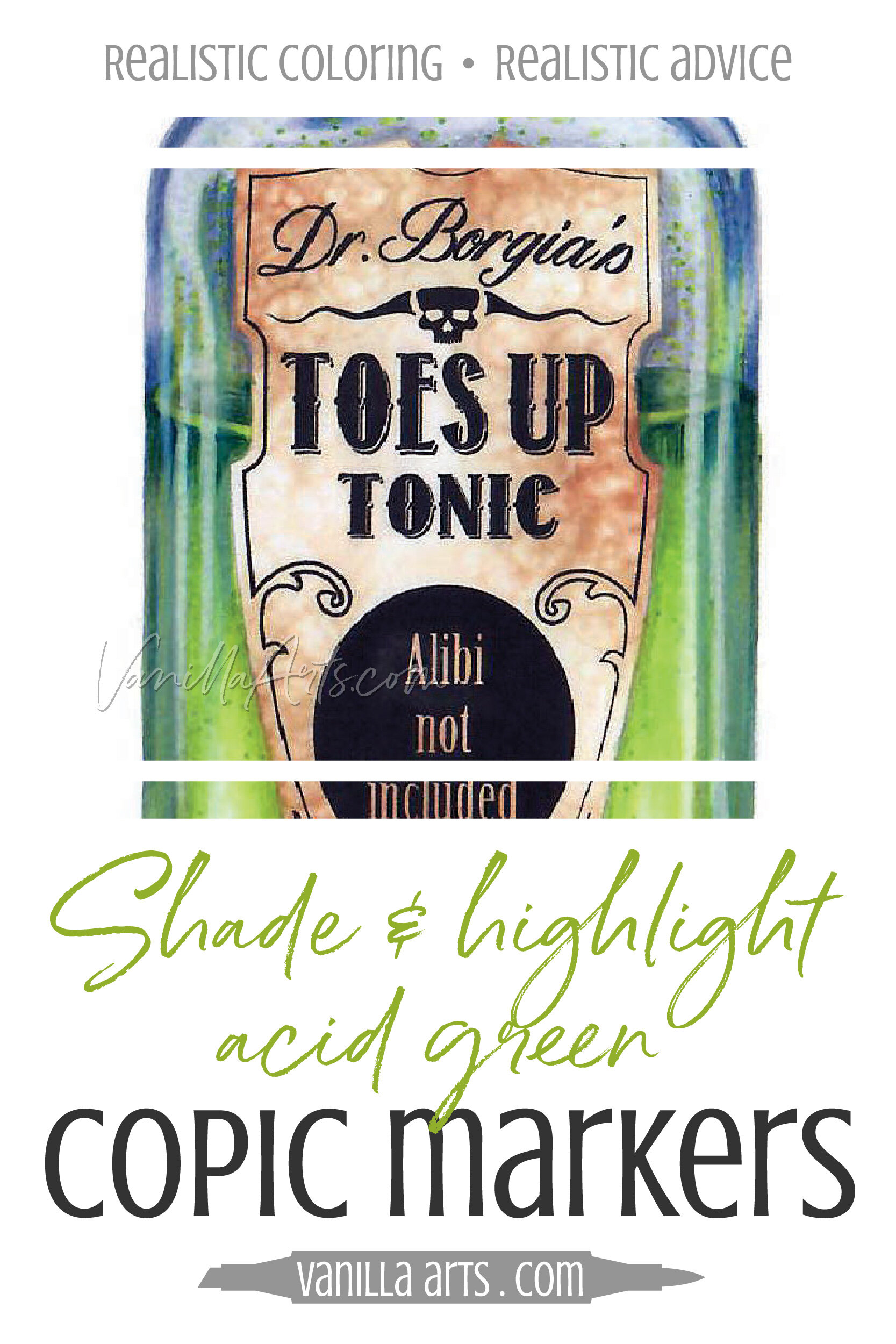
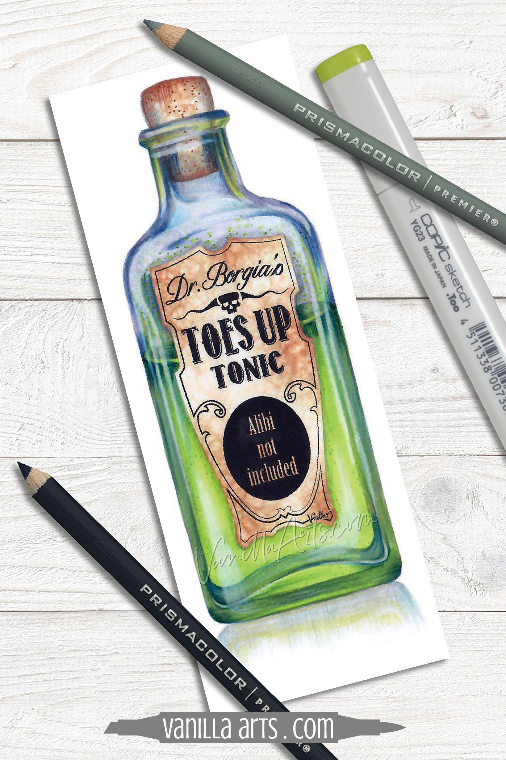
In the intermediate-challenge level Tonic class project shown here, I’ve used YG23 to create the toxic glow of a very suspicious looking medicine.
About the YG Color Family:
With Copic Markers, there are two green families. The G greens tend to lean towards blue while the YG greens are warmer with more yellow in the mix.
YG is the color designation for a mixed-ink formula of yellow inks plus green inks, hence the “YG” designation.
About the YG-Twenty Group:
YG23 is part of the “Twenty” group of YG markers— the first number in the ID code tells you the group number. In general, Copics which start with 2 tend to be bright but they’re not as candy colored or as glowing as the Zero or Teen groups. The Twenties are often my go-to for colors that are “bright yet sophisticated”..
Learn more about the Copic Numbering system in my article at MarkerNovice.com here.
About the Color Value:
The second number in the code YG23 is a 3. This tells you that YG23 is towards the middle of the Twenty group (nine would be the darkest).
Unfortunately, Copic has never developed the YG-Twenty family beyond YG23 and YG25.
Most Copics with a last number 4 or below are very easy to blend with other markers. But honestly, any marker which contains yellow ink is going to be easier than normal. The more yellow the easier the blending gets.
YG23 is an incredibly easy blender. It’s from a Twenty group, it has a value below 4, and it’s full of yellow ink. It was born to blend!
Despite the fact that YG23 is an easy blending marker, we do not recommend this marker for beginners. We’ll explain why when we get to duplications and longevity later in this article.
About the Name: New Leaf
YG23 is a bright spring green, a color frequently used for botanicals and lush landscapes. The name “New Leaf” is a perfect description of this color.
Copic names don’t always make sense but this one does!
Is Copic YG23 Ink Lightfast?
Does it fade quickly? Can it be erased? Does it shatter? Does the cap color match the ink color?
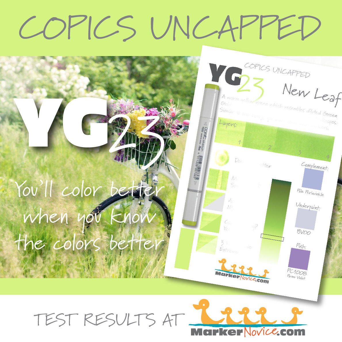
I’ve tested YG23 ink to help you better predict how this ink will behave during use.
See the test results for:
Lightfastness
Layering
Color Build-up
Dilution
Value
Cap Accuracy
Behavior upon contact with Colorless Blender
MarkerNovice.com is the sister site to VanillaArts.com where I offer reliable information for Copic Marker beginners.
How do I use Copic YG23 New Leaf in Classes and Projects?
I’m a big fan of using chartreuse in floral images because I see a lot of chartreuse in the garden, especially in spring.
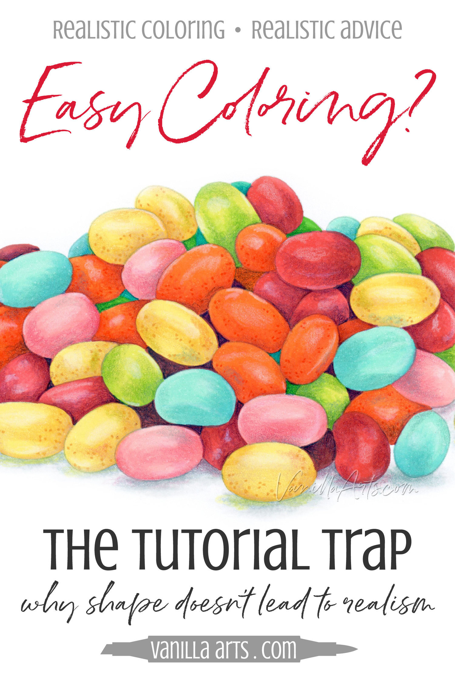
So since I color a lot of flowers and I teach a lot of floral classes, you’ll see YG23 in a lot of my class projects projects. Jellybeans, Tonic, Created to Create, and Oopsie Daisy and my Coloring Kits, Merriest Berries and Strawberry Tea to name just a few.
YG23 is part of a very small natural blending group. There are only three markers in the YG-Twenty family— YG21, YG23, and YG25.
Sadly, there’s just not enough of a difference between 23 and 25 to make the blending combination worthwhile. So I look outside the YG-Twenty family for blending partners for both YG23 and YG25.
YG17 + YG23 is my favorite pairing. YG17 keeps New Leaf’s neon glow from feeling obnoxious.
Remember, I specialize in realistic coloring which means I tend to choose the most organic and natural looking colors possible. I don’t really have a use for neon colors. But if you like the shock value of YG23, you might like pairing it with YG07.
Read More:
Click to visit articles which feature projects using YG23
How to Blend with Copic YG23
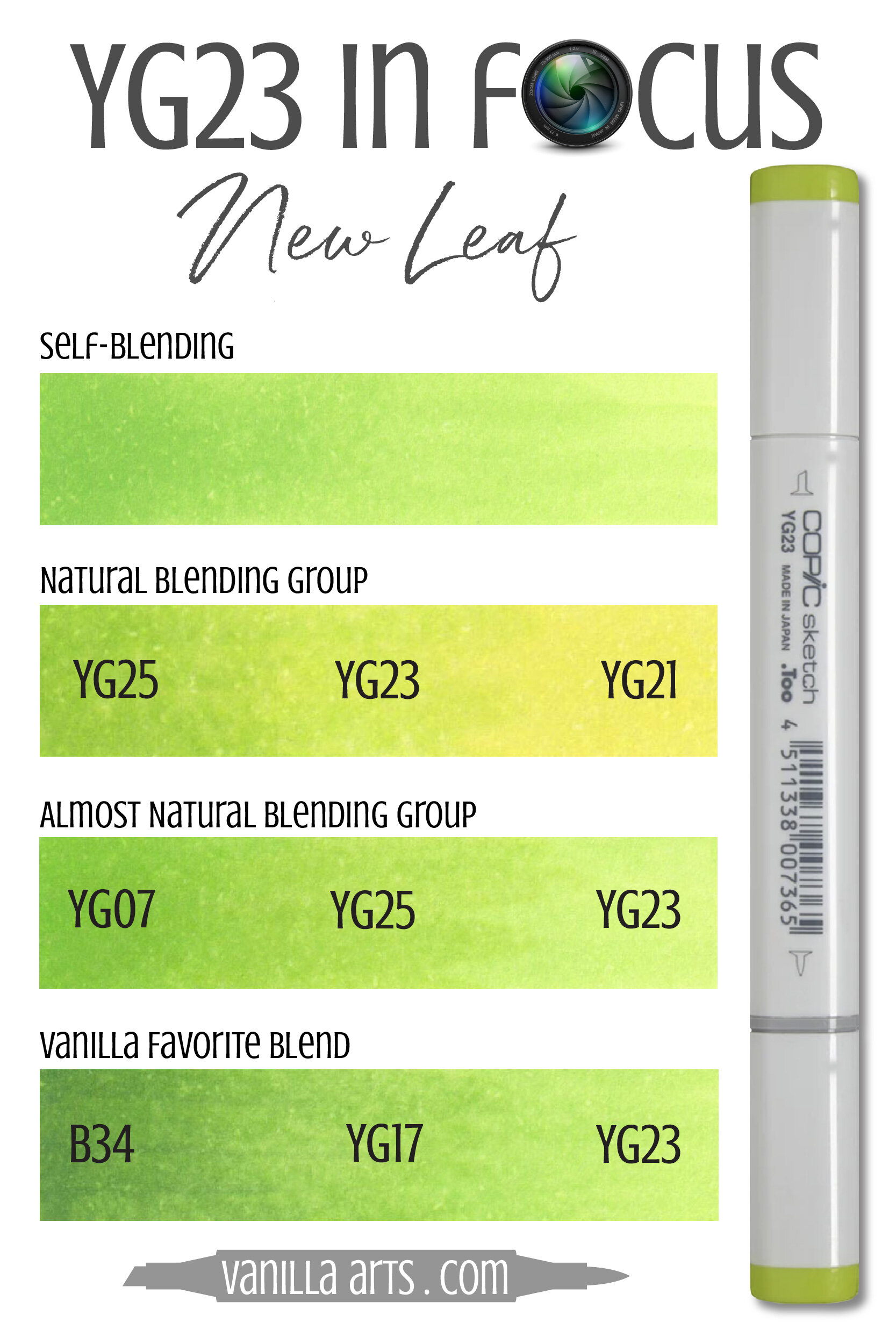
Here are a few sample blends using YG23 New Leaf.
In the Self Blending swatch, I’ve created 3 layers of YG23. The darker left side is three coats of ink, the middle mid-tone is two layers, and the far right is one layer of ink.
People don’t often think about blending a marker with itself but self-blending always creates the easiest gradient possible and a self combination always looks smooth.
I’ve sampled two natural blending groups for you. Actually, with only 3 markers in the YG20 family, I can only do one but I tried to give you a second which feels natural .
A natural blending combination is 2-3 markers which all share the same first number.
Naturals are usually very easy blends but YG21 makes it harder. The problem is that YG21 has so much colorless blender in the formula that it’s hard to keep it from erasing the darker markers.
The Natural Blend uses YG23 in the middle— YG25-23-21. I don’t love this blend because there isn’t much difference between YG25 and 23. Then we’ve got a very yellow YG21 coming in on the other side which really lifted most of the YG23. I would not teach a beginner class with this blend.
The Almost Natural Blend uses YG07 to add a darker value to the combination. This would be a great beginner blend— it was easy and I really like the look of it.
The last swatch is my favorite and this is how I use YG23 most often. I underpaint with B34 a lot, both for classes and my personal work. B34 is a multipurpose underpaint because it works underneath so many other colors. Then YG17 goes over the top of the blue and blends with YG23 for a classic green to chartreuse run. I also frequently use YG03 in place of the YG23— 03 will look more organic and 23 is brighter for a happier feel.
Tips for blending YG23:
Note: YG23 is not a staining color and it’s a pretty easy blender. So don’t talk yourself out of trying something crazy like YG23 to V25. Give it a try!
I think YG23 works best as the lightest marker in the combination. When 23 is the darker, you’re often playing with markers that end in a zero which always contain tons of colorless blender in the formula. Colorless blender really wipes away the green component of YG23 leaving you with just yellow.
Be generous with your blending inks. No blend works well when you skimp on ink but stubborn colors require extra juice to blend smoothly.
Don’t over-ink with YG23— and to be honest, this is why I prefer YG03. YG23 can look really blotchy and almost oily when layered and it happens faster than you’d expect.
Don’t go back and add more YG23 to fix a blend. As I said, too much YG23 in the same spot will look blotchy. And again, this is another reason I recommend YG03 over 23. YG03 allows you more fixing opportunities; YG23 does not.
Redundant Copic Colors:
Okay, this is the part of the article I’ve been hinting about and it’s the part Copic won’t like me talking about.
Honestly… do we really need three chartreuse markers this close?
They’re not actually duplicates because each color here was created using a different family of inks.
YG03 was made from a YG0 ink. YG13 was made from YG1 and YG23 was made from YG2 ink. They’re all chemically different.
But to the human eye, they look pretty much alike.
Now normally, Copic does a pretty good job of not selling similar colors. Some of the holes in the numbering system will never get filled because the marker in that space looks too similar to another color they already sell.
Copic is not perfect though, there are some redundant markers which double another color.
But in this case, Copic released three YG markers which might as well be triplets.
I’d recommend buying one and skipping the other two.
At least not until you’re two markers short of a full Copic collection and you can’t sleep at night knowing you’re this close to marker nirvana.
So which YG marker should you purchase?
Looking at the three swatches, they’re remarkably close. YG03 is more yellow and YG13 has a bit more blue in it. YG23 sits in the middle and it’s a chameleon which honestly looks more yellowish or bluish depending upon which swatch you hold it closer to.
But I’m nit picking here. The three colors are all so darned close! You can color Tonic with any of the three and I’d never know which you used.
If we can’t differentiate by color, then how about by how they blend?
This is why I recommend YG03 as an all-purpose chartreuse.
There’s not one thing really wrong with YG13 or YG23, they blend fine but it’s the look of how they layer that really puts them at a disadvantage.
Check out the layering test for YG13 here and YG23 here. Both markers can look oily and blotchy with as little as 2 layers.
This doesn’t happen to YG03. It’s not 100% blotch free but it’s a lot easier for you to go back and re-blend with YG03 than the other two YGs. Beginners tend to blend very slowly and they re-blend a lot, so the more a marker allows you to go back, the better your coloring will look.
YG03 is so easy to work with, I feature it in my Marker Painting Foundations course and it’s part of my recommended Copic Starter Set list.
So skip YG13 and YG23.
And when they come up on supply lists, you can usually substitute YG03 for the other two.
How to Shade & Highlight Copic YG23
If you’ve read many articles here at VanillaArts.com or taken any of my classes, you know I teach an underpainting method.
In underpainting, we choose opposite colors on the color wheel to add the realistic murkiness found in real-life shade. We “desaturate” with complementary colors. Read more in my article series here.
After I underpaint and blend with Copics, I come back with colored pencils to boost the shade and add highlights. My pencils rarely match the Copics.
Shade suggestions for YG23 New Leaf:
Copic Underpaint— B21, B32, BV00, BV20, BV31, V01, V12, or V20
Prismacolor Pencil Overpaint: PC901 Indigo Blue, PC109 Prussian Green, PC911 Olive Green, and PC105 Cobalt Turquoise looks really cool.
Highlight suggestions for YG23 New Leaf:
Try the Vanilla combo shown above (B34, YG17, YG23) but add a marker to the light end. Try YG21, YG01, or even Y02.
Prismacolor Pencil Overpaint: PC 914 Cream, PC938 White. Sorry, Prismacolor doesn’t make any greens light enough to use on YG23.
Is Copic YG23 a Good Marker for Beginners?
It’s not bad; I just like YG03 better.
I teach beginner classes with YG03 because it’s more forgiving than YG23…
but I allow students to use YG03 and YG23 interchangeably.
So basically, YG03 is on my starter list but I’d never be able to tell if you subbed YG23.
Remember, yellow-green markers are generally very easy blenders, it’s just the blotchiness that you have to watch out for.
YG03 is less blotchy than YG23 but they’re both easy colors to use.
And that reminds me of another point…
In general, I recommend that beginners start with YG markers and leave the Gs for later.
The Gs don’t blend nearly as well as the YGs.
So if someone offers you the set of YG-20s, that’s great! You can color a lot of florals with just these 3 markers!
Read more about my starter set with tips for building your marker collection in my article here.
Learning Resources for Copic YG23 New Leaf
See YG23 in action:
Use our Vanilla Undercover swatches to add realistic depth and shade to your next coloring project.
We publish new swatches every Thursday.
Vanilla Undercover is sponsored by Violeta-Ink.com
Vanilla Arts Online Classes & Kits using YG23 or similar chartreuse color palettes:
(Click for more info)
Something Wicked…
Join Amy for an introduction to realistic glass and touchable textures.
“Tonic”
Learn to color fizzy liquids and Amy’s exclusive parchment technique, plus we discuss the keys to realistic transparent glass with amazing reflections.
Intermediate’s Challenge Level
Copic Marker + Prismacolor Premier Colored Pencils
Anytime access, work at your own pace.
Class Printable Pack Includes:
Digital stamp in 3 easy print options
Class syllabus with detailed recipe guide
Full color project sample
Guide to Copic base
Detailed color map
Project inspiration references
Select supplies used in Tonic:
Vanilla Arts Company is a participant in the Amazon Services LLC Associates Program, an affiliate advertising program designed to provide a means for use to earn fees by linking to Amazon.com.

