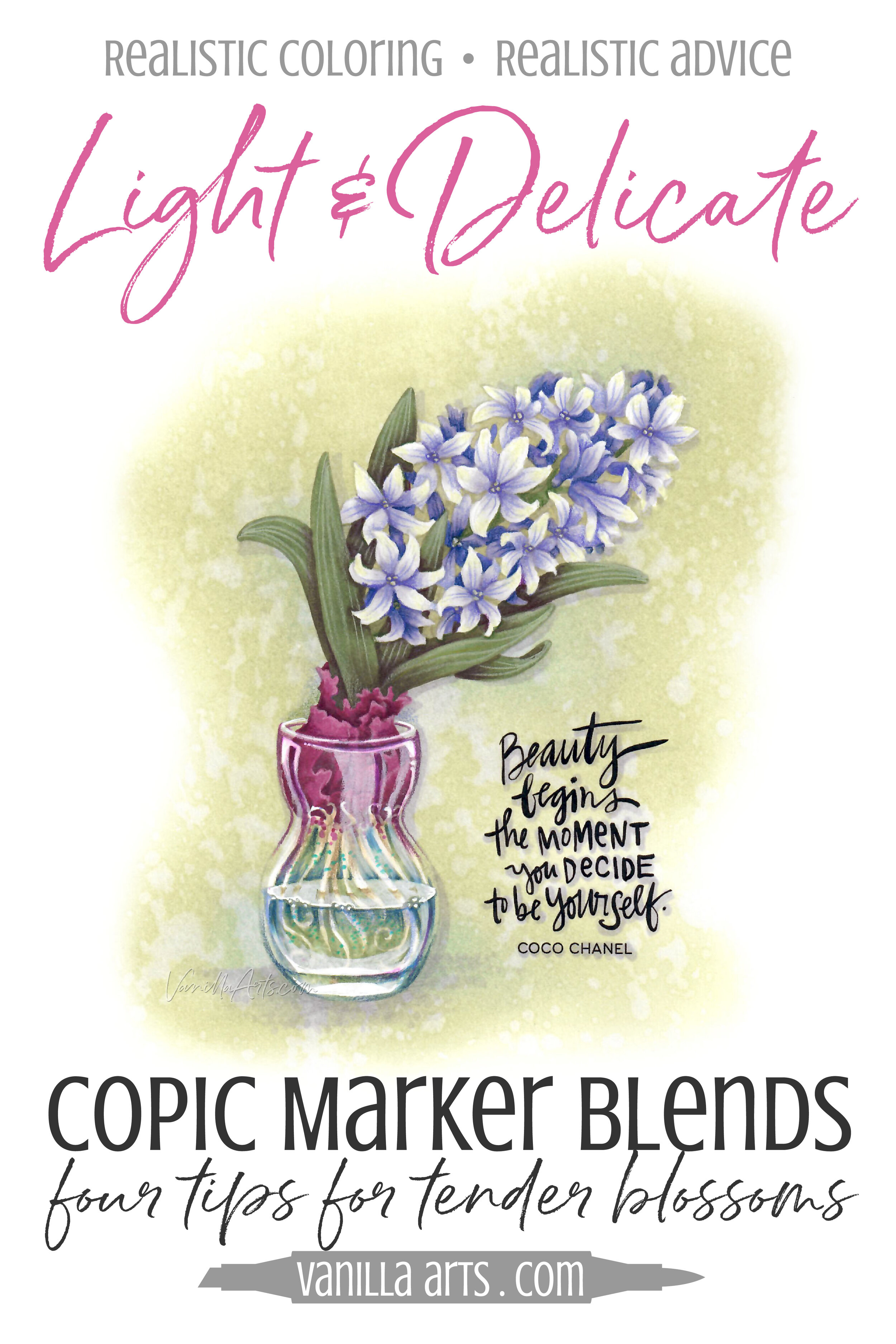
Improve your Coloring: How to Keep Copic Marker Projects Lightweight & Delicate
Do you have a weight problem?
Sorry, not that kind of weight problem.
Do you have a Copic weight problem?
You are not alone.
You color something like flowers and your blends are flawless. You use your best techniques and all of your skill. Basically, the stars align and it might be the best coloring you've ever done.
And yet your flower blossoms look like they weigh about 900 pounds each.
There's nothing light or delicate about your project. It's leaden and heavy.
Traditional Copic Marker technique adds visual weight to everything you color.
By choosing darker and darker markers to shade every object, the usual Copic blending combinations weigh-down the look of your projects.
I suspect this is why many marker experts color everything super pale (hello RV0000?). Or you'll find marker mavens who color everything using bright primary colors (hello B05 and Y08!).
They've noticed the built-in heaviness and they're avoiding the problem rather than solving it.
Why do your marker projects look heavy?
Here's a test-
Think about something pink, like a tulip. What Copics would you use to color hot pink tulip petals?
Most of you would start with an RV09 or even RV19. Both are classic dark pinks. So what's the shade color for either of those markers?
If you're shading bright pink with a burgundy or deep wine color like RV99, that's exactly why you have a weight problem!
Did you really want to color burgundy tulips? So what happened?
You've been taught to use the wrong color and that leads to excessive visual weight.
It's not just your Copic Blending Combinations though...
The way you color the image is important too.
Do all of your projects look like they're standing under an unrelenting noon-day sun?
Extreme shading and harsh shadows add weight.
Ever notice how photographers obsess about lighting? Professional portrait photographers are really picky and they use multiple soft lights to virtually eliminate all shade and shadow.
And yet you've been taught to add more shade and more shadow?
It's no wonder your coloring weighs a ton!
Florals show all your flaws!
Flowers are supposed to be light and delicate.
And flower stamps are evil; they emphasize and amplify your weight problems.
You might get away with a deeply shaded burgundy Santa Claus but a 10 ton daisy just feels wrong!
Are you sick of coloring heavy, plastic, and artificial looking flowers? Let's fix that.
It's time to rethink color
It's not you.
It's not the Copics.
It's the rules you've been faithfully following.
I'm giving you permission to break the law and lighten up!
Four tricks to losing weight:
Color weight. I can't help you with the muffin top...
Avoid shading with burnt marker colors - stop associating level 9 markers with shade!
Stop extreme shading - make your color transitions softer and gentle.
Monitor your temperatures - keep the cool colors cool and the warms warm.
Find breathing room - look for air pockets or places where the background can peek though.
Want to know more?
Great, because there's a lot to explore. Remember, I've sat through all the boring color theory classes so that you don't have to.
I can't wait to share this fun lesson with you!
Hyacinth Bulb in Glass
Join me for a fun Copic Marker + Colored Pencil lesson in the Vanilla Workshop
Hyacinth Bulb in Glass was recorded live, now it’s available as a Marker Painting Workshop with anytime access.
Vanilla Livestream was a live demonstration program from Vanilla Arts.
Edited classes with perfect narration tend to make the coloring process look faster, easier, and smoother than it really is.
Stop comparing yourself to the supermodel version of an artist!
Real time coloring with real mistakes and real fixes.
Class Printable Pack Includes:
Class syllabus with detailed recipe guide
Full color project sample
Guide to Copic base
Detailed color map
Project inspiration references
Hyacinth Bulb in Glass!
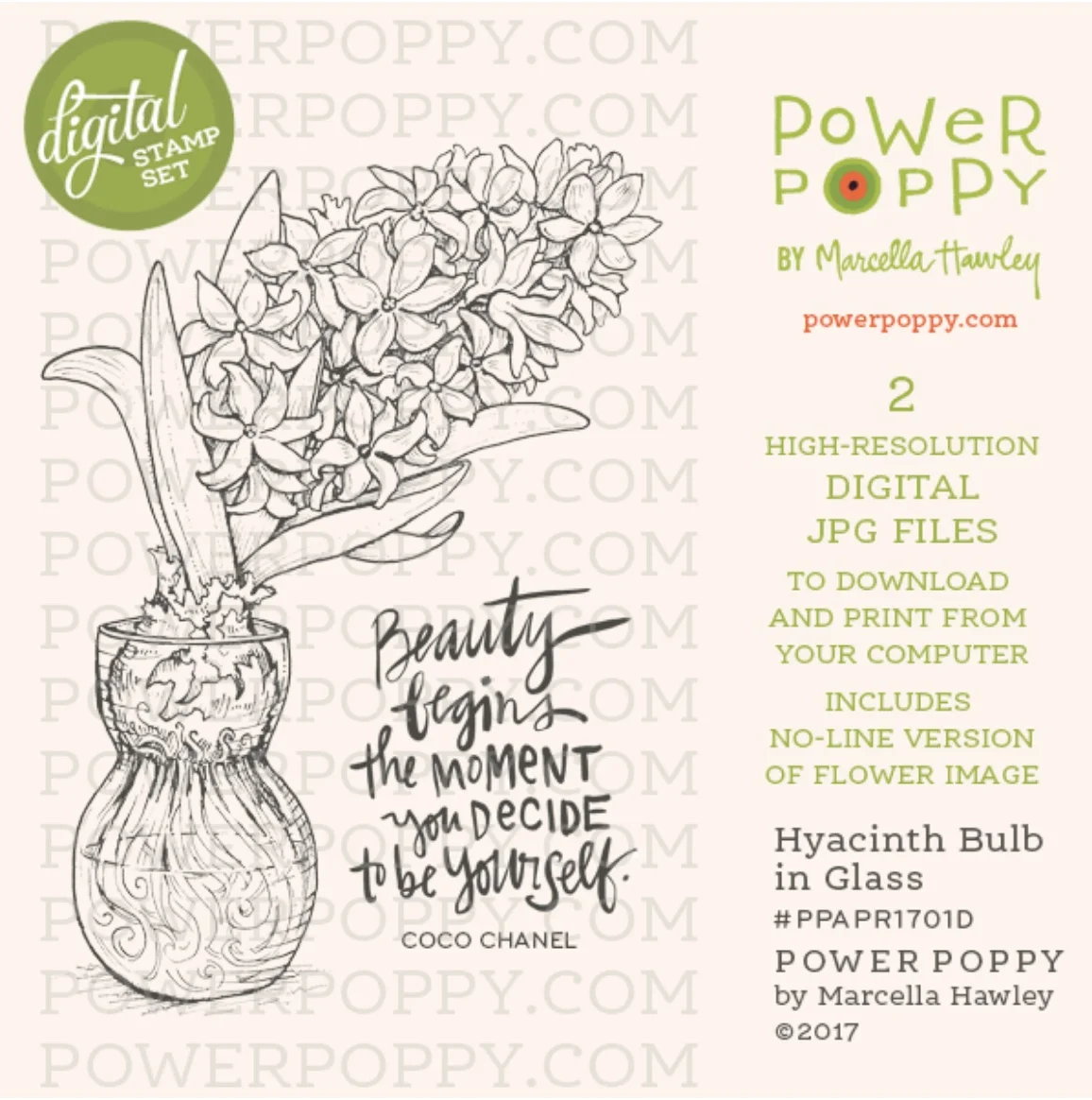
Marcella Hawley of Power Poppy Stamps has drawn a Hyacinth Bulb and glass vase. The vases were designed to cradle the bulbs and hold them just above the water, roots were coaxed from the bulbs down into the water, sending the bulb into bloom soon after. The digital stamp is available as a separate purchase from PowerPoppy.com
Join me for a lightweight lesson that will change the way you color
Plus, it'll be fun!


