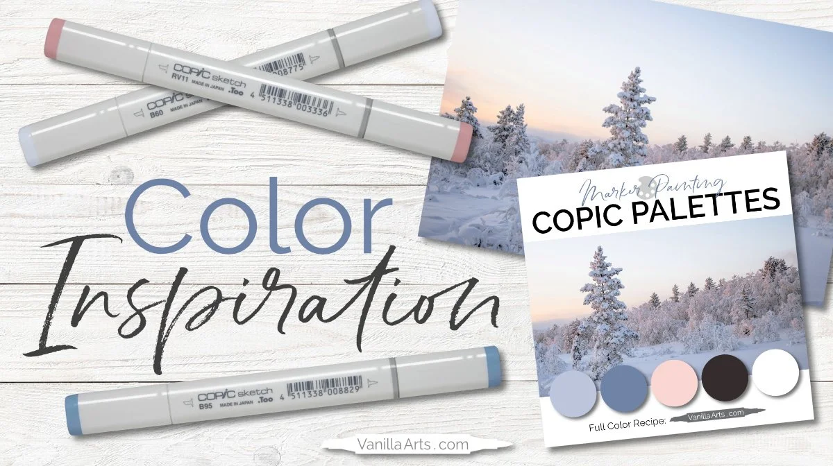
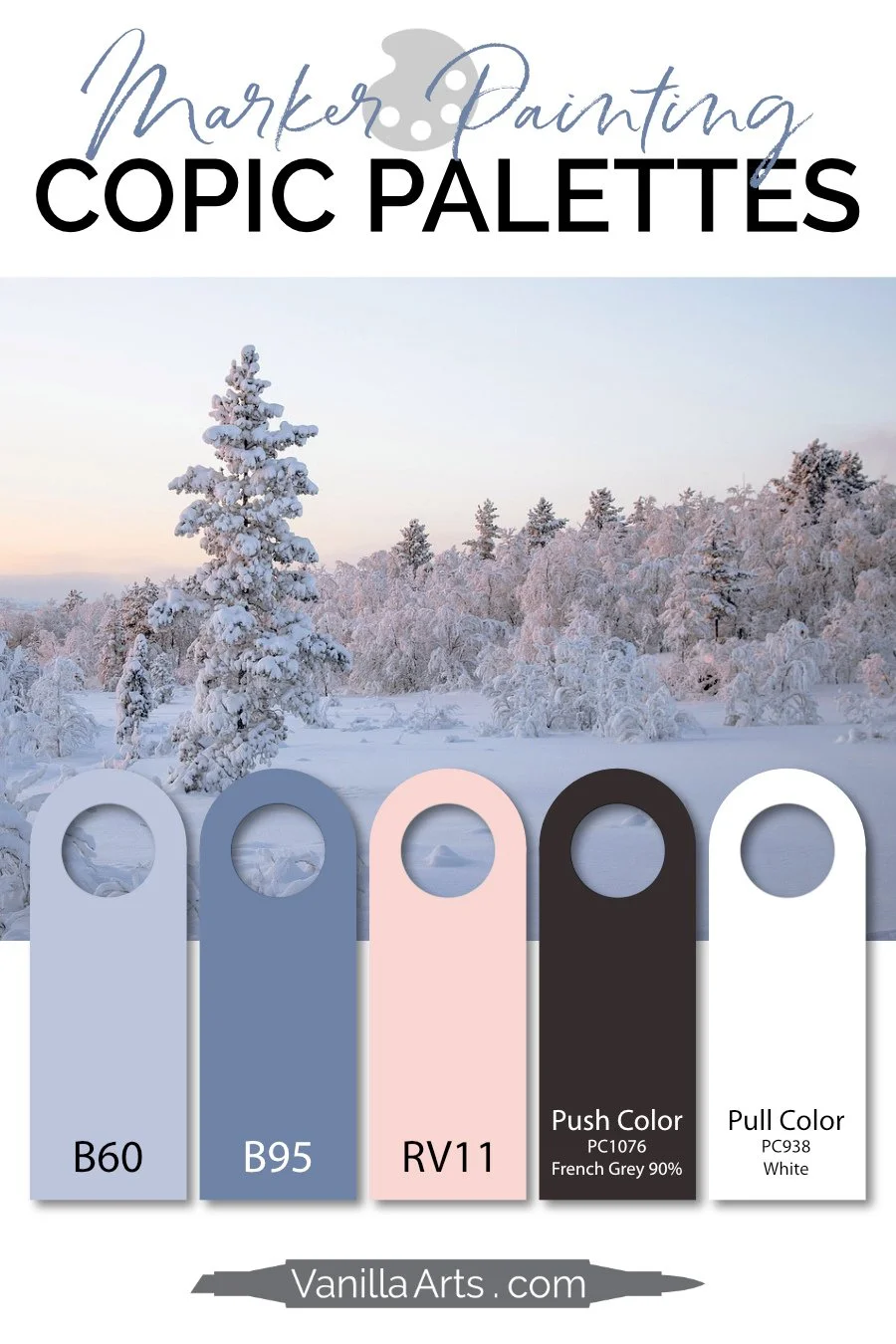
Color Palette: Copic Marker + Colored Pencil Combination (Blue-Gray, Blue, Pink) Powdery Snow
“Powdery Snow” - Copic Color Palette
Blueish gray, blue, and light pink blue Copic Markers make a light palette for your next coloring project.
How to use this Copic color palette:
In Vanilla Arts online classes, we use colored pencils over the top of Copic Marker or watercolor in process called color sculpting. Color sculpting is the basis for realistic, artistic coloring.
Pushing colors are used to deepen the look of the base color. It provides the look of distance.
Pulling colors are used to lighten the base color. It makes the area feel closer.
Together, push and pull create surface dimension and form. Use the pushing color to deepen and desaturated the marker colors in this palette. Use the pulling color to lighten and brighten them.
And no, the push & pull colors do not need to match the markers. It actually works better when they don’t!
Note: Color sculpting is different than the shade/highlight techniques taught in blending combination based coloring classes. For more information, we have a series of articles and an introductory level Push & Pull class.
Advertisements help to support the free content on this website.
More Blending Combinations, Tests, and Swatches
Amy creates color palettes especially for your marker painting projects. Her Copic + colored pencil palettes include push and pull suggestions for creating depth, dimension, and realism.
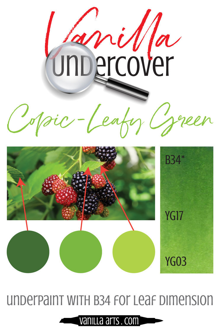
Add realistic dimension using our unique Underpainting Combos. These odd-marker colors underneath standard blending combos create the desaturated colors Copic does not make.


