The Myth of Contrast: Why High-Contrast Coloring Does Not Look Real (video + resources)
Have you been fooled by the Myth of Contrast?
We learn to blend alcohol markers with three markers.
Light, medium, and dark
Then somewhere along the way, we hear about depth and dimension techniques, which increases the marker count.
Highlight, light, light-medium, medium, medium dark, dark, and shade
The new colors in your blend are supposed to create “Contrast”.
Contrast is good? Contrast makes your coloring more dimensional:
And it’s not just markers. Colorists are spreading the contrast technique from markers to colored pencils and now into watercolor… Any medium the colorists touch, they bring their contrast techniques.
But it’s a lie.
Contrast does not create depth.
Contrast doesn’t create dimension.
And contrast techniques do not make things look realistic.
So why does everyone say it does?
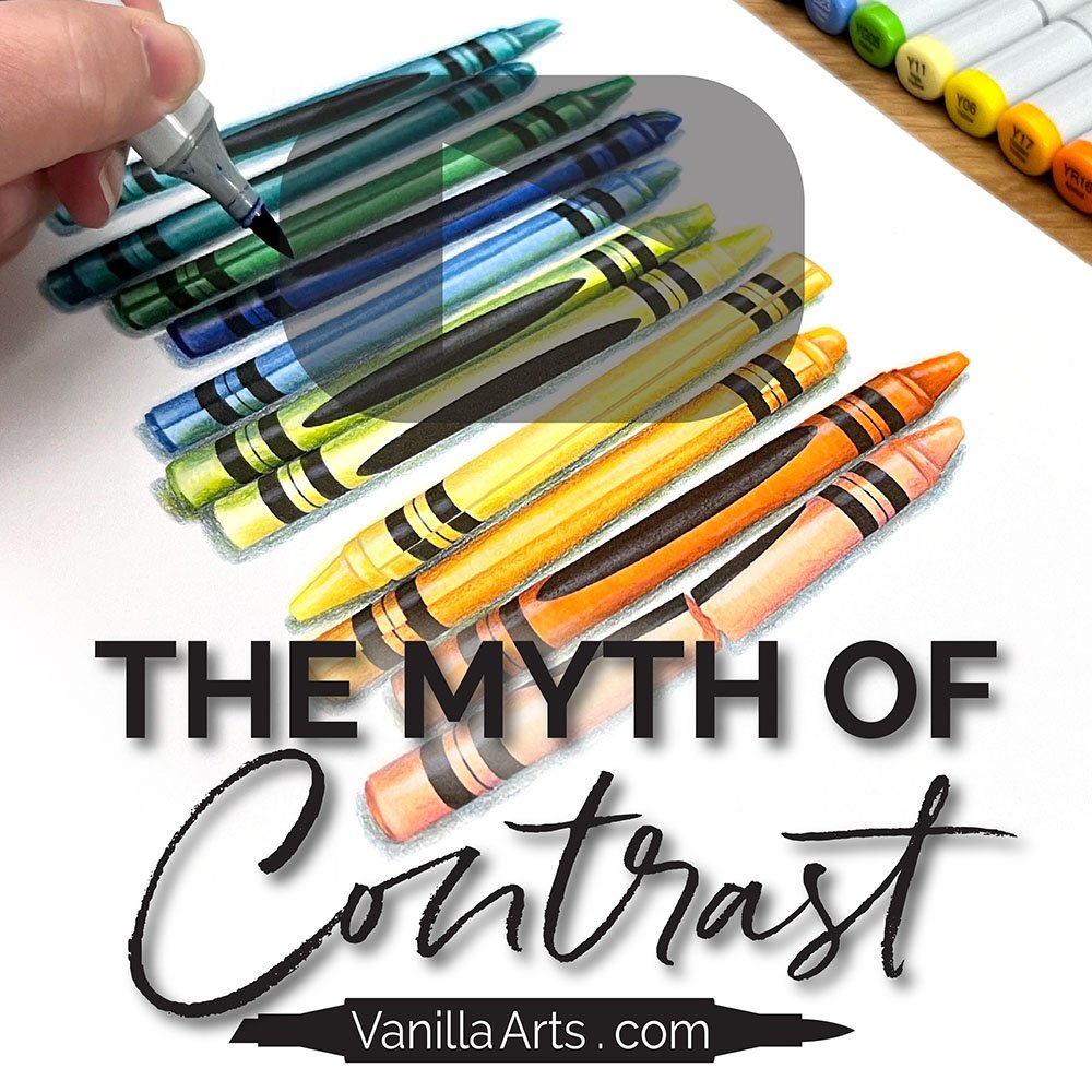
Colorist or Realist? The Myth of Contrast
(click below to watch at YouTube)
Want to know more about the Contrast in this video?
What is Contrast?
Contrast is the difference between your lightest lights and darkest darks.
It’s a measurement of color value.
Contrast is not a technique, although I’ve heard coloring people talk about it as if it is.
As I mention in the video, I hear many words being used differently in the coloring community than amongst artists. The coloring definitions are often a bit warped— which I think is because coloring information is spread verbally from person to person, like a game of telephone. When in doubt, always trust the Artist definition because art terminology has been recorded in text books and taught in formal classes for hundreds of years.
In the video, I set up a value scale based on the Copic N Gray markers.
This is how Copic numbers their markers. The last number on any Copic cap code tells you the value of the color with 9 being the darkest and 0 or the sub-zeros (00, 000, 0000) being the lightest.
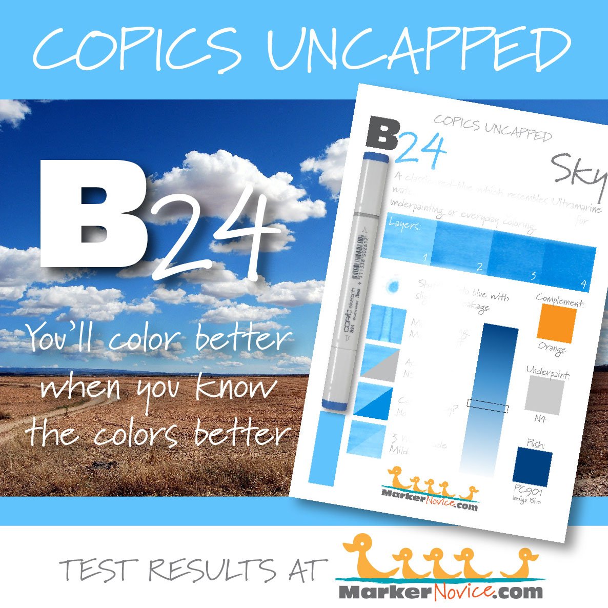
B28 has a value of 8. B24 has a value of 4.
Contrast is the difference between the two values.
8 minus 4 equals 4 points of contrast.
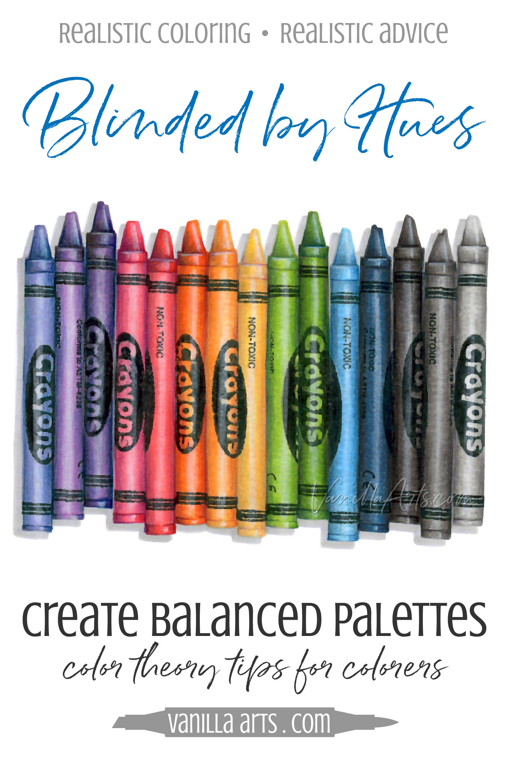
The dark blue crayon on the “beginner” set below (left) was colored with 4 point contrast. In fact, the entire set was colored with 2, 3, or 4 points of contrast.
The dark blue in the “advanced colorist” set on the right was colored with 8 points of contrast. Every crayon in the set uses at least 5 points of contrast.
Which crayons look more realistic?
Why do beginner blends look more realistic?
Colorists often exaggerate contrast because it’s a fun technique which feels artistic and sophisticated.
And frankly, some people just really love the stylized high-contrast look.
Unfortunately the high contrast colors become a distraction. The viewer’s eye is drawn to the blend rather than the crayons.
High contrast also distorts the shape of objects.
We can’t see the cylinder shape when our eyes keep getting dragged back to the extreme highlight zone.
And finally, as I demonstrate in the video— crayons are not a high contrast object in real life.
Realistic coloring mimics real life color.
If you’re adding extreme contrast for fun, you’re breaking the illusion.
Take the Online Coloring Class
Introduction to Realism
In “Real Crayons”, Amy walks you step by step through the underpainting process, creating a touchably realistic rainbow of crayons.
Intermediate Copic Marker + Prismacolor Colored Pencil
This is not follow-the-leader coloring. You’ll learn the mechanics of underpainting and then practice it on ELEVEN different colors.
Learn to Underpaint with Markers
This is usable information which will immediately improve your coloring AND increase depth and dimension in all your future projects.
The coloring is fun. The results are amazing!
Tips for Smart Contrast
TIP: Always question your use of contrast.
Are you using high contrast blending combinations because it’s fun?
If you are, keep having fun.
But if you’re trying to use contrast to create realistic depth or dimension and wondering why you keep failing…
It’s not your fault!
There are hundreds of tutorials on the internet and in craft stores around the world teaching that contrast creates dimension.
They’re wrong.
Are you exaggerating contrast because a colorist told you to?
That’s the wrong reason.
TIP: Stop confusing your lightest marker with a “highlight”
I think this is where the contrast myth was born.
The easiest thing to teach a beginner is how to add a lighter marker to an existing blending combination.
Light markers can add a bit of flair and interest to an otherwise boring blend. Lighter markers also carry extra solvent in the formula which makes smooth blending easier.
To justify this easy lesson, people started calling it a “highlight” color.
But not every object has a highlight! On our blue crayon, the wax has a highlight but the wrapper does not.
Automatic highlighting techniques automatically decrease realism.
In fact, we talk about the lack of highlights on matte objects in my Real Crayons online coloring class!
Looking for Intermediate Coloring Classes?
Color Wonk: for the love of coloring
Monthly Marker + Pencil lessons for casual colorers.
Membership includes:
Original digital stamps
20+ page guidebook with full color learning aids
Intermediate level instruction with a no-stress approach
Monthly live step-by-step demonstration with Q&A
Supportive community for encouragement and feedback


