Do You Collect Marker Blending Combination Recipes? Uh ohh...
Advertisements like this support free lessons here and at YouTube
DO YOU STRUGGLE TO FIND THE REALISTIC BLENDING COMBINATIONS?
I’ve taught marker art classes for over 10 years and almost every student I meet has a collection of marker recipes.
I also get asked about how to find “better” blending combinations which is a sign those recipe collections don’t work as well as people expect.
Everyone just assumes that when a marker blend looks cartoonish or fake, it must be a bad recipe…
Have you ever considered that it’s not the recipe at fault?
It’s not how you’re using it either, it’s where you’re using it.
Today, let’s look at why I don’t use pre-made marker recipes and why I start every coloring project completely from scratch.
Plus, I’ll show you where I get my color inspiration from.
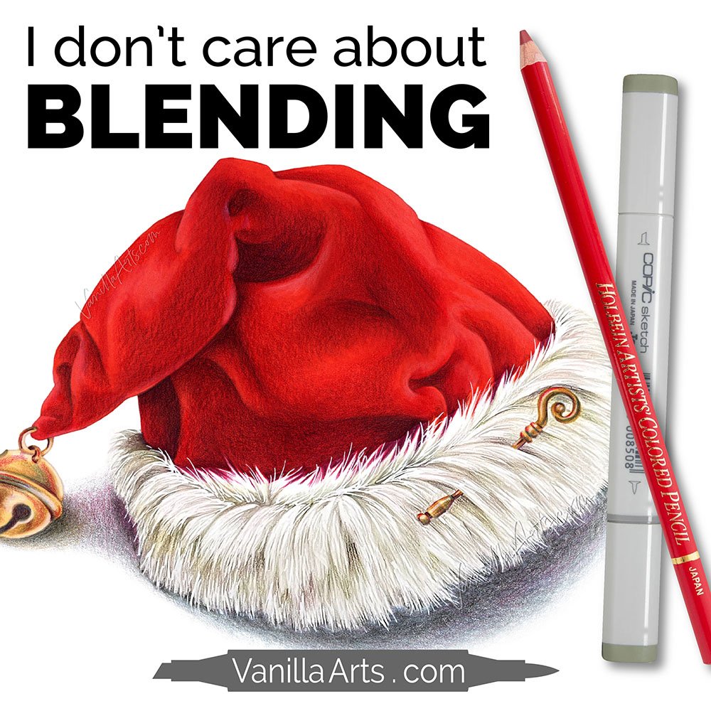
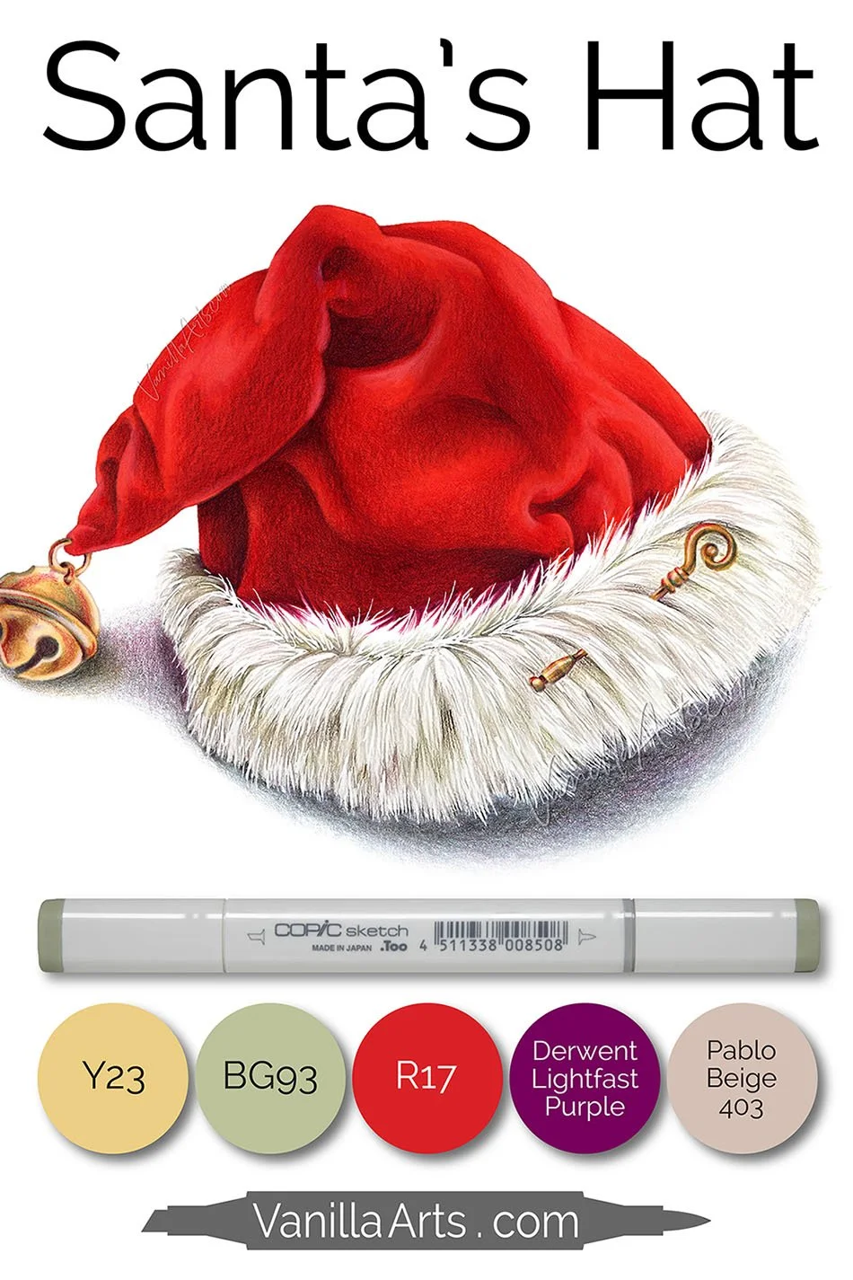
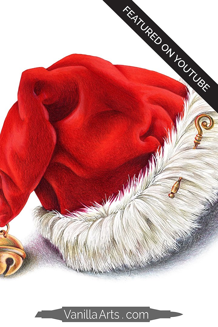
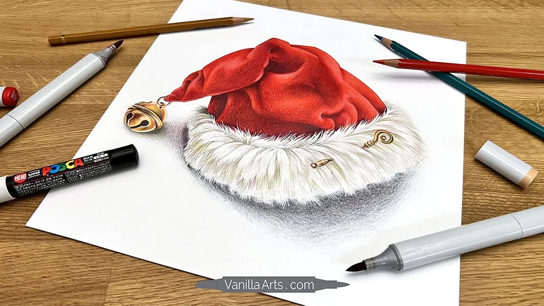
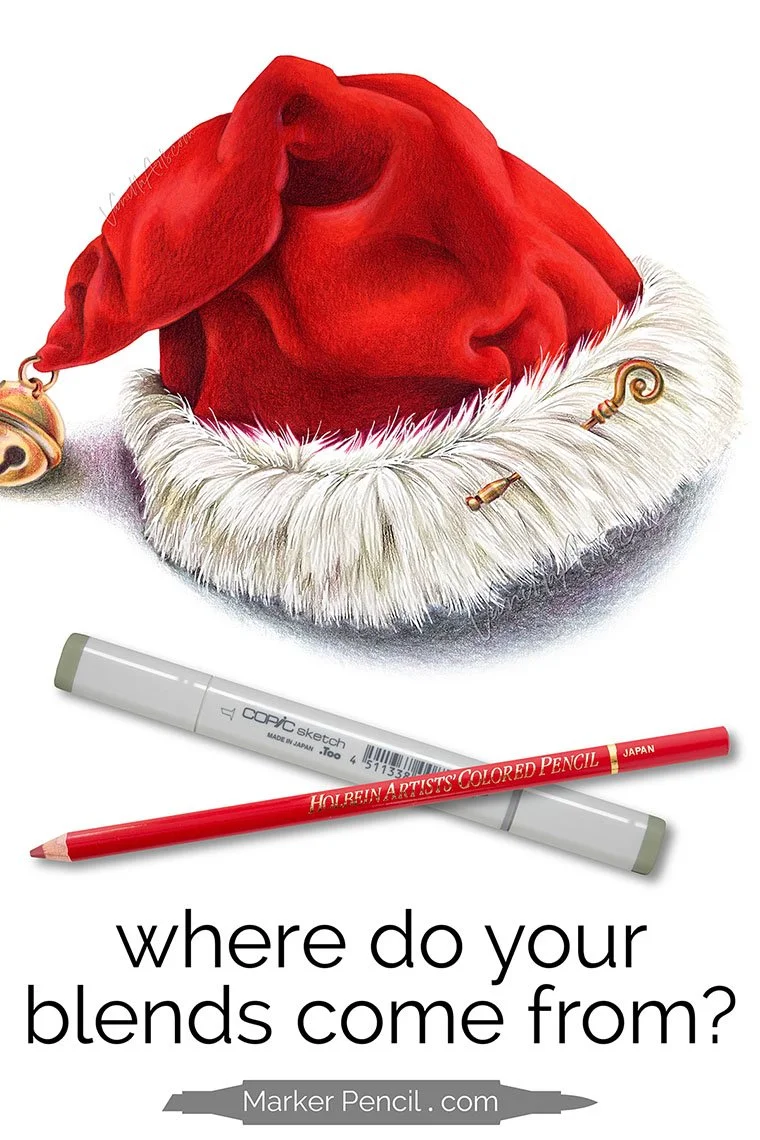
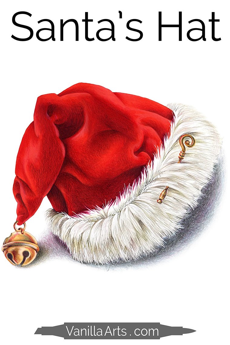
“Santa’s Hat”. Copic Marker + Colored Pencil on Strathmore 300 Smooth Bristol Board. 9 × 9” by the author, Amy Shulke.
WATCH: I DON’T CARE ABOUT BLENDING
Latest Video - Do You Collect Marker Blend Recipes? Uh ohh...
(supply list at bottom of this article)
Video not playing?
If your device blocks embedded video, click here to watch at YouTube.
LEARN MARKER + PENCIL COLORING TECHNIQUES
Marker with a dash of colored pencil…
The Blend - A 12 week online course for beginners/intermediates which focuses solely on smooth blending with Copic Markers. Learn to blend or improve your current blending technique with this intensive skill building approach to coloring.
Enrollment open January through June.
Colored pencil with a touch of marker…
The Point - A 12 week online course for beginners/intermediates which focuses on efficient techniques for Prismacolor colored pencils. Learn to layer colors with confidence and artistry through this intensive skill building approach to coloring.
Enrollment open July through December.
TECHNIQUES USED IN “SANTA’S HAT”
The following techniques can be spotted in the I DON’T CARE ABOUT BLENDING video:
I printed my Santa hat line art using a Copic safe ink-jet printer onto Bristol board. Bristol is almost a mixed media paper and it will tolerate some water. Then using a fine point waterbrush (Amazon), I moistened the fur outlines. Once the printer ink melted, I then dabbed it with a tissue. This allows the gray stamp line to completely disappear underneath the ink and pencil used on the fur.
I do not use R39, R59, or R89 with markers like R27. They’re blue based where R27 is orange based. The red hat shade is created with red over an underpaint of BG93. The dusty gray-green shades the red gently and retains the warm flavor of the original red.
The most natural white fur references did not have a lot of gray shade to them. Instead I found hints of greenish gray. Everyone debates whether to shade white with C, N, T, or W grays, meanwhile I saw a totally different color!
White fur reflects colors from its surroundings. I added hints of pink, red, and gold to the fur, helping the white interact with the colors around it.
Like the white fur, realistic metals reflect the colors around it. Adding red and green gold to my bell and stick pin brought the metal to life.
HO, HO, HO!
There are lots of Santa Hat stamps out there and yet it’s been at the top of my most-requested lists for years now. I resisted because, well… does the world really need another Santa hat?
Apparently so.
But I figured if I was going to do it, I’d do it different. Forget the legend of Santa, I went all the way back to Saint Nicholas for this hat!
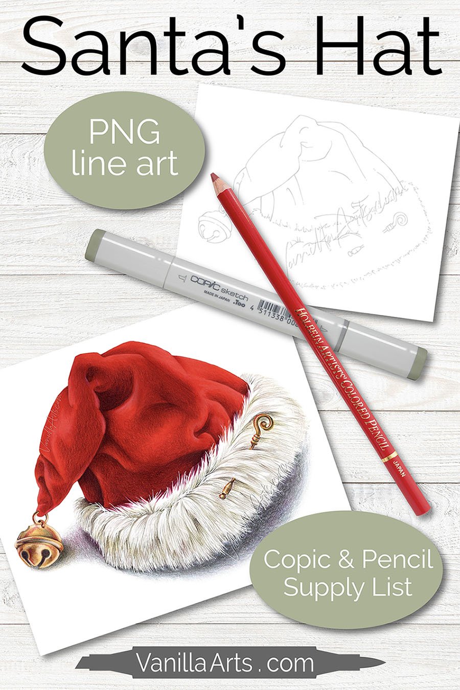
Santa’s Hat is an artist-grade digital stamp perfect for realistic coloring, now available here in the Vanilla Arts store.
PURCHASE INCLUDES FULL SUPPLY LIST FOR EVERY COLOR BLEND
Watch me color crisp red velvet, realistic white fur, and shiny brass accents, then color your own— use my style and supplies or develop your own unique twist.
Santa’s Hat digital stamp comes in two line colors: black lined version for easy coloring and disappearing gray lines for realism.
“Santa’s Hat” artist grade line art for realistic coloring. Perfect for marker, colored pencil, watercolor, mixed media. | VanillaArts.com
FEATURED IN TODAY’S VIDEO
Full supply list for “Santa’s Hat” at bottom of the page.
THE GIFT OF COLOR
MORE CHRISTMAS PROJECTS
(click the pic for more info)


