Ice Cream Twist: Shading Line Art with Copic Marker & Colored Pencil

THE MOST COMMON LINE ART MISTAKE: SHADING
It’s a problem in adult coloring…
Most tutorials focus on blends, shade, and highlights— which is basically all about color.
But when you’re not following tutorial instructions, you find yourself wondering, “where does the shade go?” and “is this where I add highlights?”
Then when you coloring looks weird, you blame the blending combination.
Stop. None of this makes sense.
Let’s take a step back and look at the real problem:
When you don’t understand the line art, of course you’re going to stumble over shade and highlight.
In today’s video, Amy helps you understand the gap between what the line artist has drawn and how you’re coloring it.

WATCH: COLORING A REALISTIC ICE CREAM CONE
With Copic Markers and Prismacolor Colored Pencils
(supply list at end of this article)

Not playing?
If your device blocks embedded video, click here to watch at YouTube.
TIPS FOR REALISTIC SHADING WITH ALCOHOL MARKERS
1. Look for the forms first.
While it can be tempting to start coloring right away, you increase your odds of success when you understand the shapes before applying color. And don’t just say “here’s the ice cream and here’s a cone…” Instead, look for the forms that make up each individual object.
Have a game-plan for every form before you color.
2. Get to know your line artist.
We all have favorite stamps and coloring books. It’s no coincidence that your coloring looks better when you’re coloring an image from your favorite artist! When you color enough of one artists’ line drawings, you’ll develop and ease and familiarity with the way they draw. Your comfort with their style of drawing means you’ll interpret and finish their forms more accurately.
3. Stop betting everything on color selection.
Colorists tend to obsessively focus on color and in doing so, they over-value the importance of color in creating depth, dimension, and realism.
Think of the artists you’ve seen creating realistic drawings with just a #2 pencil or one blue Bic pen. Now compare that to the time you spend picking out the perfect blending combination for every single object in the line art.
Perhaps you’re focusing on the wrong thing?
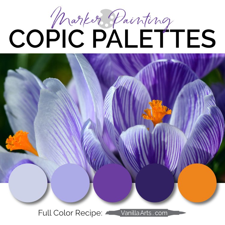
TECHNIQUES USED FOR “ICE CREAM TWIST”
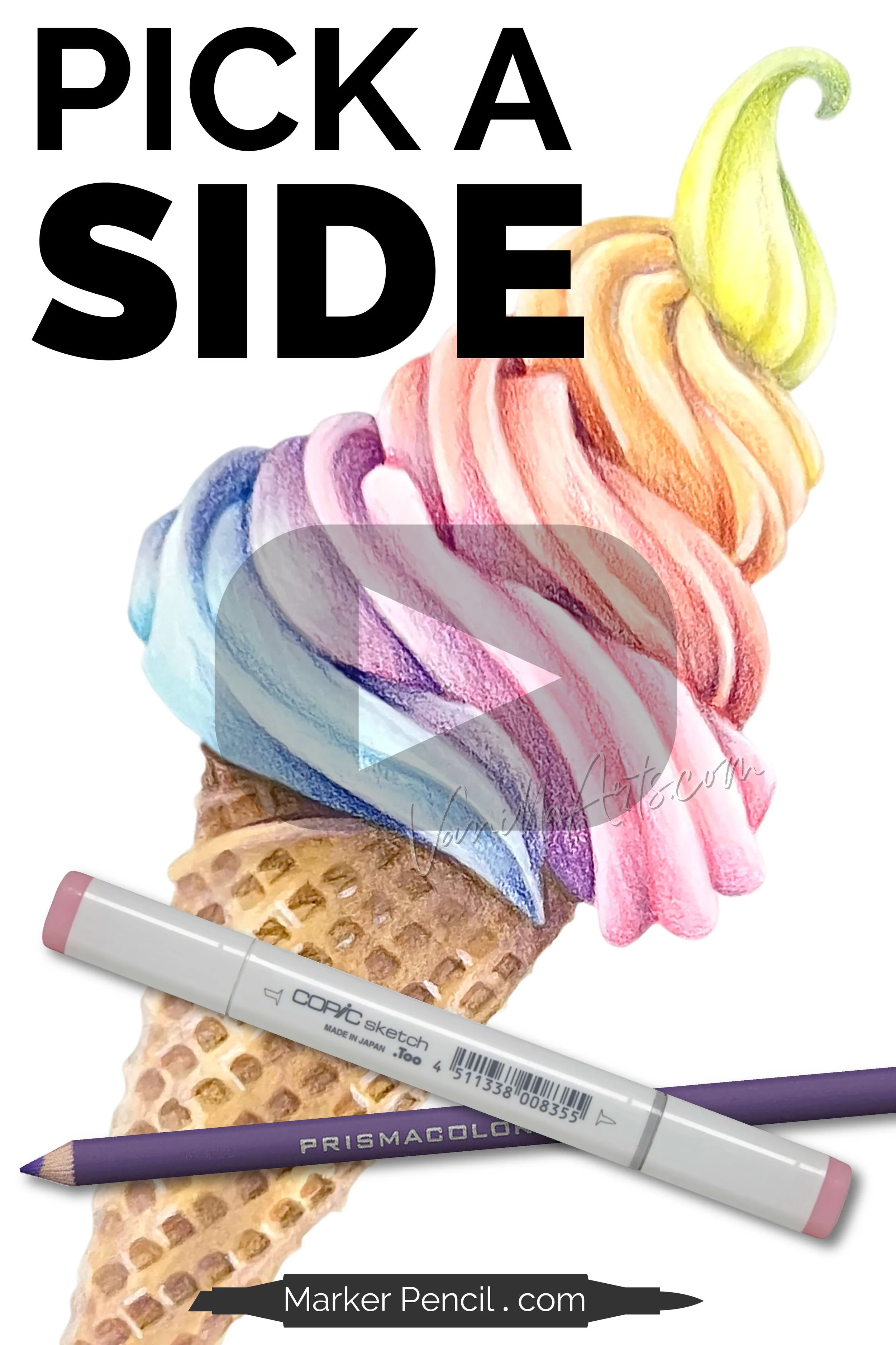
The following techniques can be spotted in the Pick a Side video:
I always color dark to light. It’s easier than light to dark and doesn’t waste ink.
I use a flick stroke to control where I place the ink. Circular techniques lead to over-inking and blotchiness.
The ice cream colors blend into each other. You can’t get this kind of smooth transition if you’re not using the flick stroke. Circular strokes and stripes will ever blend this smoothly.
Soft pencil color is applied using a circular “lambswool” technique.
Note that while I’ve used a white pencil to highlight some areas of the cone, there are NO white highlights on the ice cream. No white pencil, no white gel pen, no white paint. The lightest Copic forms the highlight which makes the ice cream look appropriately matte and subtle.
COLOR ICE CREAM TWIST HERE

PINK COLORING KIT

WE TEST PINK INK

MAKE PINK BEAUTIFUL
UNDERPAINT ARCHIVE

SUPPLY LIST FOR “ICE CREAM TWIST”