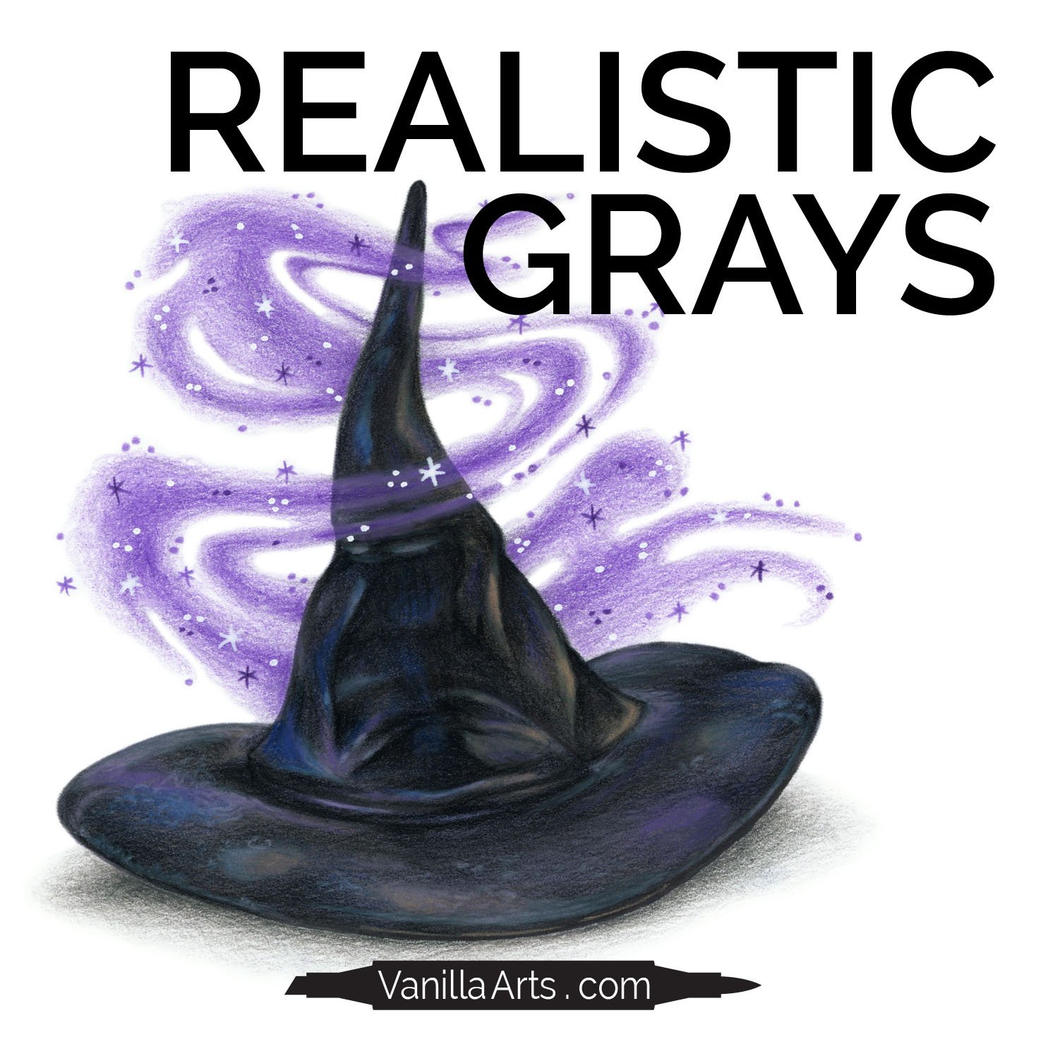
How to Color Realistic Grays (Draw & Color Demo)
Draw and Color with Amy in her latest livestream series.
In this episode, we explore grayscale coloring and why it doesn’t work for realism. Read more here.

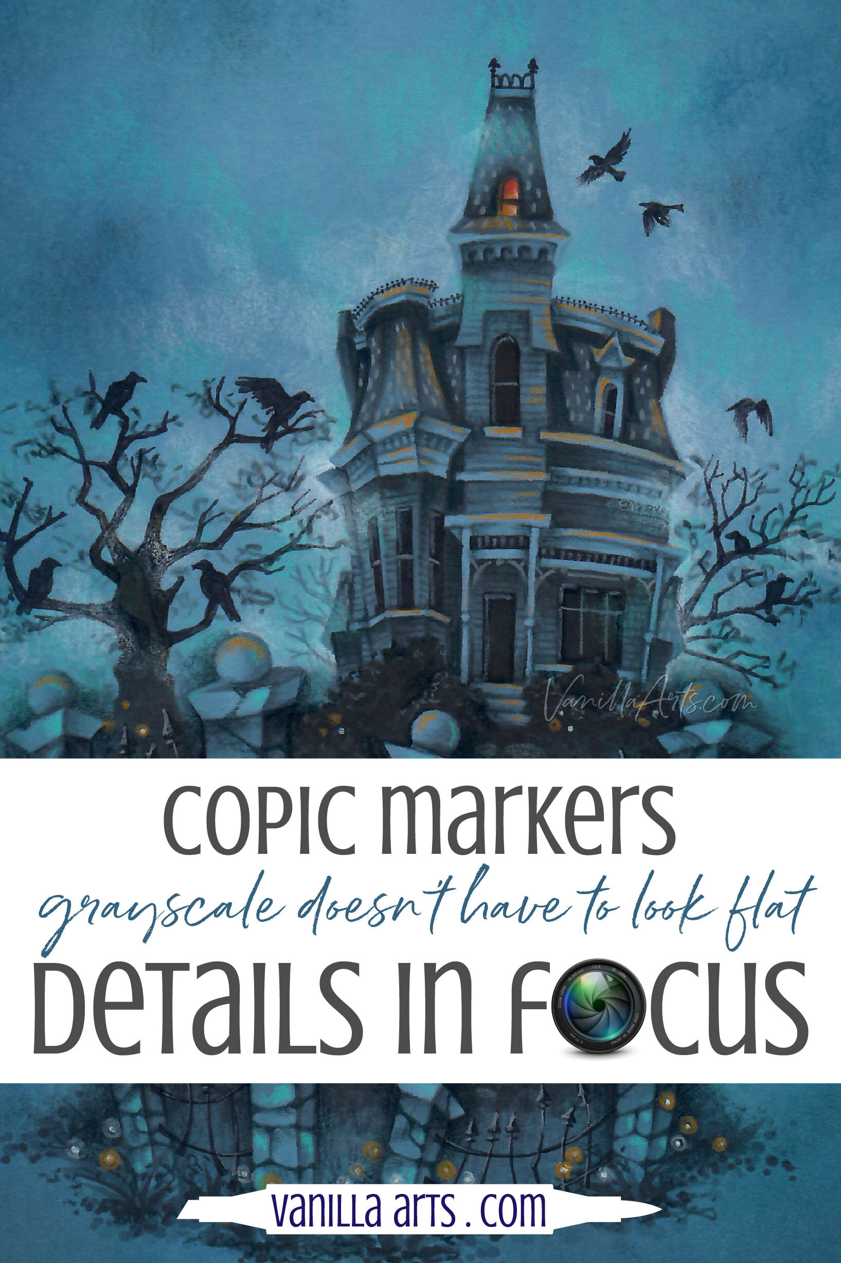
Details in Focus: Add Beautiful Color to Gray Copic Marker Projects (Grayscale Coloring Paper Recommendations)
A whole project with only gray Copic Markers?
How boring!
Actually no.
In the coloring world, grayscale is presented as a fun novelty technique. Something to try just for the heck of it.
But in the art world, gray is serious. Gray is how artists train.
Grayscale projects improve your coloring by teaching you to focus on value rather than color.
But oh, gray markers are so… uh… well… they’re gray.
Gray is drab and ho-hum.
Meh times 10.
Pssstt… gray is only boring if you color it boring.
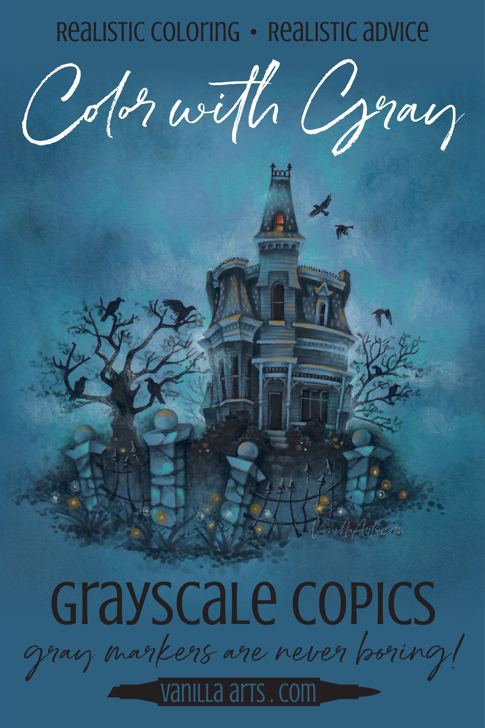
My spooky Nevermore Manor online class project is anything but drab. You can get the same beautiful effects from your gray markers on a wide variety of projects!

Grayscale Coloring: Depth & Dimension + Tips for success (Copic Marker, Colored Pencil)
Why is Your Coloring Flat?
In the coloring world, grayscale projects are presented as novelties.
“You’ve got a bunch of gray Copic Markers and a ton of gray colored pencils, so let’s color a bunch of funny penguins!”
But in the art world? Monochromatic is how we train!
So as a colorer, when you wonder why your projects look cartoonish or lacking in depth and dimension, you assume it’s because you’re not using the best blending combination.
Hold on…
