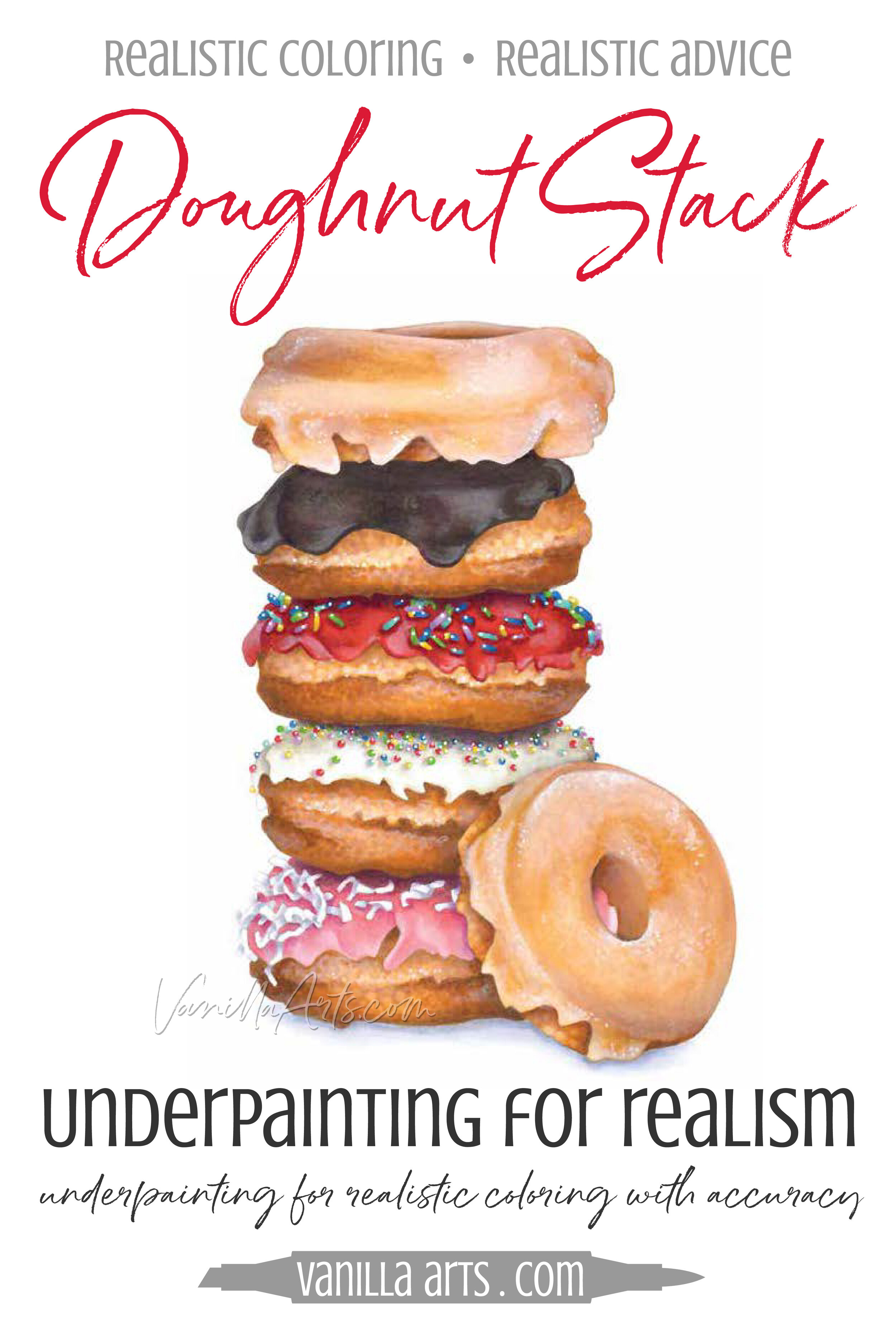
Doughnut Stack - Underpainting for Realism, Coloring with Accuracy

Doughnut Stack - Underpainting for Realism, Coloring with Accuracy

Glazed Heaven!

How about a special treat?

"Doughnut Stack" is an advanced skills level Marker Painting Workshop, a realism challenge for those of you who love food illustration! And I promise you, this whole stack of doughnuts is 100% calorie free! You might even burn a few calories coloring it.
Copic Coloring: Artists Do Not Shade- Part 3

 
The Copic shading system leads to frustration. Learn how to combat flat coloring by changing your technique and your outlook. | VanillaArts.com


Artists do not shade?

Last month, I innocently dropped a comment that “artists do not shade”Then the emails started coming in:

"But I've been taking coloring classes for years and that's what we've learned. What am I doing wrong?"

My answer is a three part series and it definitely pays to read the articles in order.

Please backtrack to read Part One first. That's where I explain the problems with the Copic blending trio system. If you're trying to add more depth, dimension, and realism then you should start by ditching the recommended Copic blending trios.

Then read Part Two where I discuss the problems with shading theory for colorers. If you've tried all the tutorials and you're still not coloring with realism, you'll find out why in Part Two. Standardized shading technique leads to flat coloring, no matter how much you practice!


The Tutorial Trap

In Part 2 we covered the two types of coloring classes or tutorials.

The "shade around the edges" technique leads to flat and unrealistic coloring. Meanwhile, the "put the shade where I tell you" style tutorials leave you dependent upon the instructor's wisdom.

The Copic shading system leads to frustration. Learn how to combat flat coloring by changing your technique and your outlook. | VanillaArts.com

But there is a deeper problem with both styles of shading-

Shading formulas rarely fit well with your stamp images.

What good is "shade the edges" when you're coloring a bicycle?

And you'd be hard pressed to find two Copic instructors who would tell you to shade identical bicycles the same way.

This failure leads you to hours of blog hopping, hoping to stumble upon something that works. You'll start hoarding tutorials and creating gigantic Pinterest boards full of "How to Color Easy Elephants" and "How to Color a Pink Squirrel on a Rusty Unicycle" step by steps.

Pink squirrel on a rusty unicycle? I'm not kidding.

For tutorials to work, they must be very specific to one particular stamp. The instructions for something as simple as "How to Color an Apple" fail completely as soon as anything in the stamp image changes. Place that apple on a black background or cut the apple open, put the apple in a basket, add a banana next to it, or change the apple from Red Delicious to Granny Smith and suddenly that realistic apple tutorial doesn't work anymore.

Then you're stuck hunting for new apple tutorials. It's a vicious cycle.


Learning to read

We thought my daughter was a genius.

We had a ton of early-reader books and she could read them all before she started school. For about six months, she was the kindergarten star. Point to any sentence and she'd tell you what it said.

But then she started falling behind. She struggled with new words and her cute little narrator's voice was lost in a sea of uhms and uhs.

Here's the thing that we didn't realize (and even her teacher missed)- my daughter had never really learned to read.

Her brother is two years older and we always read to the kids together. Then her brother started reading aloud and his books were at just the right level for my daughter to start making connections. It wasn't long before my daughter had memorized the entire bookcase of books.

It wasn't that she memorized stories or phrases; instead, she memorized the words "bed" and "dog" by their visual shape. The word "bed" was a picture; she saw it as three round shapes with a stick on each end, almost like hieroglyphics!

At a certain point, when the words got longer and the sentences contained more words, she wasn't able to keep up with the memorization game.

Without the ability to sound out new words, her amazing reading skills evaporated.

You're doing the same thing when you use tutorials to color.

Because you're not learning how to read.


Using your eyeballs

A lot of people assume that art classes teach people how to draw things- how to draw a lemon, how to draw a cupcake, etc. Bookstores are filled with "How to Draw a ______" type books and the children's department is littered with especially pernicious easy-draw books.

This leads to the idea that to be an artist, you've got to be able to draw random objects on demand. That the best artists are great because they've memorized how to draw more things.

The Copic shading system leads to frustration. Learn how to combat flat coloring by changing your technique and your outlook. | VanillaArts.com

But that's not how it works.

I've spent a lot of time sitting in art classes. I've never once had a "How to Paint a Pocket Watch" class.

Art at the college level is not Potted Plants 101 and Basic Buildings 140, working your way up to Advanced Chipmunk Techniques 450.

That's not how art works.

Art classes are about learning how to read

Art school was 4 years of figuring out how to use your eyes to observe the objects around you. Learning how to read the shape, line, and color of everyday items.

It's all about seeing.

The more you see and the stronger your observations are, the better your drawing, painting, or coloring will be.

It all starts with the eyes and that's the part which 90% of coloring tutorials skip.


Remember that sphere?

I mentioned in Part 2 that the sphere shading lesson was an exercise taken completely out of context. Colorers completely misunderstand the point of the sphere diagram.

The sphere exercise is not supposed to teach you how to shade a sphere.

It's a lesson on finding the surface of the sphere, letting your eyes wander across the surface and noting where the color changes. The goal is to find the edges between lights and darks and to note how the color travels.

sphere_large.jpg

The most important part is what happens after the students shade one sphere. Once students understand the sphere, the class gets up and switches seats. Suddenly, it's a whole new sphere! Now the challenge is to see how the lights and darks are different from a new vantage point.

Then in the next step, the sphere changes to red, or blue. How does it change the behavior of light and color? Or perhaps the teacher swaps the sphere for an egg, a cube, or a wadded up piece of fabric.

There's a lifetime of lessons that come after shading a sphere for realism! Every change the instructor makes forces the students into re-reading the object for new patches of light and dark.

That is why art is a life-long study.

Every time you change the vantage point, the lighting, the color... any slight change you make alters the entire look. Even subtle shifts create whole new landscapes of light and dark. It takes a lifetime to visually explore all the variables and options. 

You can't memorize this stuff. It's too much.

Artists learn to read and then they spend every day after that practicing their reading skills.


Tutorials do not work

... because life is too complex.

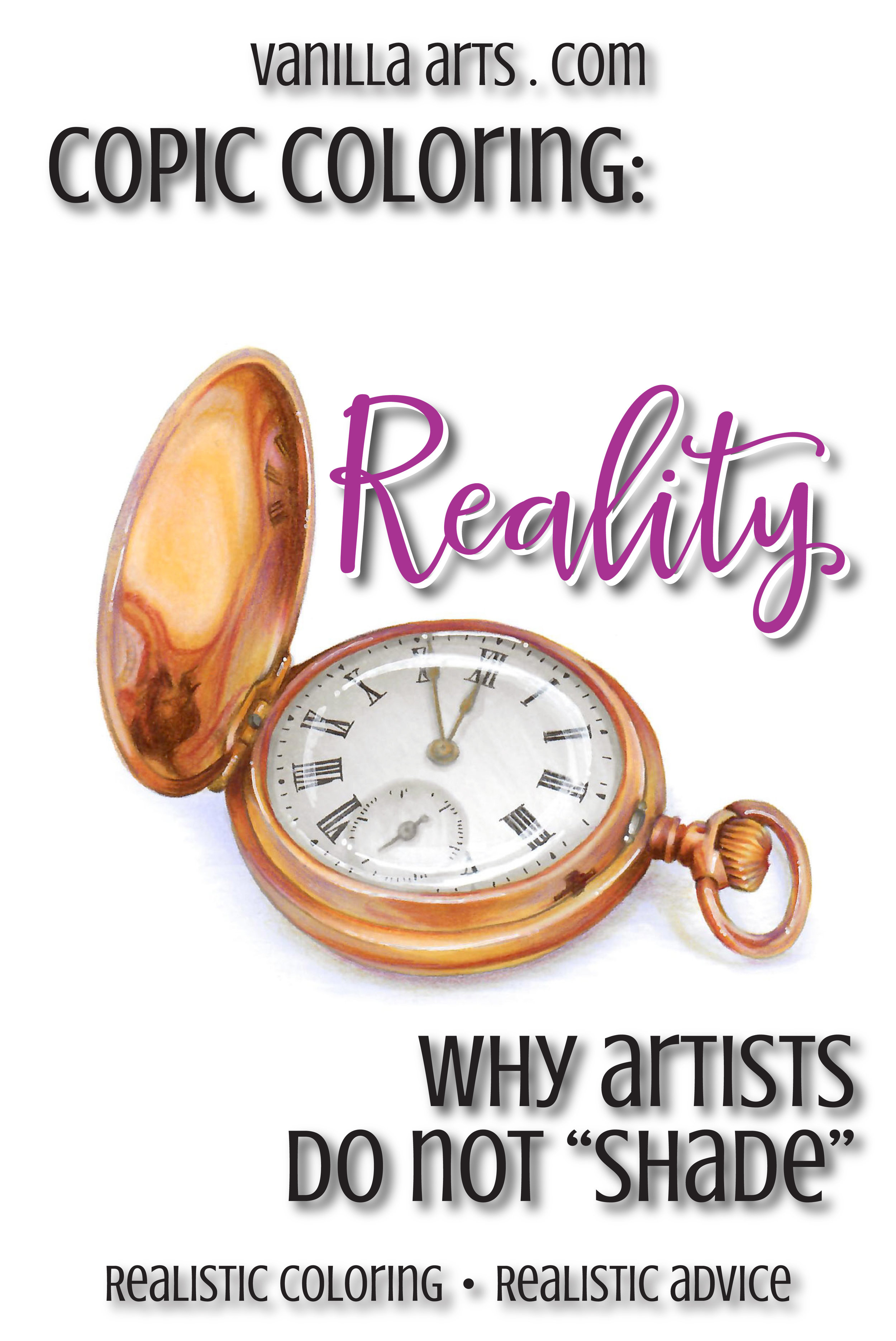
Look at my pocket watch illustration here.

The Copic shading system leads to frustration. Learn how to combat flat coloring by changing your technique and your outlook. | VanillaArts.com

I haven't Googled it but I'm certain that I'm not the first person to color a pocket watch with Copics. There may even be a "How to Color a Watch" video or tutorial on the internet right now.

But really look at my watch. Look inside the watch cover.

There isn't a Copic tutorial anywhere that shows you how to shade the inside of a watch cover like that.

And really look closely, because there's more than shade inside my cover. The cap looks concave and recessed, not because of shade but because of how the reflections travel.

Try to find a tutorial that explains how to reflect the watch face in three different areas of the inside of the cap! The larger numerals, the miniature clock-face, and the winding stem are all reflected inside the cover!

I can not teach you how to color something like this.

No teacher can.

This is not a lesson that can be conveyed via words, or written text, or even step by step work-in-progress photos.

You must learn to see it.

Only then can you do it.


Artists do not shade...

Because realism is so much more than shading.

There isn't a quick and easy formula, no one size fits all tutorial, and no 10-step solution to coloring objects for realism.

Tutorials can not teach you how to see and seeing is the key to life!

When an artist approaches a lemon, or a cupcake, or a pocket watch, they're not looking for shade. In fact, as I was coloring this watch, the only time I consciously thought the word "shade" was as I was darkening the upper left corner of the white watch face!

The rest of the time I was looking at the watch as if it were a landscape.

The watch has dips and valleys, plateaus and raised edges. Some of the surfaces are close to me, others are farther away. Some of the shapes have hard edges and others have very soft edges.

And the color!

The color saturates and desaturates as the eye travels across every single landscape feature.

"Shading" is an incredibly superficial way of approaching your art.

This is why you can get some depth, some dimension, and some realism without ever once coloring anything that actually looks real.

You're not reading the color!


Can you learn to read color?

ABSO-FREAKIN'-LUTELY! It's not a unique or rare talent.

The Copic shading system leads to frustration. Learn how to combat flat coloring by changing your technique and your outlook. | VanillaArts.com

Reading is something EVERYONE can learn to do.

But you have to ditch the tutorial concept.

You have to scrap the idea of blending combinations and project recipes.

No more light charts and no more "put the shade right here" style instruction.

And relax, I'm not about to recommend enrolling in years worth of expensive classes.

You've always had the power all along, Dorothy! And hey, no ruby slippers or creepy scarecrow hitchhikers required.

Before you color a stamp, look for a photograph of that object. If you're lucky, you might have the actual object in your house to look at.

It doesn't have to be an exact match. Close is good enough!

Visual references are what you've been missing. You have the eyes, now you need photos and objects to read.

Look for lemons before coloring lemons.

Look for cupcakes before coloring cupcakes.

Look for apples, look for pocket watches.

Let your eye travel across the surface of the item. Don't look for shade, look for changes in color. What colors do you see and what shapes do they take?

Then and only then do you pick up your marker to color.

You have to see before you do.

When you color, color what you see.

Don't color what someone told you, color what you see. The more you see, the more you'll add to your coloring. It's a slow-growth process but it's the same one used by artists everywhere.

It's not about shade, it's about the shape of color.

Artists read.

Artists do not shade.


Want to know more?

Check out my 12 week study and learn to blend like an artist!


Pocket Watch Is Now Available In The Vanilla Stamp Shop!

Pocket Watch -

Capture a moment of time! My students love the challenge of coloring realistic, unusual images. Pocket Watch is an intermediate/advanced level digital image and perfect for those looking to challenge themselves.

This digital image is an original stamp created for the students of my 2018 Harbor Springs Summer Art Retreat. It was originally colored in watercolor and colored pencil but is also perfect for Copic and other mediums.…your options are endless!


"Chocolate Box" - a Copic & Colored Pencil Marker Painting Workshop

 
Get your FREE copy of the "Chocolate Box" digital stamp in February 2018. Join the Free Digi Club for a new stamp every month! | VanillaArts.com
 

Sweets for the sweet...

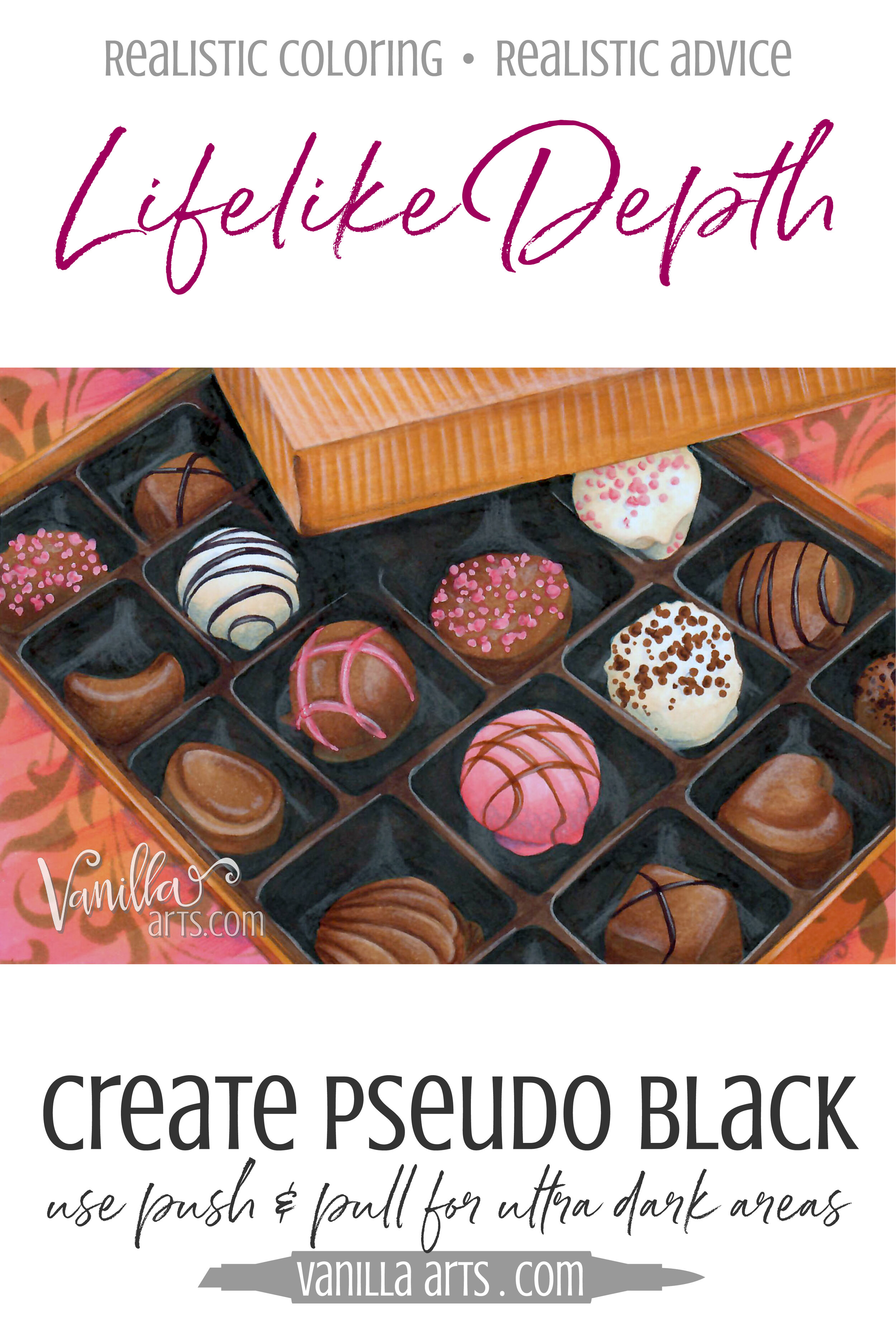
I've got a calorie free chocolate treat for you.

"Chocolate Box" an advanced Marker Painting Workshop.

Amy shows you how to create darker colors than Copic makes, essential to creating realistic deep dark areas.

 
Get your FREE copy of the "Chocolate Box" digital stamp in February 2018. Join the Free Digi Club for a new stamp every month! | VanillaArts.com

We've used the Push & Pull technique to create lifelike depth but how do you Push a dark object when Copic does not make a marker dark enough to push it with?

It's a problem!

Learn Amy's Pseudo-Black process which creates the correct color for your pushes without guessing or shopping for new markers.

This lesson also includes a bonus segment on my vibrant silk flourish technique.


Want to Color Chocolate Box?

Join me for a fun Copic Marker + Colored Pencil lesson in the Vanilla Workshop

Chocolate Box is an Advanced skills class showing you how to create darker colors than Copic makes

Learn to incorporate real artistry into your coloring projects, one concept at a time. Every Workshop details a new method for enhancing realism, depth, and dimension.

Each class stands on its own as independent learning. You don't have to take six of my other classes to understand this lesson.

Workshops are NON-SEQUENTIAL!

All of my Workshop classes are ANYTIME ACCESS. Work at your own pace and repeat the project as many times as you'd like.

Come color with me. It's a ton of fun!

Vanilla Workshops: Online classes for Copic Marker + colored pencil. Improve your coloring by adding fine art techniques to add depth, dimension, and realism. Classes for every skill level. | VanillaArts.com | Copic Markers, Colored Pencil, How to C…
 

If you’re looking for the Free Digi Club, the program has been discontinued.

You can check out the many free resources at VanillaArts.com which include the Studio Journal Article Archives, Vanilla Beans, YouTube (demonstrations & tips), Computer for Colorers, Undercover Swatches and Instagram for Works in Progress.


Happy coloring!

"Red Bird" a Copic and Colored Pencil Marker Painting Workshop

 
Get your FREE copy of the "Red Bird" digital stamp in January 2018. Join the Free Digi Club for a new stamp every month! | VanillaArts.com


In the bleak midwinter...

Cheer up with a brilliant burst of red!

"Red Bird" is an Intermediate Marker Painting Workshop.

Amy explores bird anatomy and the use of photo references to improve your coloring on any bird themed stamp. Includes smooth ink background method.


Want to Color a Cardinal?

Join me for a fun Copic Marker + Colored Pencil lesson in the Vanilla Workshop

Red Bird is an Intermediate skills focusing on developing bird anatomy for realism

Learn to incorporate real artistry into your coloring projects, one concept at a time. Every Workshop details a new method for enhancing realism, depth, and dimension.

Each class stands on its own as independent learning. You don't have to take six of my other classes to understand this lesson.

Workshops are NON-SEQUENTIAL!

All of my Workshop classes are ANYTIME ACCESS. Work at your own pace and repeat the project as many times as you'd like.

Come color with me. It's a ton of fun!


If you’re looking for the Free Digi Club, the program has been discontinued.

You can check out the many free resources at VanillaArts.com which include the Studio Journal Article Archives, Vanilla Beans, YouTube (demonstrations & tips), Computer for Colorers, Undercover Swatches and Instagram for Works in Progress.


Happy coloring!