Color Theory for Markers & Pencils: Shade a Yellow Daffodil (Live Swatching - Episode 1)
Color Theory for Alcohol Markers
Episode 1 - Yellow Daffodil Swatching
Alcohol markers are popular for blending but the technique often results in cartoonish and flat images. Light-medium-dark combinations do not look realistic. In this free video series, illustrator Amy Shulke shares her color theory process to select realistic, dimensional yellow markers which blend beautifully.
Resources & Learning Aids
Watch the FREE video at YouTube
This episode was streamed live on March, 24, 2023. The video replay is available now.
In this episode, Amy shares her color swatching process to select the ideal blending combination to color this bright yellow daffodil.
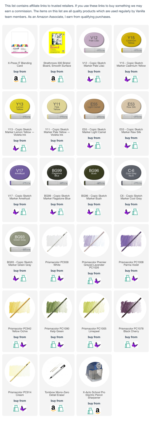
Supplies and colors are listed at the bottom of this page
Amy’s Swatch Sheet
(Scanned immediately after the livestream, notes were made during the broadcast except for bottom ID and date)
PENCIL COLOR NOTE: During the livestream, Amy mentions Prismacolor Lilac 956 which has been discontinued. If you have this pencil, it’s great over yellow marker. Parma Violet 1008 is a suitable replacement and Amy would likely never use both Lilac and Parma in the same project as the colors are too close.
TIP: Always swatch on a sample of the same paper you intend to use for the full project.
Marker inks look different on every brand of paper. Swatches are only useful if they’re on the same paper as the project.
TIP: Make new test swatches for every project.
All alcohol ink is fugitive, meaning that it will fade over time. It’s not just UV light exposure, even protected swatches will fade. For more fading info, see Amy’s Copic lightfast test results here.
Purchase the Kit
Color along with Amy - Spring 2023 Color Theory kit
Files for THREE months of YouTube lessons: March, April, and May.
Easy PDF digital downloads include:
3 flower blossom PNG digital stamps—
Daffodil (episode 2)
Lily of the Valley (episode 4)
Dogwood (episode 6)
3 PDF worksheets (March, April, May) targeting specific colors from the photo reference
Amy’s PDF Copic color wheel
Free Photo Reference
Our daffodil photo reference provides lots of yellow inspiration.
References are important because you can’t color realistic yellow until you can see realistic yellow.
Download the free photo reference from Pixabay here.
About the Cardstock
In episodes 1 and 2 (yellow daffodil swatch and demo), Amy uses her favorite cardstock for mixed media, marker plus colored pencil projects.
Cryogen 89lb Cardstock in Curious Metallic White
THIS CARDSTOCK WAS DISCONTINUED THE DAY AFTER FILMING EPISODE 2
Amy is searching for a replacement paper.
It’s not an easy search because Cryogen was a bit of a unicorn— smooth enough for marker but toothy enough for colored pencil.
Episodes 3 and 4 will be filmed using Strathmore 300 Bristol Board, Smooth Press.
Learn to Color like an Artist
Vanilla Beans is a weekly Saturday newsletter full of coloring tips and articles about developing your artistry.
Announcements and video notifications are also sent to this mailing list. Click to subscribe.
Color with Yellow
Designed for large scale, realistic coloring. Amy’s illustrations are drawn with minimal texture marks or decorations to let your marker art shine.
Take a Class
Amy has classes featuring yellow and yellow coloring technique
Or focus on blending skills
View all classes, courses, and workshops here:


