How to Color Realistic Highlights with Marker and Colored Pencil (Draw & Color Demo)
Realistic Highlights with Pink RV Alcohol Markers
Every coloring teacher teaches the same thing…
It's standard practice to color highlights with the lightest marker in your blending combination. People even refer to the lighter markers as "highlight colors".
And this method is spreading. Colored pencil people are now using this same technique with colored pencils-- building pencil combinations as "shade, medium, and highlight color".
Then as the cherry on top, everyone adds little white dots and dashes with a gel pen.
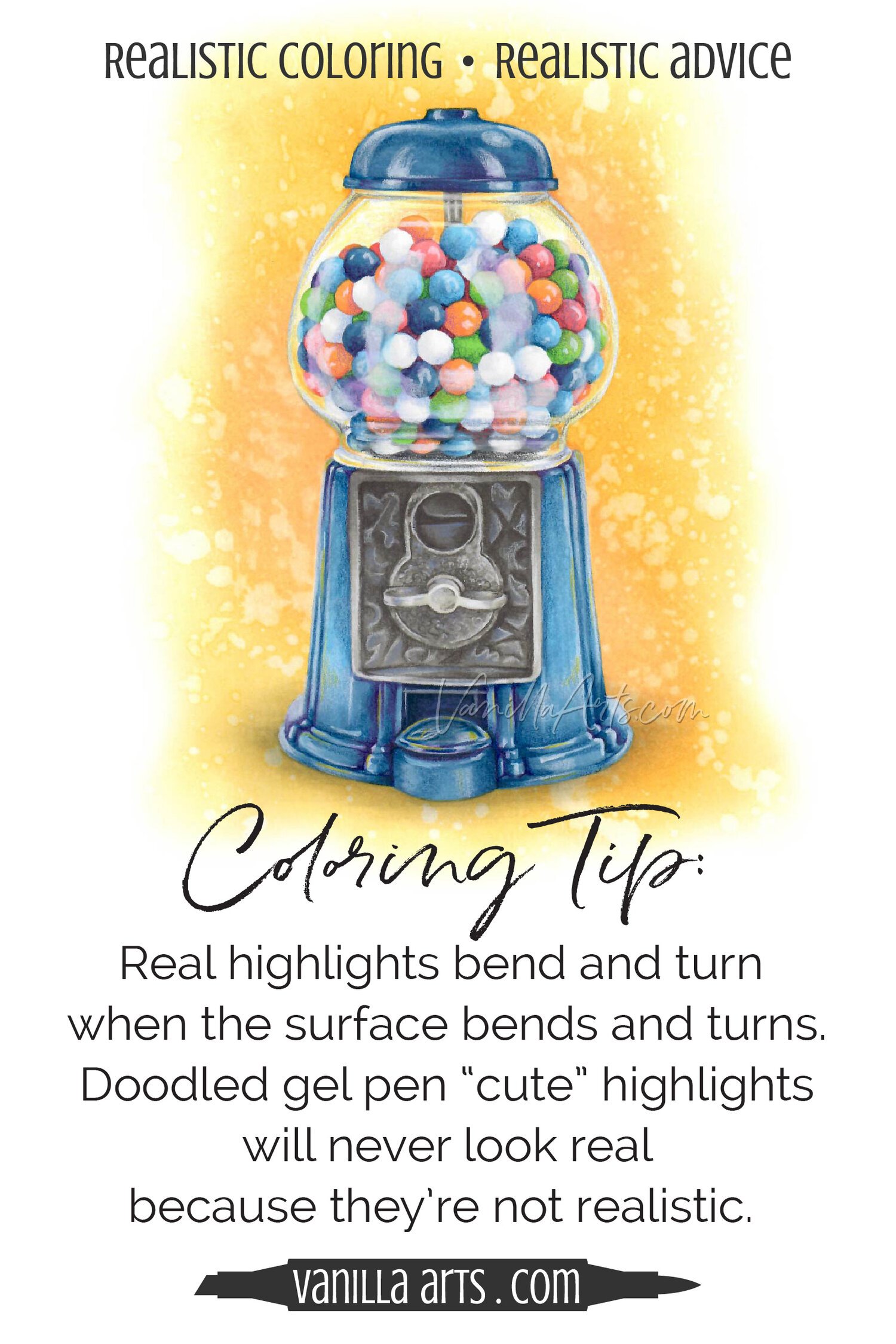
Psssttt... did you ever notice this highlighting technique never looks realistic?
There are several reasons your highlights look fake—
Let’s explore why.
DON’T MISS THE PINK LOLLIPOP MARKER & PENCIL LIST AT THE BOTTOM OF THIS PAGE
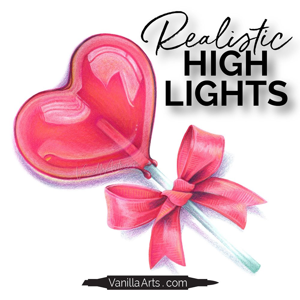
DRAW & COLOR: Heart Lollipop
Realistic Highlights with Copic Markers & Prismacolor Pencils
(click below to watch at YouTube)
Last Month’s Livestream
Do you love novelty coloring techniques?
Maybe you dab a washcloth soaked in colorless blender or you draw a brick pattern with a chisel nib.
It's fun to create special effects but you're also secretly hoping this new technique will finally add more realism to your coloring.
Maybe you've even spent money on texture classes?
Psssttt... If techniques created realism, everything we color would look like a photo!
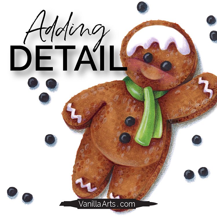
Join me as I draw and color a cute gingerbread man from scratch, taking your detail questions and offering tips.
Loving the FREE Lessons?
I’m happy to bring them to you. But please understand:
Free lessons are not free to produce.
Just like you, I must buy paper, pencils, and refill ink.
Unlike you, I also have cameras, microphones, broadcast software, and usage rights for photo references to pay for. There’s also this website and the apps I use to create graphics, reminder emails, supply lists, and PDF learning aids.
And then there’s the hours I spend researching, creating, and promoting every lesson.
HOW TO SUPPORT MY FREE VIDEOS AND LIVESTREAMS
Purchase the digital stamps, kits, or classes associated with the lesson
Let the advertisements play instead of hitting “skip”
Use my affiliate links in the supply lists. Shopping at Amazon is especially helpful!
Share links to my videos with your coloring friends
Share photos of your completed project on Facebook or Instagram, tagging or linking to VanillaArts.com
RESOURCES FOR HEART LOLLIPOP:
Subscribers to Amy’s Saturday newsletter can download a free PDF photo reference worksheet with color and texture prompts. Subscribe here.
Photo Reference Worksheet
Get your copy of the primary photo reference for the Heart Lollipop project. Worksheet includes the photo plus color and highlight prompts.
FREE Worksheet now available inside the Vanilla Beans Library
All subscribers to my Saturday newsletter have password access to the library where I keep several nifty downloads plus an exclusive blending video.
Subscribe, then take the link to the latest issue of Vanilla Beans. Every issue lists the current Library password.
Tips for Coloring Realistic Highlights
TIP: Highlights sit on the surface of the object, they’re not actually part of the object
This is why I don’t color highlights with Copic Marker. When you incorporate the highlight into your blending combination, the highlight ends up looking like part of the shape.
TIP: Pay attention to the opacity of your colored pencils
You’ll hear me reference “opaque”, “translucent”, and “transparent” almost every time I describe a pencil color. This is because I don’t select pencils for the color as much as their opacity.
There are many shades of pinks that will work but you can’t make an opaque pink transmit color!
TIP: Why do I never use white gel pens to make highlights?
Watch the livestream to find out!
Heart Lollipop Digital Stamp
I colored over my original sketch during the livestream but that’s okay. After the stream, I re-created the original drawing, improving the heart shape and bow.
clean and minimalist digital art
I always keep the drawing simple with no texture marks or artistic decotation. I want your color choices and your added details to give the stamp personality and character.
What story will you tell with my line art?
Color Inspiration
Vanilla Undercover is my series of underpaint blending combinations, creating realistic color with unusual markers.
I’ll be coloring our lollipop with this marker combination.
Because the candy is transparent, I may not need much underpaint color. Tune in to see how much I end up using.
My Marker Journal
I use a Zeta journal in the Draw & Color livestreams.
It’s hard to find good paper for my mixed media illustrations. Markers like ultra smooth paper while colored pencils need tooth. Markers and pencils are opposites, so any paper that works for both mediums will always be a compromise.
And once you find a good compromise, it rarely comes in journal format.
This paper is pretty good for markers— it doesn’t feather, bleed, or discourage blending.
It also has enough tooth to add a few layers of colored pencil.
Is this the paper I’d use for an all-marker illustration? No.
Is it the paper I’d use for an all-colored pencil illustration? No.
But this is one of the best journals I’ve found for marker + pencil.
(affiliate links)
Related Reading
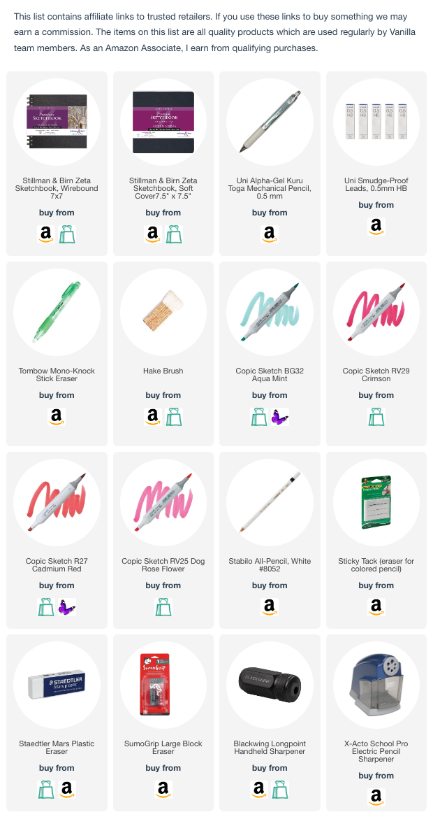
Supply List
(This is an estimate of what I expect to use during the livestream. This list will be updated after the livestream with actual supplies used)


