Dimensional vs. Realistic Coloring: What's the Difference? (Copic Markers, Colored Pencils)
The downside of dimensional coloring
You have colored with Copic Markers and colored pencils for a long time. You’ve got lots of beautiful coloring projects under your belt. You are NOT inexperienced!
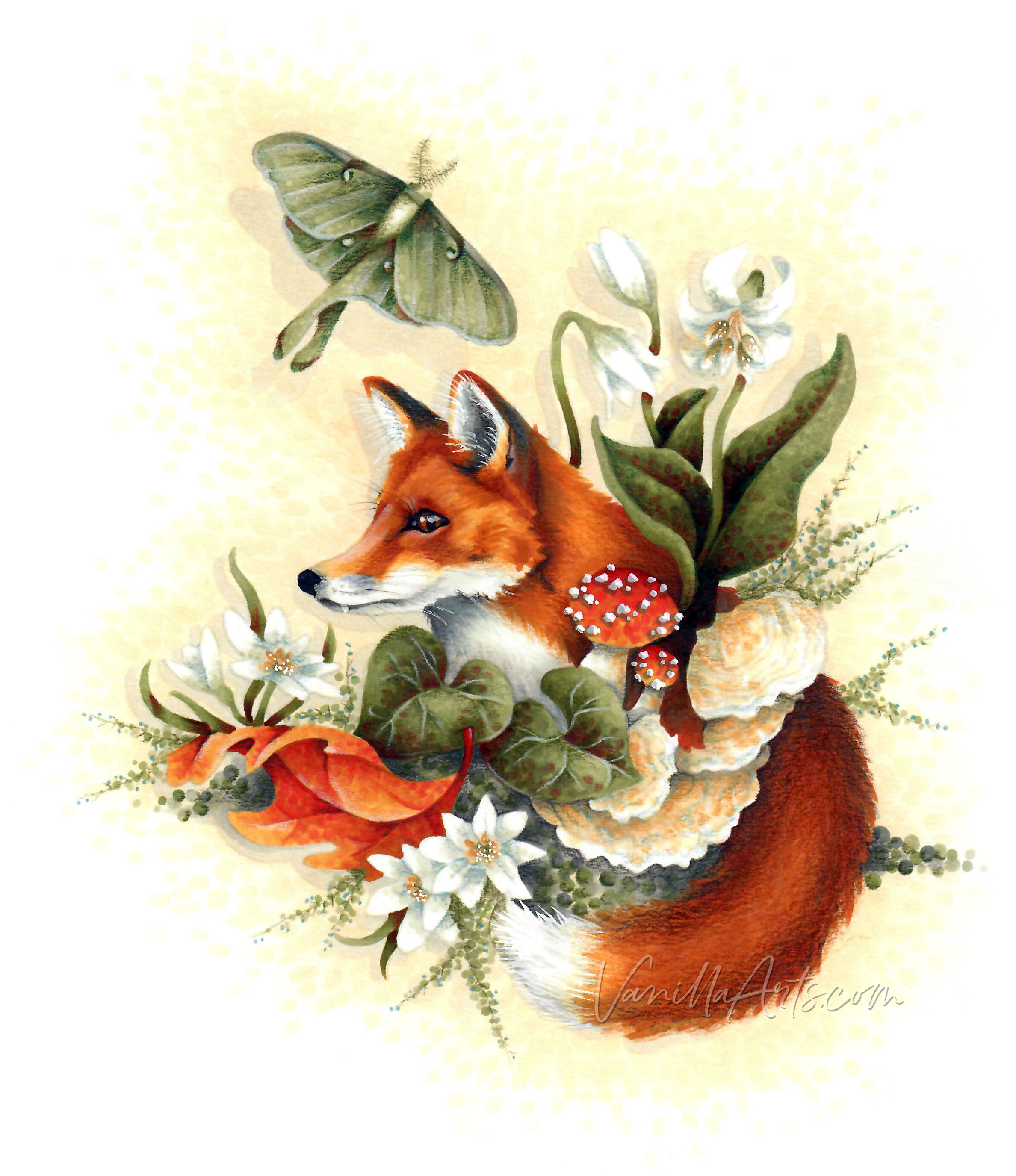
And yet when you look at this fox, you are blown away…
Because this is sooooo not the same kind of coloring that you do.
But why not?
Why can’t YOU color with realism?
“Oh, but Amy is an artist. She can color real looking animals and flowers because she’s had training. She’s creative and…”
Bull pucky!
I did not draw this fox. This is a digital stamp called “The Fox & The Moth” from Power Poppy.You can buy the stamp and download it just as easily as I did.
The Copic Marker combinations used here aren’t unique either. They’re totally yawn worthy and very traditional:
YR27 - YR24 - YR30
YG97 - YG95 - YG93 - YG91
R17 - R14
I’m sure you’ve used these exact blending combinations before; probably more often than I have.
And I didn’t do anything revolutionary with the Painted Fox project. The techniques have all been covered in many of my classes but more importantly, the same exact techniques have appeared in countless blogs and tutorials from other Copic instructors.
Nothing here is new.
So why does it look different?
That’s the difference between realistic coloring and dimensional coloring.
They’re not the same.
You can be a Copic super-star, but if you’re always coloring dimensionally, your projects will always look cartoonish.
And cartoony fine, if that’s the look you want.
But if you’re someone who wants more, then please stop talking yourself out of coloring with realism!
Because realistic coloring doesn’t require amazing talents or enrolling in special schools. There’s no membership card and no secret handshake.
If you’re already doing dimensional coloring, then you have the skills required for realism.
All you’re missing is the deeper thought process.
There’s only one difference between you and me:
I colored a fox.
And you color balloon animals.
The Balloon Animal Curse…
I’m not trying to be mean here. This is a common problem that a lot of people wonder about. No matter how good you are at blending and all of the other technical things that go with Copic markers, all of your projects somehow still turn out cartoonish.
The natural tendency is to blame the stamps, because you’re ticking all the boxes coloring-wise. So you switch to more realistic stamp images. You get rid of all the animals with black dots for eyes and any character with a goofy grin. You buy serious looking stamps.
Except it doesn’t solve the problem. Your coloring still looks cartoony…
But now, with less humor.
The problem isn’t the stamps. It’s how you’re coloring the stamps.
Think about it: the best compliment you can get in the Copic world is “Oh my! Your coloring looks so dimensional!”
The tips and tuts are everywhere, “How to color with more dimension”.
Dimension. Dimension. Dimension. It’s what we all want, right?
Well, what is dimension?
Dimension is the Balloon Animal Curse.
Every dimensional tutorial tells you to do the same thing:
Basecoat the face or body of the animal
Darken the edges to round out the sides of the face (or body, or arm, or leg)
Blend it all smoothly
Pop a highlight somewhere in the center
Which is exactly how I’d tell you to color a very realistic balloon animal!
Look folks, I know you know this, even if you’ve never had to think about it before:
Foxes are not shiny tubes of latex filled with air.
So why would you color a fox the same way you color a balloon but then expect it to magically look like a fox?
And let me point something else out to you-
Have you ever noticed that the instructions for dimensional fish are almost exactly like the instructions for dimensional fox?
Ohhhh… but that’s why you need Sally Stamperson’s Fabulous Fox Coloring Tutorial, right? Because she gives you the perfect Copic recipe to make your dimensional balloon animal look very foxy instead of fishy!
Really?
Rounded on the edges?
Rounding the sides is why your animals look fake.
Dimensional coloring may look more dimensional than if you’d colored the whole animal with one brown marker.
But what a wasted opportunity when you color everything like a balloon!
So today, I’d like to give you a little nudge.
Let’s look at how you can start adding more realism to your animal stamps!
By adding special texture?
Nope.
By finding the perfect marker recipe?
No.
To color realistic animals, you must color like a blind man.
Color what you feel?
Try this experiment:
Take your hands and place them on your face. Move your fingers slowly over the surface of your face and head, closing your eyes to really concentrate on the surfaces of your face. Trace your fingertips over the bridge of your nose, around your nostrils, along your eyebrow ridge and down into the valleys where your eyes rest.
Does any of that feel like a balloon?
What you color in dimensional coloring tutorials isn’t the whole story. “Rounded on the sides” is just the preamble to something greater.
Dimensional coloring is the dumbed down version of realism.
It’s simplified so that anyone can do it.
But once you get good at the dimensional stuff, there’s no reason why you can’t move on to real realism!
The only difference is that instead of coloring by rules or steps, you start coloring by feel.
Balloon animal techniques treat every animal (and frankly, most objects) the same exact way— everything from snails to spoons gets rounded off on the sides.
But to color with realism, you have to think like a blind person, mentally running your hands over every surface and coloring what you feel.
Because realism is not about coloring generic, one size fits all dimension. Realism is about coloring form.
Form is the fancy artist’s term for the different planes and levels of an object. The dips and valleys, rises and ridges that happen on the surface of every object— that is the objects form.
Forms are unique to the animal or object.
A fox does not feel like a fish, which doesn’t feel like your face. Everything has a unique feel because everything has a unique form.
When you color the form, you begin to color with realism.
Check out Amy’s favorite art supplies, click above.
So how can you color form?
Well, it’s not going to happen overnight. This is the kind of stuff you practice for a lifetime.
The key is to always be the blind man.
Vanilla Arts students are used to me throwing photo references into class packets. I talk about using photo references all the time.
I suspect many students secretly skip the photographs because it’s easier to copy my motions. But of the students who actually do pay attention to the photographs, even they sometimes miss the point.
A lot of people think photo references are used for color.
So we look at a fox photograph and match our markers and colored pencils to the color of his fur…
A lot of people think photo references are used for shade.
So we look at a fox photograph and try to match where the light falls or where the face turns into shadow…
And you’re not wrong. Photo references ARE good for finding appropriate colors and for locating light patterns.
But color and shade are not my primary concerns.
Photo references serve as a stand-in for real life hands-on experience.
Most of us will never be able to lay our hands blind-man-style upon a fox. Heck, if we felt-up a fox, he’d bite.
Photographs are the next best thing to actually touching something.
So while I often give you a few photo references in the class packet, when I start my research on foxes, I’m not looking at one or two photos.
I may look at several dozen fox photos!
To color The Fox & The Moth with realism, I need to understand how a fox’s face and especially how his muzzle, eyes, and ears are shaped. To do that, I need to see his face from several angles. I need to know:
are the cheeks are sunken or plump?
do the eyes point forward or to side?
how does the mouth close? overbite? underbite?
how do the lips end? in a smile? or downward?
how does the jawline connect with the neck?
do the ears point forward or to the side?
By surveying multiple photos and really studying the anatomy of a fox, that’s how I begin to understand which parts of the face need to be rounded.
A balloon animal has rounded edges. For realism, you step it up a notch and start rounding individual features… or NOT rounding them if that’s what’s needed.
Photo references from multiple angles help you mentally run your hands over the face of a fox so that you can understand what is rounded and how the different rounds are shaped.
Think about this-
If I make a fox balloon animal, some of you might think it’s a dog and others may guess it’s a cat or a horse. Realism does not come from dimension tutorials.
Light sources change by the minute and yet a fox looks like a fox at 8am and also at noon. A change of light sources will never make a fox look like a fish. So realism does not come from light sources!
Fur color is different from fox to fox. You could actually dye a fox blue and we’d still recognize it as a fox. So realism does not come from using a specific color recipe.
A fox looks like a fox because of his form.
If you’re not looking a the form, you can’t color with realism.
And if you’re not coloring the form, it’s going to look cartoonish.
Cartoons are the result of shortcuts
In fact, cartoons ARE shortcuts!
To cartoon or caricature something is to boil everything that is unique or detailed about something into its most basic shapes.
So if your project looks cartoonish, that means you’ve taken a shortcut and simplified the the coloring too much.
Either you’ve followed a generic tutorial.
Or you’re not coloring by feel.
It’s not just foxes— this rule holds true for everything from chairs to buildings or people too.
If what you’re coloring looks cartoonish then that’s the telltale sign you took a shortcut.
You accidentally colored the balloon.
When your coloring looks cartoonish:
Ask yourself the following questions to diagnose what went wrong.
1. Have you followed a tutorial?
Step by step coloring doesn’t usually result in realism. Realism requires you to color what YOU see and feel. If you’re following someone’s directions, you’re coloring a second-hand version of what they see.
2. Did you properly research your animal before you started?
Never trust yourself to imagine accurate form and never trust the stamp artist to draw everything you need!
3. Did you stop looking at the photo references before the end of the project?
Just like you can’t trust your brain to imagine accurate form, you can’t trust your brain to remember it accurately either.
4. Did you oversimplify something?
Stamp artists can not provide every nuance. If you fail to add enough form with your markers, the result is less realism.
5. Did you add too much detail?
Both extremes are possible- too much detail is as bad as too little. For Painted Fox, I didn’t add eyelashes to the fox, I didn’t draw individual hairs, and I didn’t depict his ear canal. Getting bogged down in the tiny details can often lead to grotesque looking caricatures.
Want to know more about coloring animals with artistry AND realism?
Join me for Painted Fox a lesson in conveying the feel of a form rather than teeny tiny details.
Oh, I know. That all sounds fancier than it really is.
We’re coloring a fox and yet we’re coloring more than a fox. It’s a little trippy but trust me, you’ll love it.
And I’ll cover tips for translating this fox process into other animals too.
Painted Fox
Join me for a fun Copic Marker + Colored Pencil lesson in the Vanilla Workshop
Painted Fox is an Intermediate Challenge skills class focusing on developing artistry & moving beyond fill-in-the-blank coloring.
Learn to incorporate real artistry into your coloring projects, one concept at a time. Every Workshop details a new method for enhancing realism, depth, and dimension.
Each class stands on its own as independent learning. You don't have to take six of my other classes to understand this lesson.
Workshops are NON-SEQUENTIAL!
All of my Workshop classes are ANYTIME ACCESS. Work at your own pace and repeat the project as many times as you'd like.
Come color with me. It's a ton of fun!
Join me for an online lesson that will change the way you think about animals!
Plus, it'll be tons of fun!
Select supplies used in “Painted Fox”:
Vanilla Arts Company is a participant in the Amazon Services LLC Associates Program, an affiliate advertising program designed to provide a means for use to earn fees by linking to Amazon.com.


