Details in Focus: How Important is Smooth Copic Marker Blending?
Are You Obsessed with Copic Marker Blending?
Once upon a time, we shared quick informal snapshots of our latest coloring projects. Now most projects get primped, propped, and Photoshopped to perfection.
Which makes nice eye candy… but it’s also deceiving.
When you see artwork from your coloring heroes, it’s easy to be distracted by the rustic wood background and artfully placed curl of ribbon.
You see the presentation, not the coloring.
Later, you remember the coloring as better than it actually was.
Which is a terrible thing to do to yourself!
I see students blending the heck out of projects, agonizing over minor details, and starting over for the 45th time.
This isn’t healthy.
Let’s look up-close at the real flaws on my real coloring projects.
Because coloring doesn’t have to be so stressful!
Presentation skills make Copic Marker or colored pencil art look better than it actually is. We assume professionals always blend and that the blends are smoother than they are. Professional artist Amy Shulke shares enlarged scans of her latest project to show the normal flaws in her coloring.
Let’s look at my Copic blends
Pssttt… please keep in mind: I’m a trained artist with twenty-umph years of technical illustration experience. This means my projects will look naturally more professional and polished than the average colorer.
To be absolutely honest, I don’t do as much blending as you think I do.
A normal Copic tutorial would have you use three or four markers to color these lotus petals.
Perhaps R14 - R12 - R00 - R0000?
You might nurse the blend getting the perfect red to white gradient.
I did not.
I put R14 on the petal point, then flicks over it with R12.
That’s it. I added some details and shading with red, periwinkle, and chartreuse pencils but the actual Copic blends are not really blends at all.
These lotus petals are all less than 1/2 inch from the point to the center. It’s a really small detail. Would you notice my unblended blends if I hadn’t blown them up large and pointed it out?
Blending Perfection?
I see students labor over blending.
Blending that ultimately doesn’t matter.
Don’t ruin beautiful coloring by re-blending the re-blend of a re-blend.
Always keep in mind— while you color, your nose is about 10 inches over the paper. You’re hyper-focused on the tip of your marker and some really small coloring spaces.
Meanwhile the people who view your project may stand 4 feet away!
I’m not encouraging you to color sloppy.
I’m simply suggesting that your maximum effort should be concentrated on the things which viewers notice most:
color palette
value & contrast
form & depth
skill proficiency
clean edges, clear shapes
Very Zen & Beautifully Blue
Join Amy for a vibrant Copic + Colored Pencil lesson
Marker Painting Workshops - online!
Blue Reflection features ”Take a Deep Breath” from PowerPoppy.com
Blue Reflection is an intermediate challenger level coloring class
Real time coloring, recorded live
Live Workshops are unscripted demonstrations which provide students with a real look into the authentic coloring process. You’ll see mistakes being made and corrected. It’s just like visiting Amy in her home studio.
Log in and color with Amy at your convenience. Anytime access, no expiration dates.
Class was recorded in June 2020 and featured a live student audience. Amy answers questions from the students and offers many tips for better colored pencil art.
Take a Deep Breath
Blue Reflection uses the “Take a Deep Breath” digital stamp, an instant download from PowerPoppy.com.
Easily print your stamp on Copic safe paper and color along with me!
Join me for an online lesson…
that will change the way you think about marker and pencil technique. You don’t have to follow the rules to make beautiful realism.
Plus, it'll be tons of fun!
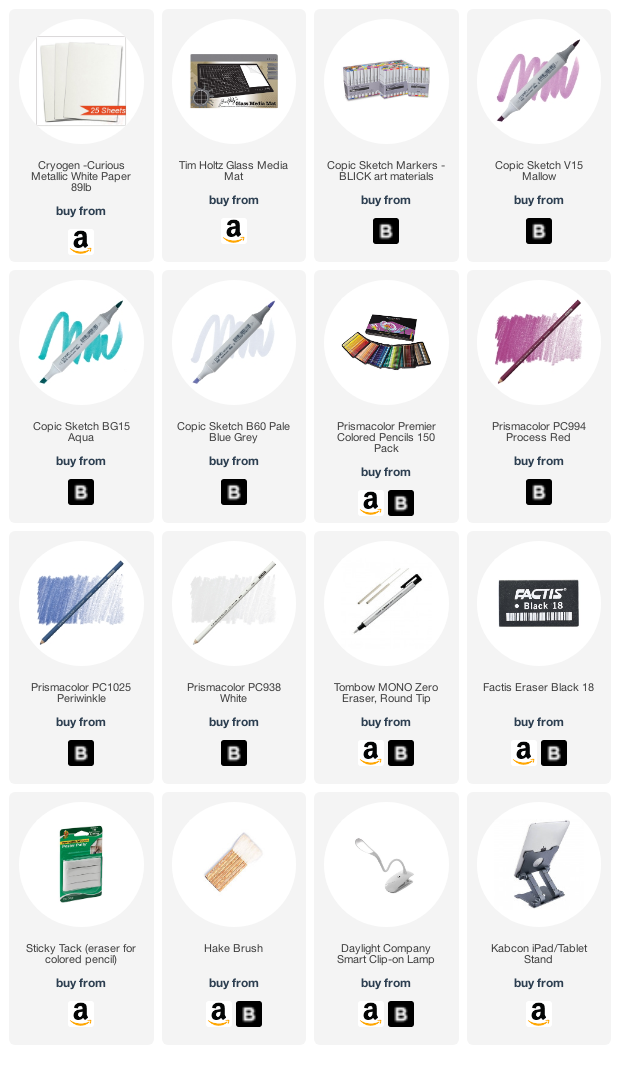
Select supplies used in Blue Reflection:
Vanilla Arts Company is a participant in the Amazon Services LLC Associates Program, an affiliate advertising program designed to provide a means for use to earn fees by linking to Amazon.com.


