Artist's Notebook: Check Your Color Values! (Copic Marker, Colored Pencil)
Frustrated with Your Original color palettes?
Tell me if this sounds right…
You’ve colored for months or maybe years, and you’re pretty darned good at it. There’s no tutorial that you can’t knock out of the park.
And yet when you go off on your own, picking original color palettes and choosing your own markers or pencils… well… your coloring is still good but, uhm… there’s something missing.
Your personal projects don’t have the same oh-la-la you see in professional projects.
You can’t quite put your finger on it, but something is just… off?
So you chalk that up to talent. “I love Crafty Candie’s Coloring tutorials! Her classes are the best because she always gives us the best color recipes!”
Psssttt… It’s not talent.
Crafty Candie does something you don't.
Today, I’ll show you how!
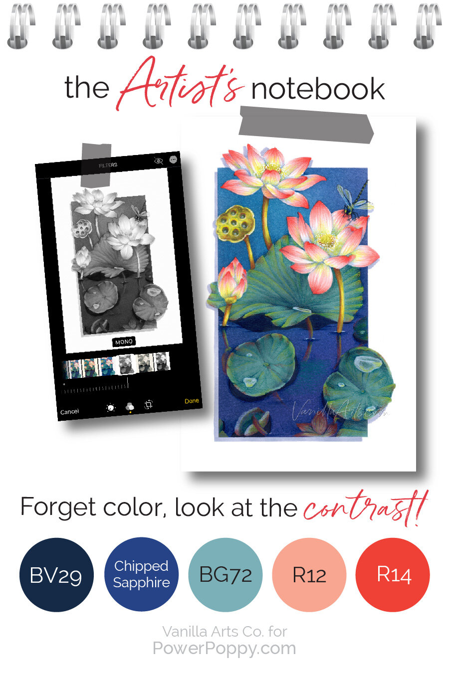
What is Contrast?
First off, don’t get scared. Artsy people name drop “value” and “contrast” a lot. Fear not, there will be no deep weeds here.
Because we don’t have to go deep to fix the problem!
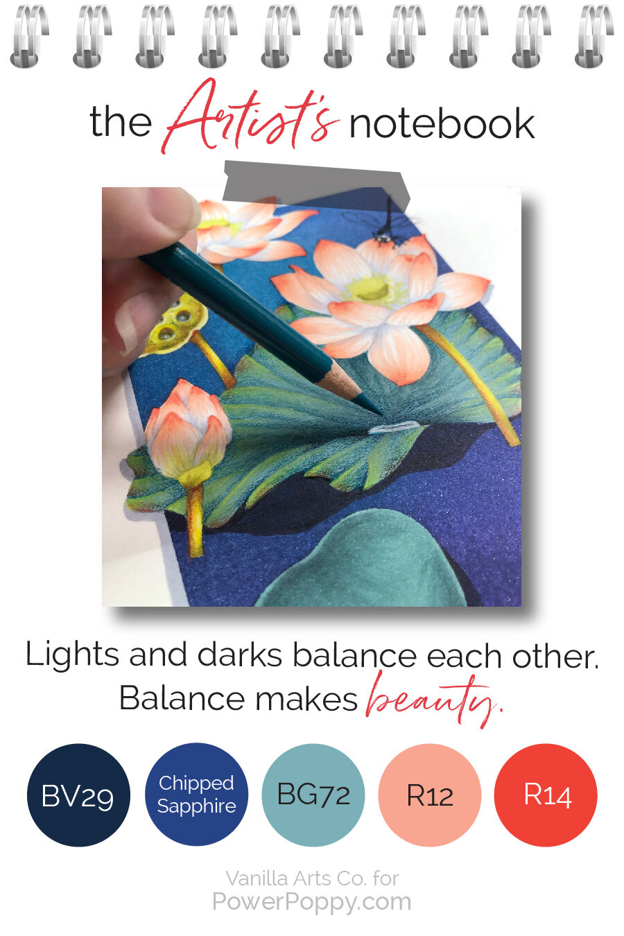
Value simply means…
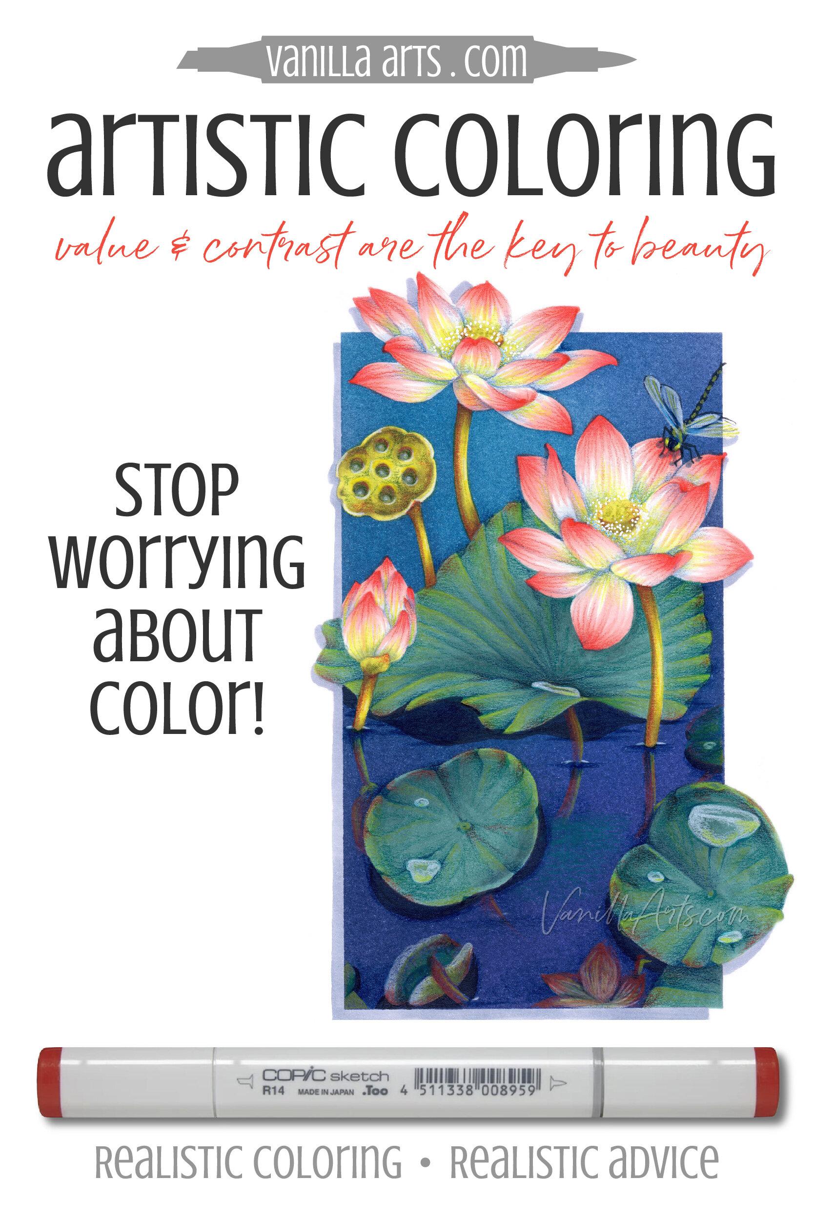
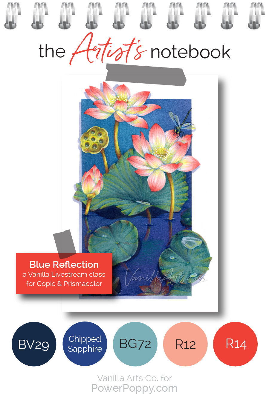
Let’s color Blue Reflection together!
Select supplies used in Blue Reflection:
(contains affiliate links)
Vanilla Arts Company is a participant in the Amazon Services LLC Associates Program, an affiliate advertising program designed to provide a means for use to earn fees by linking to Amazon.com.

