Depth & Dimension: Why pretty Copic Markers make your coloring look flat
The beautiful curse…
Are you searching for dimensional Copic coloring tips on the internet?
I caught you, eh?
You’re not alone. You’ve tried lots of tutorials promising depth and dimension. You’ve taken a few classes, paid for charts and guides, and watched hours of coloring on YouTube.
Right?
And it’s helped, at least a little bit.
Your coloring is better now than when you started...
But still, something’s missing.
You can color cute stuff, that’s easy. And you can blend better than most. But your projects still look kinda fake, kinda cartoonish and well darnit, they just don’t look like you could reach out and touch them!
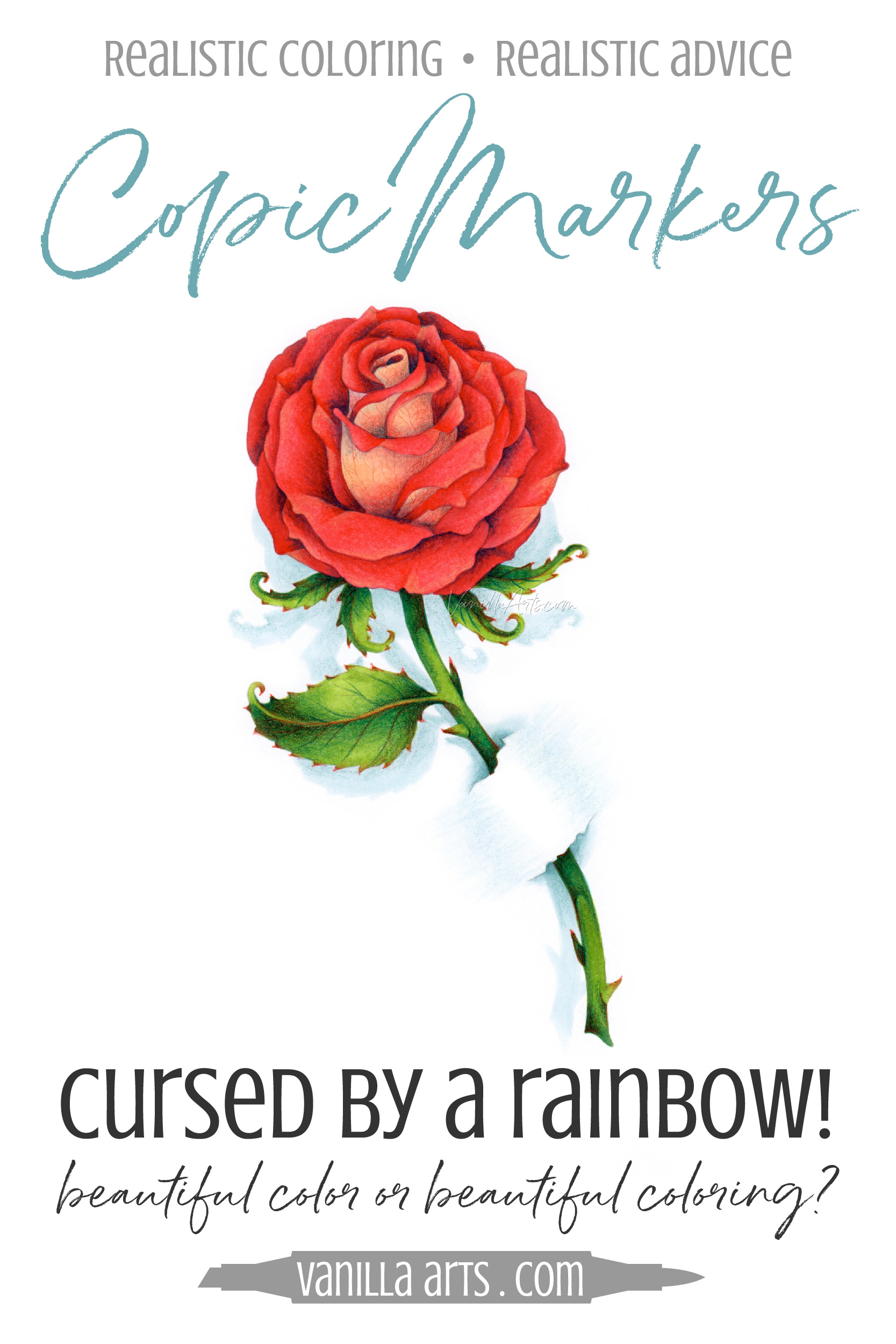
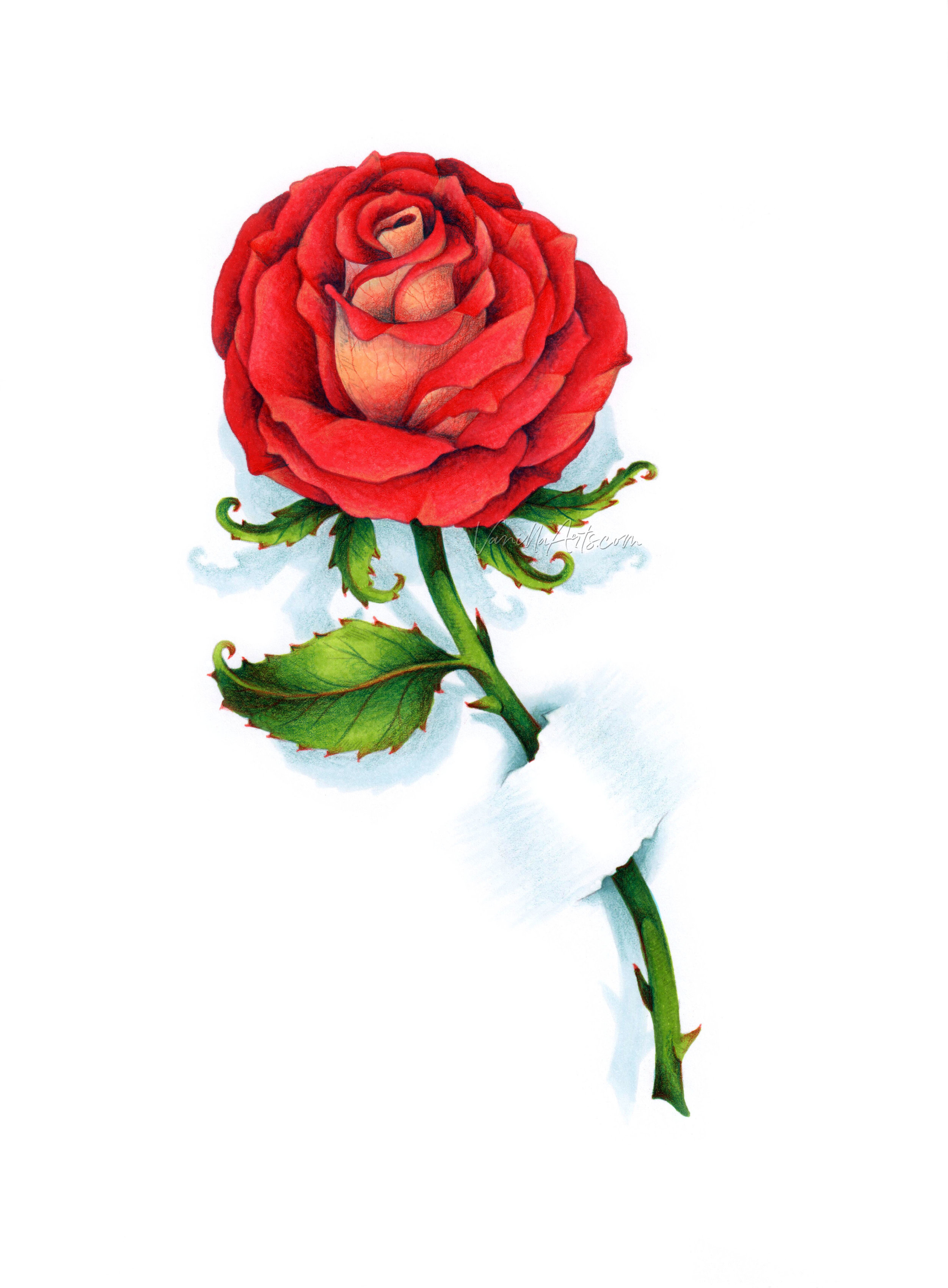
You see my rose project here and holy schmoly, that’s it!
This is how you want to color!
It’s not photorealism (because that’d take a long time to learn, right?)
And it’s pretty (because what’s the point of coloring if it’s not pretty?)
But it’s also not flat.
Which means someplace, somewhere out there, there must be a happy place for you. Halfway between hyper-realism and third-grader scribble technique.
So why can’t you color like this?
Because you’ve been cursed by a rainbow.
Cursed by a rainbow?
Yep.
All the pretty markers you own? They’re killing your ability to color dimensionally.
Copic comes in 358 candy colored markers. Gorgeous pinks, happy greens, beautiful blues. Even the ugly colors are pretty.
Copic wants to sell you lots of markers.
Which is why they don’t make markers named Dust Ball, Dog Vomit, and That Thing You Pulled Out of The Garbage Disposal Last Week.
Copic doesn’t make ugly markers because you won’t buy ugly markers.
And therein lies the problem dear grasshopper:
Ugly color is essential for realism.
It’s pretty darned hard to color real without real colored markers.
If you want to color with depth & dimension…
... or even the slightest bit of realism, you can’t get there with traditional Copic coloring techniques using the standard Copic colors.
Copic tutorials tell you to take this pretty marker and blend it with that pretty marker.
The result is a smooth and beautiful gradient where color A gradually morphs into color B. You’re not really changing the colors though. We can still see A and we can still see B. The only thing you’re doing is letting them flow seamlessly together.
It’s beautiful but it’s not real.
You’ve got a choice to make
You can keep on scouring the internet for depth & dimension tips that won’t work the way you want them to.
Or you can learn to color with real looking color.
Do you want beautiful color or beautiful coloring?
Look, there’s nothing wrong with pretty colors and pretty blending combinations.
Blend all the beautiful colors you want if that’s what gets your groove on.
But you can’t keep taking blending class after blending class and then complain that nothing looks real.
Blending isn’t supposed to look real, it’s supposed to look beautiful. Blending makes you feel all warm and squishy inside; it’s a fun thing to do on a Saturday afternoon.
Blending is superficial beauty. It’s not real.
If you want that missing depth and dimension, you’ve got to make some mud.
Dirty, muddy, and weirdly grayed colors are a natural part of life.
Look at the color along the sides of your coffee mug. Look at the color of a banana, way down where it meets the surface of the table. Now look at the color of your daughter’s ear when her hair hangs down over it.
The color of real shade is not one marker darker. That’s a Copic thing, not a real life thing.
Real shade is dusty and murky.
Real life is full of Dustball and Dog Vomit colors.
No matter how pretty the rose is, if you look into the shadiest areas, you’re going to see some ugly color where the red isn’t happy, bright, and vibrant anymore.
We call it “desaturated” because most of the time, desaturated colors don’t even have official names. They’re “desaturated red” or “desaturated peach”.
Shades are blackened color. In art, the verb “to shade” literally means to mix a bit of black into a color. This blackened, toned down, desaturated drabness is the color of real depth and real dimension.
Shading is not pretty, it’s real.
So if you want to color with realism, you’ve got to wreck the Copic rainbow.
How do we wreck the rainbow?
Well, for more background, I’ve got a series of articles starting here:
But I also structure all of my Copic and colored pencil classes around the underpainting process, teaching you to create realistic depth and dimension by desaturating your colors.
I don’t teach standard Copic blending combinations where the makers get prettier as they get darker.
That makes all the difference.
We desaturate for depth.
There are many ways to desaturate Copic Markers but I teach the three methods I’ve used most in my professional work:
Underpaint with gray - Grisaille (“gris-eye”) is a great all-around method which can be used for anything from mild realism (like my rose) all the way up to photo realism.
Underpaint with pseudo grays - This is my preferred method for beginner to intermediate Copic students, especially with floral images and human faces. It’s not as strong as grisaille and a lot easier for students to adopt. Think of it as Diet Grisaille.
Underpaint or Overpaint with the complement - This is the watercolorist’s method for fun and adventurous coloring. We’re using this method in the “Rosie Gets the Blues” class shown here.
Want to know more about underpainting?
Join me for Rosie Gets the Blues, a lesson on complementary underpainting and for real looking depth and dimension.
Underpainting is not hard to learn and once you’ve got this skill under your belt, you’ll be able to shade any project with greater realism.
You don’t have to be an artist with a gigantic brain and overflowing talent to master this method! Underpainting is for everyone.
My love is like a red, red Copic Marker…
Join Amy for a fun artistic coloring lesson in the Vanilla Workshop
Rosie Gets the Blues - Copic Marker + Prismacolor Colored Pencil
This Marker Painting Workshop was recorded live and demonstrated in real-time with no speed coloring or edits. Edited classes with perfect narration tend to make the coloring process look faster, easier, and smoother than it really is. Stop comparing yourself to the supermodel version of an artist!
Real time coloring with real mistakes and real fixes.
Class Printable Pack Includes:
Class syllabus with detailed recipe guide
Full color project sample
Guide to Copic base
Detailed color map
Project inspiration references
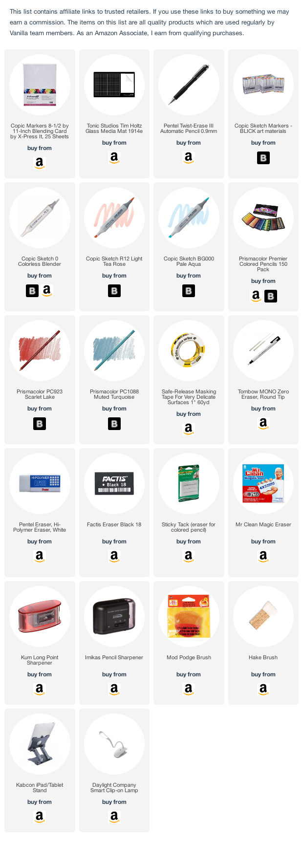
Select Supplies used in “Rosie Gets the Blues”:
Vanilla Arts Company is a participant in the Amazon Services LLC Associates Program, an affiliate advertising program designed to provide a means for use to earn fees by linking to Amazon.com.


