
Be a Smart Artist: 5 Things to Think About While Coloring (Copic Markers, Colored Pencils)

What do professional artists think about as they work?
It’s not what you see in the movies.
Turning the stereo up to eleven, chugging whiskey, and waiving a paintbrush around in the air like you’re swatting flies? That’s how artists work on television. It looks dramatic on camera.
But in real life?
All that distraction is a good way to make bad art.
If you’re moving from craft-level stamp coloring to artistic coloring with Copic Markers, colored pencils, watercolor… well, it’s easy to feel like a misfit.

You’re trying hard not to follow the leader in classes where the instructors talk you through every step. But at the same time, you don’t really feel at home in the paint or pencil communities where they don’t explain the process with much detail.
There aren’t a lot of artists talking about how to do serious coloring.
You are in-between worlds.
I keep suggesting that you should color more like an artist but how do you even start if no one explains the internal parts of how artists work?
I’d like to help you fill the knowledge gap.
I regularly color my own original drawings and sketches. Even when I do use a purchased stamp or someone else’s line drawing, I don’t sit waiting for an instructor to tell me exactly where and when to apply the C5 or YR24.
I color without guidance in a style that is uniquely me and that’s not completely due to skill.
A large part of art comes from an artist’s thought process.
Let’s peek between the ears and spy a little bit on the artistic coloring process, starting with the things that constantly run through my head as I draw and color.
If you understand the things I think about, the things I worry about, and the way I evaluate my project as I work on it— then you can start doing the same things too.
How do you color artistically and independently?
Here are 5 things to pay attention to as you work.
5 things I always think about…
This is the stuff that runs through my head constantly as I color a project.
But before we start, I need to set this up. You know from previous articles that I prepare and plan my projects very thoroughly before I begin coloring.

I decide upon the stamp image or line drawing and choose an appropriate paper
I narrow down the color palette next
Then I swatch out my blending combinations making sure that my markers blend smoothly and fit within the color palette
I do a few color studies to determine what color every object in the drawing will be
I plan out a background that won’t distract from the artwork and I often complete the background a day before coloring the image
So the article today deals with the thought processes that I go through as I’m actually coloring the images; NOT the preparatory steps listed above.
And do not be confused. These five things are not actual techniques.
Remember, as an experienced colorer, I’m no longer thinking through what to do with my hands or the markers. That’s the kind of stuff beginners think about.
It’s like riding a bicycle— when you were a beginner, you had to think about balance and remind yourself to keep the pedals moving. But once you learned to ride well, you never thought about weight distribution or momentum again.
I don’t think about coloring as I’m coloring anymore.
The five things I think about are not technique related.
This is higher-level stuff that leads to better artistry.
#1: Color Palette & Cohesiveness
As I said above, I choose my color palettes ahead of time.
I use my color palettes to set a mood and establish the desired level of realism in my projects. After all, it’s hard to say “Let’s Celebrate!” with a bunch of dingy gray markers and an elephant won’t look realistic if we color him green with orange stripes.
Setting the color palette ahead of time helps me set a standard of professionalism.
But the hardest part is sticking to it!

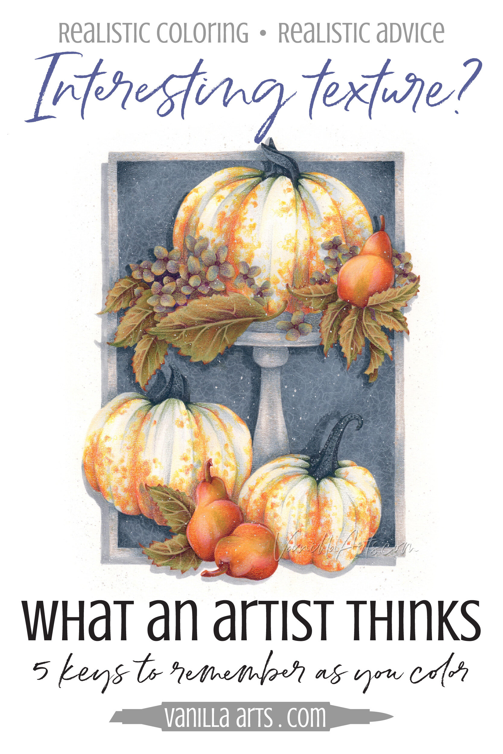
The project shown here is Silvered Pumpkins and it uses very organic greens, golds, and grays with a pop of orange. It’s an untraditional palette which I hoped would look more sophisticated than the overused fiery fall palettes.
Except as I colored the pears, something felt wrong. They weren’t looking very pear-ish.
I deliberately chose Bosc pears which are more brown than gold. They’re not the stereotypical cheerful yellow pears you’re used to seeing in art. Boscs are unique and they go perfectly with my autumnal palette.
But my golden pears were boring!
I wasn’t even sure they read as pears.
Ugly? Yep.
So I fought with myself for a long time, desperately wanting to start over with brighter yellows tinged with pinks and greens. To me, those are beautiful pear colors.
See? Setting a color palette at the beginning means I have to babysit myself the whole entire entire time; resisting the temptation to wander back to the stereotypes that feel safe and comfortable.
Eventually, I noticed that my Bosc photo reference actually does show a subtle blush to the skin. While it’s not the cheerful salmon-pink that I usually use, a bit of rosiness was likely the thing most missing from my snooze-worthy brown pears.
But uh oh! We have our original color palette to contend with right?
There are no pinks in our palette!
What to do, what to do, what to do?
This is where the artistic thinking comes into play.
Off to the side, I started re-swatching my golden marker combination and experimenting with various colored pencils to see if I could blush the pears without breaking the cohesiveness of the color palette.
In the end, I borrowed the clear red that I was using to enhance the pumpkins. It adds just a touch of warm glow to the pears but not so much that the color stands out as a freak of nature.
It’s not enough to choose a color palette at the start. You must guard it the whole entire time.
I can’t tell you how often I want to reach for an oddball color that makes superficial sense but doesn’t work for the image as a whole. Adding a touch of violet to an ocean wave, adding hints of pink to an apple, adding black to shade… anything.
C’mon, you know you grab black for shade all the time. And you think we don’t notice how disjointed it looks?
One-off colors, like sudden bursts of obnoxious hot pink on an autumn pear feel foreign and odd to your viewers if they’re not also present in the other areas of the image.
So if you’re going to add hot-pink, you have to add it to more than just the pears, it has to be added to the leaves, the pumpkins… otherwise it will feel foreign and confusing. If you’re not prepared to add hot pink everywhere, you shouldn’t be adding it at all.
I’m very conscious of my color palette as I color my way from start to finish. It’s constantly on my mind.
I’m not saying you have to stick with the original palette plan like a stubborn fool; I’m simply pointing out that before you grab a new color, you’d better think it through.
I make sure that every color feels balanced and makes sense.
It’s a constant vigil. I am always thinking about color cohesiveness.
#2: Interesting Texture
I do not color photorealism. My work does not look photographic.
I’m much more interested in hyperrealism. The difference between photorealism and hyperrealism is that the photorealist tries to duplicate a moment in time exactly as the eye or a camera would see it. The finished work looks like a photograph.
Meanwhile the hyperrealist aims for something lifelike while still leaving their fingerprints all over the place.
Hyperrealism has brush strokes and color surprises. That’s what I mean by artistic fingerprints. You can see the human origins.
But even then, I’m still an illustrator; so even my moderate form of hyperrealism isn’t super realistic-realism.
Anyway, because I love those artistic fingerprints, I’m always obsessing about texture.
Copic Marker-world is actually an odd place for me to be, considering I’m not all that thrilled about blending. I’m not a digital artist, so why would I want anything to look artificially smooth?
One of the things I do, beyond the normal photo reference search is that I try to find photos of my items from several angles and several distances. I don’t just stop at one awesome pumpkin photo. I look for that same pumpkin from several angles. I want to understand exactly how the ridges run from top to bottom, I look at how the stem connects into the bulb of the fruit, and I find macro shots so that I can investigate the texture of the surface and how the pigment looks up close. I even find the real object and run my fingers all over it if I can.
Wait… All of this for a pumpkin? Pumpkins are smooth, right? We blend then smooth because they’re smooth.
Nope.
You didn’t do your research.
The people who blend pumpkins smooth have obviously never looked closely at a pumpkin.
Pumpkins are covered with small little random divots and bumps. As you run your fingernail over the surface, your finger rises and falls over a tiny landscape. And not all pumpkins have deep valleys or actual creases, some varieties are barely lobed. Most pumpkins have wonderful warts on them; often up by the stem. And they’re never a solid orange, most have freckles or veins of pigment.
There’s so much detail to a pumpkin that you’ve been missing!
If you pay attention, you’ll never blend them smooth again!
I treat every object in the stamp with the same kind of attention. Look at the the vanilla bean illustration below. Nothing is smooth. I’ve given everything a textural note.
I’m always trying to get my markers and pencils to mimic the texture of the objects I color.
I’m always striving to invent more realistic strokes and find more artistic patterns.
I love texture and I think about it constantly as I color.

#3: Pushing & Pulling the Form
Pushing is the way I teach shading. We push surfaces deeper or distant with desaturated and neutralized colors.
Pulling is the opposite and most people wrongly think of it as highlighting. We pull surfaces closer with warmer colors or cleaner colors.
Then we use tints for highlights, but only when the object is actually receiving a blast of direct light.
To do all of this accurately, you have to understand the form of every object in your coloring image.
Let me put it simply: If you’re not thinking about the form, you can not color realistically.

Remember above when I said I investigated photo references to understand texture.
I also do it to understand the shape of every object I color. “Form” is the official artist’s word for the surface shape of an object.
Form is everything.
People in the marker world love two buzzwords - depth and dimension. But Sweet Baby Jehoshaphat, I’ve never met two more poorly defined terms. Y’all want depth and dimension but how many of you could actually tell me what each means and how they’re different?
Let me help. Dimension is the kiddie version of form. It’s got nothing to do with pop-dots.
A pumpkin is basically a modified sphere. It’s squatty on top and bottom and there are lobes or long bulges running from stem to the blossom scar at the bottom.
I’ve just described the form (dimension) of a pumpkin for you with words.
Your job as an artist is to describe the form with your coloring.
If you do it wrong, we’ll think you colored a basketball.
Form is constantly on my mind and it should be on yours too.
I don’t assume I know what a pumpkin’s form looks like, I find photo references. I buy a pumpkin. I look it over and talk through what I see.
Then I don’t just grab a pumpkin coloring tutorial from some rando on the internet. Let me guess, they told you to shade the outside edges all the way around from top to bottom to make it look rounded?
Psssttt… that’s why it looks like a basketball.
A pumpkin has a unique form. I constantly check my references to make sure that I capture the form accurately.
Constantly. Form is always on my mind.
#4: How does it look from a distance?
One of the best quick tips I can give you is to stop sitting in a dining room chair or on the couch.
If you’re coloring, you should be sitting in a chair on wheels.
Seriously.

As you color, your face hovers about 12 inches over the surface of your project. I’ve seen students crowd their paper even closer when they’re working on small details.
So basically, your project looks perfect as long as it’s inside your personal space.
But where does your viewer stand?
Well, most of my projects are framing size, so people stand a good two to three feet back from the glass. My larger projects are better from even farther away.
Understand the problem?
You can’t color with markers or pencils from viewing distance.
Unless you’ve got long octopus arms.
If you’re not moving back, you’re doing it wrong.
I color a little and then hold it out at arms length. I color a little more and then roll back from the desk to see it from farther away. And about every 10 minutes, I prop it up on a plate stand and look at it from across the room.
Up, down. Up, down. Back and forth, back and forth.
I wouldn’t call it exercise but my buns don’t fall asleep either.
You absolutely must view your projects from a distance. It’s not optional. This is a basic thing in art, it’s why the easel was invented.
You have to move back, to see your work as others see it.
If you’re not thinking about how it looks from distance, you’re not seeing it clearly.
#5: Clarity- can we understand every element?
I hate it when I’m coloring along, only to find out that what I thought was a leaf is actually a petal.
This happens all the time with commercial stamps.
When you color your own drawing, you know what you’ve drawn. But with other people’s stamps, I sometimes have little arguments with myself.
Am I looking at background space here or is that part of the flower?
Is this part of her skirt or a bit of her leg?
And my very favorite debate…
Where in the heck is this lock of hair going?

If you don’t understand what you’re coloring, how do you know how to color it?
Look, even the best stamp artists get a little sketchy sometimes. Drawing hair is fun but it’s easy to get carried away. Sometimes the flowers don’t have the right number of stems. Sometimes the puppy is missing a tail… or he has an extra tail.
I travel my eyes around the whole entire stamp before I start to color, making sure I know what I’m about to color. I don’t want to color a tennis ball neon yellow only to figure out later that it’s a golf ball.
But even with all the prep work, I still think about each object as I’m coloring it and for a long time afterward.
That was my whole problem with the pears in this project. I know Marcella at Power Poppy knows they are pears.
I know they are pears.
But would YOU know they are pears?
If they don’t look like pears when you’re scrolling past my project on Pinterest, that’s not Power Poppy’s fault. It’s my fault for not coloring them pear-like enough.
Ultimately, I can’t stand there to explaining it to everyone who sees it on my website. And I can’t slap a little warning on it that says “Hey folks, just in case you were wondering: the lumpy brown things are pears.”
Clarity is always on my mind.
Is this the best pear it can possibly be? Will my viewers see a pear? How can I make it the peariest pear that ever peared?
Will viewers be able to understand and recognize every object in my project?
So I’m always asking myself and I even get second opinions from friends and family: “am I making everything clear?”

Check out Amy’s favorite art supplies, click above.
If you’re not thinking,
you’re not making art.
Artistic coloring requires thoughts beyond “flick-flick-flick” and “now blend it a little more.”
Beginners assume that once you get to a certain skill level, then coloring becomes easier. But the truth is that once you master the techniques, then the real thinking starts.

Artists think their way into making better art.
You can do the same.
5 keys to think about as you color:
1. Color Cohesiveness
Sticking to the planned color palette is harder than you think. Sometimes you have to stop and experiment to make the right decisions.
Then at the end, ask yourself if the colors are balanced.
2. Accurate & Interesting Texture
Very few things in life are truly smooth, so while traditional Copic technique is fun, it doesn’t lend itself well to realism. You’ll need to think deeper about texture if you’re going to capture real texture in artistic ways.
3. Pushing & Pulling the Form
The stamp artist can only draw so much. It’s up to you to bring their drawings to life. Realism comes from understanding what each object is shaped like and where the pushes and pulls belong.
4. The Viewer’s Perspective
You can’t physically color with markers or pencils from 2-3 feet away, but that’s where your audience will eventually stand. Hold the project at arm’s distance, roll back from your table, and stand on the other side of the room to make sure that what you’re coloring still looks correct at viewing distance.
5. Object Clarity
It’s up to you to ensure that the viewer understands exactly what you’ve colored.
Want to know more about using color to tell artistic stories?
Join me for Silvered Pumpkins, a lesson on using color temperature and the chameleon nature of color to your advantage.
If you’re into dimensional coloring, this is really going to help.
And if you’re in it for the artistry, you’ll love the doors this can open.
We’re thinking about color beyond the cap number and the name printed on the side. You’ll never look at color the same way again.


Silvered pumpkins!
Join me for a fun Copic Marker + Colored Pencil lesson in the Vanilla Workshop
Silvered Pumpkins an Intermediate Challenge skills class on harnessing the power of created color
Learn to incorporate real artistry into your coloring projects, one concept at a time. Every Workshop details a new method for enhancing realism, depth, and dimension.
Each class stands on its own as independent learning. You don't have to take six of my other classes to understand this lesson.
Workshops are NON-SEQUENTIAL!
All of my Workshop classes are ANYTIME ACCESS. Work at your own pace and repeat the project as many times as you'd like.
Come color with me. It's a ton of fun!
Join me for an online lesson that will change the way you think about color!
Plus, it'll be tons of fun!


Select supplies used in “Silvered Pumpkins”:
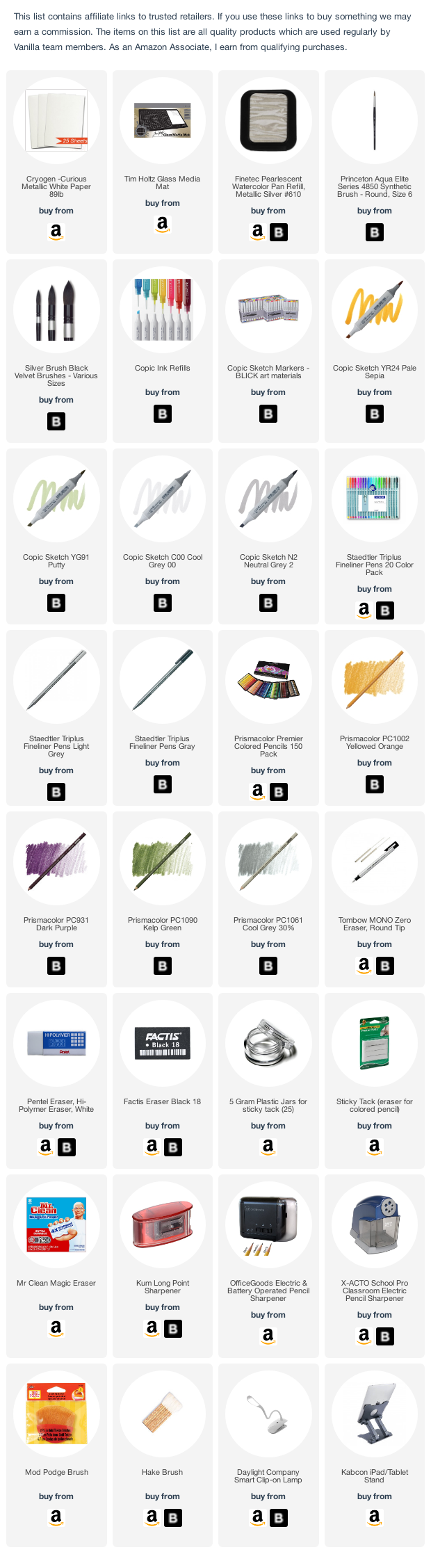
Vanilla Arts Company is a participant in the Amazon Services LLC Associates Program, an affiliate advertising program designed to provide a means for use to earn fees by linking to Amazon.com.