Improve your Copic Marker Coloring Today: Size Matters
There are no magic shortcuts to better coloring...
But there are small and simple things that you can do TODAY to immediately improve the quality of your finished coloring projects.
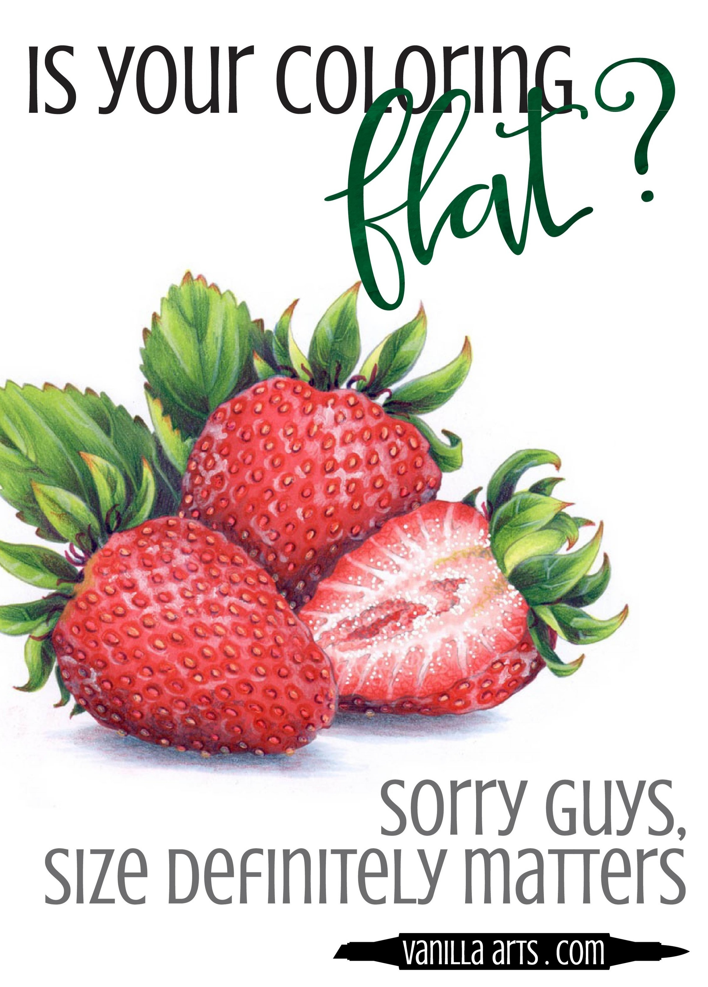
Is your coloring flat?
I know, I write about flat coloring a lot.
But that's because I hear about it. A lot.
Copic beginners are always pretty worried about getting the blends nice and smooth. But once they've nailed down the blending process, they start to wonder...
Where is the depth and dimension?
Don't worry, you are not alone. It's a common problem.
There are very few colorers who achieve the kind of depth and realism they want from their projects. Every colorer I know is on constant look-out for the magic bullet that will solve their flat coloring problems once and for all.
There are a lot of tutorials and videos out there which talk about how to add dimension to your Copic projects.
But there's one simple key that I never, ever, no-never hear or see mentioned.
Image size matters
When you walk into a museum, do they hand you a magnifying glass?
When you visit an art gallery, do they warn you to bring your reading glasses?
Heck, in the Pottery Barn catalog, do they show you big long couches with itty bitty wallet sized art over it?
That's because most artists work large.
Yes, you can purchase a pretty postcard with the Sistine Chapel ceiling on it but Michelangelo didn't paint the real ceiling that small.
Realism requires space
Let's face it, most stamps are tiny. The average stamp image was designed to fit on an A5 or quarter-fold card front and many stamp sets give you the ability to fit several objects plus a sentiment on that card front.
That leaves colorers struggling to fit several marker colors into itsy-bitsy spaces.
With big giant brush nibs, by the way.
To paint or color with realism, you are essentially creating a trompe l'oeil effect (that's French for "fool the eye"). Depth and dimension are a matter of getting the right shade of the right hue into just the right spot to fool the brain into thinking a two dimensional item is actually three dimensional. It's not only about the colors you use, it's also about placing those colors into just the right spots.
When a face is the size of a postage stamp, it's pretty darned hard to color it accurately. Depth and dimension, getting that shade into just the right areas to feel real... that's next to impossible when the head on the stamped character is pocket-change sized.
Miniature painters have unique skills
Once upon a time, back before the days of photography, you had to hire a painter to make a portrait or to capture a landscape. And if you wanted a portrait to carry around in your pocket or in a locket, you had to find an artist who specialized in miniatures.
Painting in miniature is a very specific skill and frankly, it's a rather rare talent. Working small requires lots of study and practice and a whole slew of specialized tools and supplies. The smaller you get, the more talent required.
And yet you expect to master this kind of thing instantly using big fat juicy markers and a $5.99 tiny stamp?
Be kind to yourself, use large stamps
I shock and startle my newbies all the time. When a new student takes my class for the first time, they're always amazed at the project size. That's because as an artist, I understand that your best chance to color with depth and dimension... all of that good realism stuff is highly unlikely to happen if I don't provide large stamp images.
Now granted, I draw the class images for 90% of my classes but I do use some commercial stamps. Rubber and silicone stamps are governed by the rules and regulations set by the issuing company. And some manufacturers are sticklers about enlarging their images, even if you're coloring them for personal use.
So the solution is easy. If the stamp image is too small, don't buy it.
Don't waste your money on teeny tiny stamps that are completely inappropriate for coloring with markers.
Companies are gradually learning that serious colorers want larger images. I support only those companies who produce appropriately sized coloring images, not just for legal reasons but because we want the sales statistics to show that there's a healthy market for large coloring images.
Or you can stick with digital stamps. When you purchase a digi stamp, you are not locked into using the stamp at one particular size. Digital stamps are scalable and that means you can squinch them small for a quarter-fold card front but also enlarge them when you want to practice coloring with realism.
Check out our Digi Stamps in the Vanilla Stamp Shop:
The Goldilocks Rule
Bigger is not always better; there is such a thing as too large.
Smooth blending gets harder as the stamp size increases. That's because the smoothest blends happen with fresher, wetter ink. So if the space you're coloring is so large that the ink has fully dried before you even get the whole thing base coated, then that's a blend that will require more nursing to make it happen.
And larger spaces usually require more markers in the blending combination. I save my two-color combo coloring for areas under .75 inch square.
Every colorer has an ideal size to work at. Not so large that the blend is choppy but not so small that you can't add shaded detail.
As you learn and practice your coloring skills, you can work smaller and smaller with more confidence. But just like when you were learning to write out the alphabet on wide lined kindergarten paper, it's definitely easier to learn a skill when you have room to see what you're doing (or doing wrong).
Quarter and Half-size images
When I draw stamps for classes, my beginner images are quarter sheet sized (a sheet being US 8.5x11 inches).
I don't mean that my Digis fit comfortably onto a quarter-fold with lots of extra space. I mean that my images ARE the size of a quarter sheet.
So for my classes, a single object in the stamp is usually anywhere from 4 to 5 1/2 inches wide. For intermediate students, I move them up to images that may fill the entire page.
I know, you can not fit large class projects onto a standard card. But you need the extra size to learn how to shade properly. When you get better, you can gradually begin to work smaller until you're back at standard card size.
Or maybe you'll stop producing everything for cards and start making framable art, hint hint.
Like day-old cola...
If your coloring continues to be flat, no matter how much you practice, no matter how closely you're following the tutorials, stop to consider the size of your stamped images.
Coloring isn't a clown car experience. The goal isn't to impress us with how much you can fit in. If you're trying to squeeze shade, highlights, and local color all into a teensy tiny space, it's no wonder things don't look dimensional.
Real artists rarely work itty-bitty because we understand that realism requires some elbow room. Working in miniature is a specialty skill which requires customized tools to do it right. Artists know better than to force themselves into working abnormally small.
Purchase larger images. Color larger images. Learn and practice on larger images.
It's one tiny thing you can do today to begin improving your coloring.

