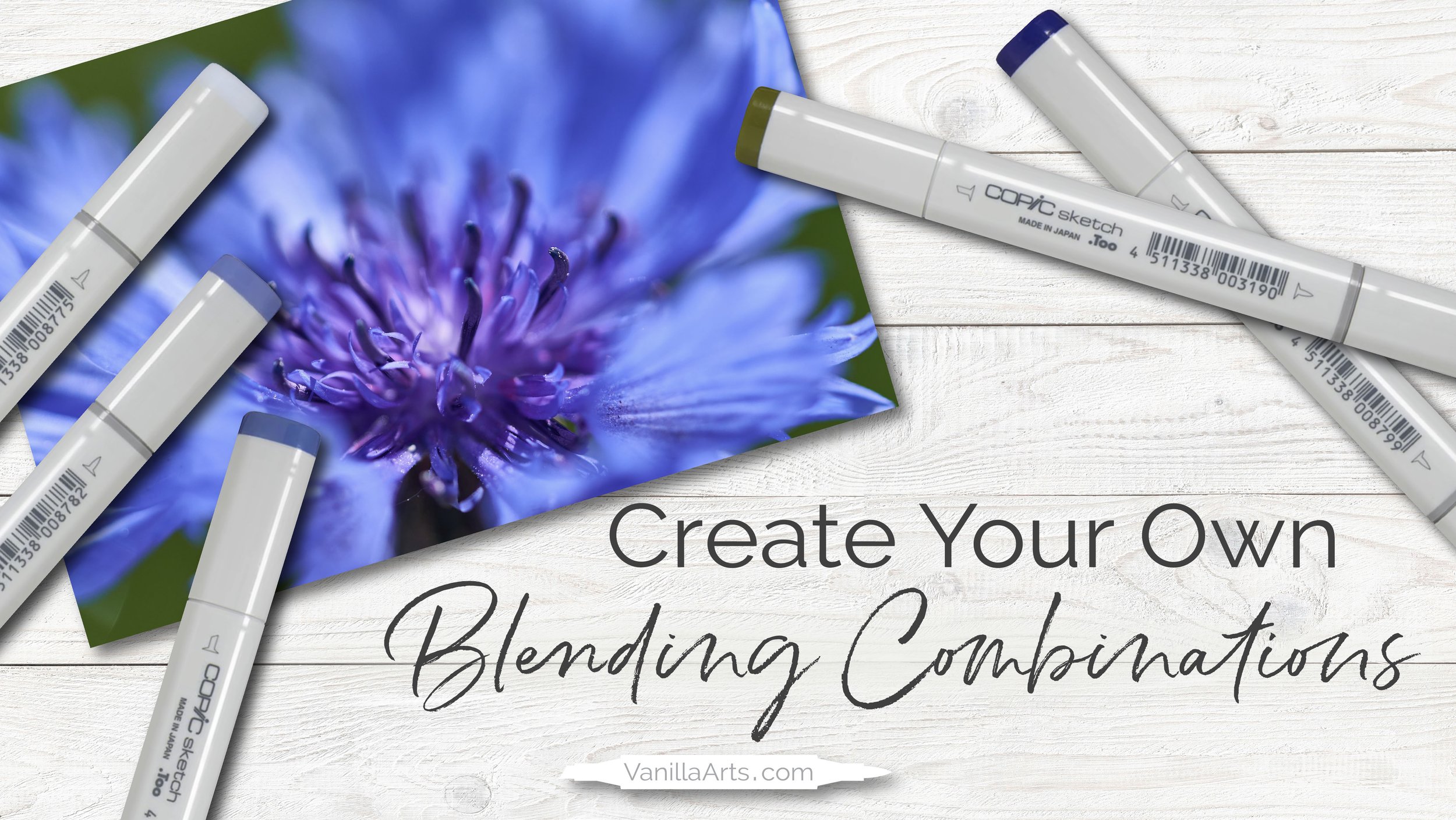
How to Create Copic Blending Combinations - Live Marker Demo (Episode 1, Blue Cornflower)
How to select Copic Marker colors for your next coloring project
“Why is it so hard to choose my own blending combinations?”
At this point in my art teaching career, I’ve taught thousands of students to blend and color with Copic Markers. By far, the most common comment I hear from students at every skill level is how much you struggle to create beautiful and unique blending combinations.
Sure, it’s easy to pick sequential blends using the cap numbers— but even then, you’ve got doubts about how good it looks.
And many of you suspect there’s a better blend somewhere out there, if only you knew how to make it!
Selecting original blending combinations doesn’t have to be this difficult.
One of the most challenging aspects of coloring with Copic Markers or alcohol markers is how to choose colors for your own unique blending combinations. In this video demonstration, I show how I use photo references and logic to select markers for a blue cornflower.
Blue Cornflower
In today’s demonstration, I provide an unrehearsed, unscripted look at how I select alcohol marker blends for class projects and my own personal artwork.
Let’s call it, “thinking out loud” because I started this demonstration with no plan and no idea where my marker choices will take me.
Join me as I swatch and test a variety of markers for this beautiful cornflower photo reference.
Ask yourself, what do you like about my color choices? Or would you use my methods to choose a different combination?
There’s no right answer and many ways to capture the beauty of a cool blue flower.
Many people misunderstand the purpose of photo references, especially for realistic coloring.
I don’t try to duplicate the colors I see in photo references. Instead, my goal is to recreate the feeling of the color.
Watch the video for more information about this process.
What Color Do You See? is a FREE resource. There is no cost to watch.
This applied color theory lesson covers the following concepts:
B (blue) versus BV (blue-violet) Copic Markers
reading a photo reference for color inspiration
the true goal of using a photo reference
color instinct, feeling, and vibes
how to swatch colors and test blends
how to avoid color distractions
limiting your color palette
choosing underpaints for realism
how to avoid Frankenstein flowers
WATCH THE VIDEO HERE:
This video is a free resource. There is no cost to watch.
(click above to watch this video at YouTube)
Want to be notified about future videos?
More videos in this series:
Learn more about Copic Markers:
(click to visit the article or video)
Today’s video was sponsored by our friends at Violeta-Ink.com
Be sure to tell them Amy sent you!


