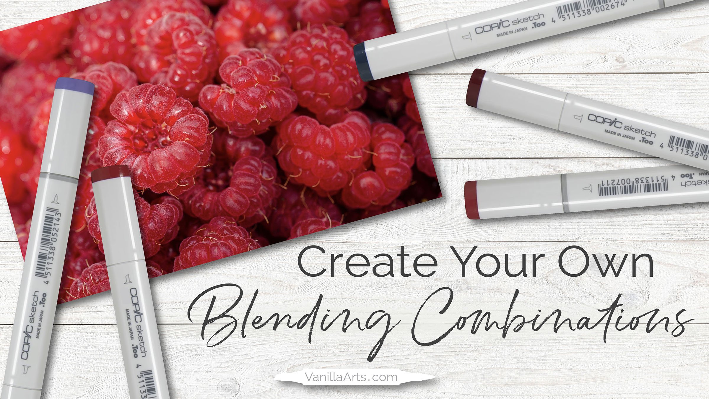
How to Create Copic Blending Combinations - Live Marker Demo (Episode 2, Red Raspberry)
How to select Red Copic Markers for your next coloring project
“Why is it so hard to choose my own blending combinations?”
After almost a decade teaching art classes, I’ve met a lot of Copic Marker fans. By far, the most common comment I hear from students at every skill level is how much you struggle to create beautiful and unique blending combinations.
It’s easy to pick sequential blends using the cap numbers— but honestly? Those blends get kind of boring after a while.
You want to choose your own colors and you want to make blends that look good.
Selecting original blending combinations doesn’t have to be this difficult.
Copic Markers and other alcohol markers can make beautiful blending combinations but many people struggle to create their own unique combos. In this free video demonstration, I show how I use value boundaries to limit the potential color combinations to prevent that overwhelmed feeling.
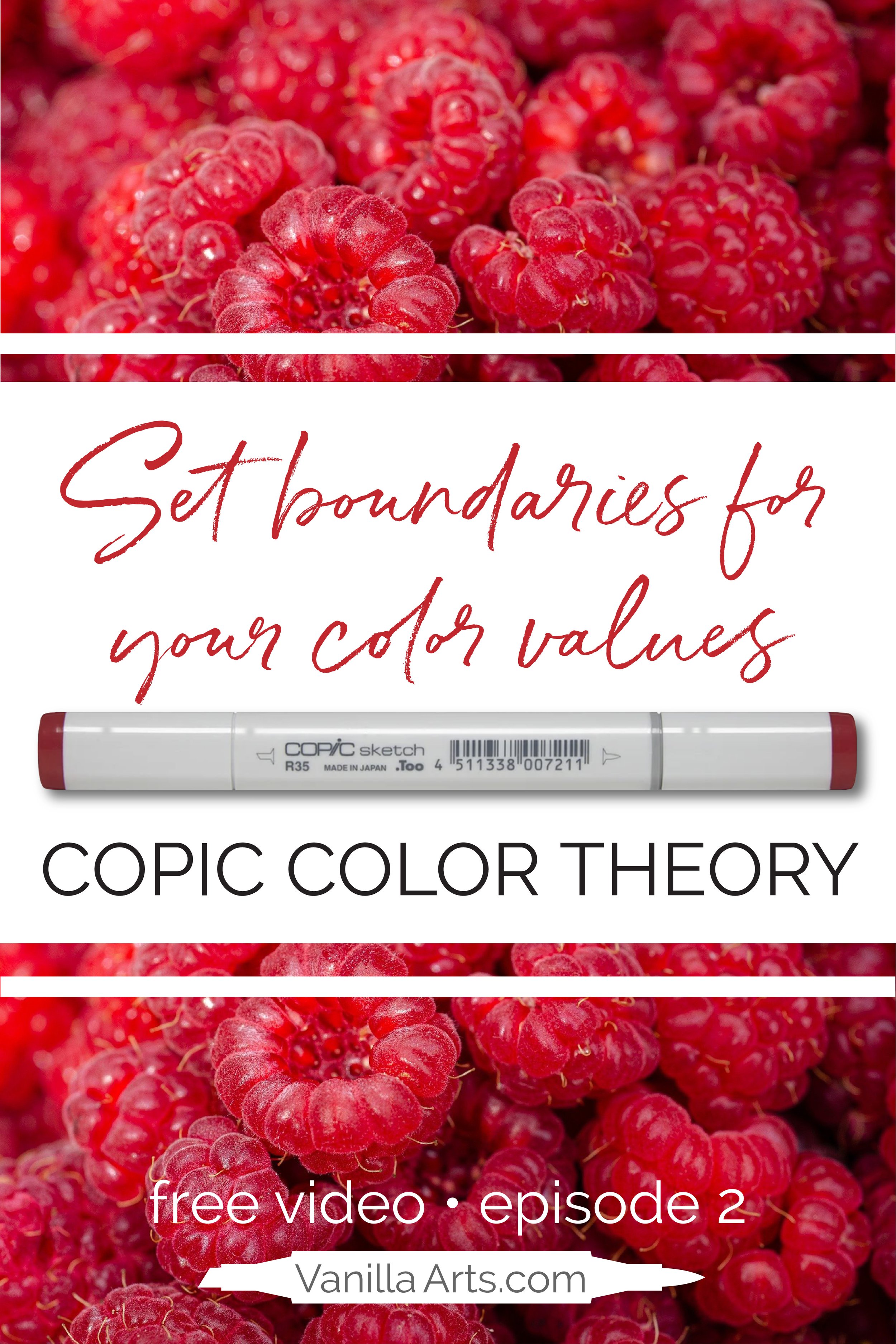
Red Raspberry
In today’s demonstration, I provide an unrehearsed, unscripted look at how I select alcohol marker blends for class projects and my own personal artwork.
Let’s call it, “thinking out loud” because I started this demonstration with no plan and no idea where my marker choices will take me.
Join me as I swatch and test a variety of markers for this juicy red raspberry photo reference.
Ask yourself, what do you like about my color choices? Or would you use my methods to choose a different combination?
There’s no right answer and many ways to capture the beauty of red berries.
People often assume they see black in backgrounds like this. They also see every highlight as white.
When you mis-identify the lightest light and darkest dark, you create an extreme value range, making the color selection process unnecessarily complicated.
Watch the video for more information about how I simplify my color values to keep the process fast and easy.
What Color Do You See? is a FREE resource. There is no cost to watch.
This applied color theory lesson covers the following concepts:
true black versus pseudo black
reading a photo reference for color inspiration
finding accurate values in a photo reference
using eyedropper tools to double check your assumptions
how to swatch colors and test blends
how to add sunny warmth to a cool red
limiting your color values
choosing underpaints for realistic reds
how pencil opacity can ruin the look of your marker art
WATCH THE VIDEO HERE:
This video is a free resource. There is no cost to watch.
(click above to watch this video at YouTube)
Want to be notified about future videos?
More videos in this series:
Learn more about Copic Markers:
(click to visit the article or video)
Today’s video was sponsored by our friends at Violeta-Ink.com
Be sure to tell them Amy sent you!


