Vanilla Beans: The Color Game
Thanks for taking the jump to read today’s newsletter. If you landed on this page by accident, subscribe to the Vanilla Beans Newsletter here.
For the next couple weeks, I’d like to share my most popular Beans articles ever.
It’s not even close. More people talk about this short series as eye-opening revelations.
They’re worth a second go-round, even if you remember them from before.
Let’s begin with the article that hit folks like a ton of autumnal bricks.
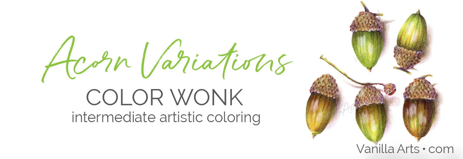
Acorn Variations is our October project for intermediates. Every Acorn here uses the same marker/pencil recipe. We’re jazz riffing with color.
Autumn is the most misunderstood color palette…
The Color Game
Let’s play a game.
Psssttt… this only works if you actually play the game.
So in the interest of maximum educational value— let me warn you:
If you’re reading this in the car right now or in the lobby of the dentist’s office, PLEASE STOP READING.
Close the email and put it away. Wait until you’re at home with your markers or colored pencils, then open it back up and play along.
I mean it. You will only learn from this game if you follow the rules.
I’m about to put a big white spacer under this section to keep you from cheating. So close your phone or tablet and don’t open it up again until you’re within arm’s reach of your art supplies.
Ready?
Okay, here’s the game.
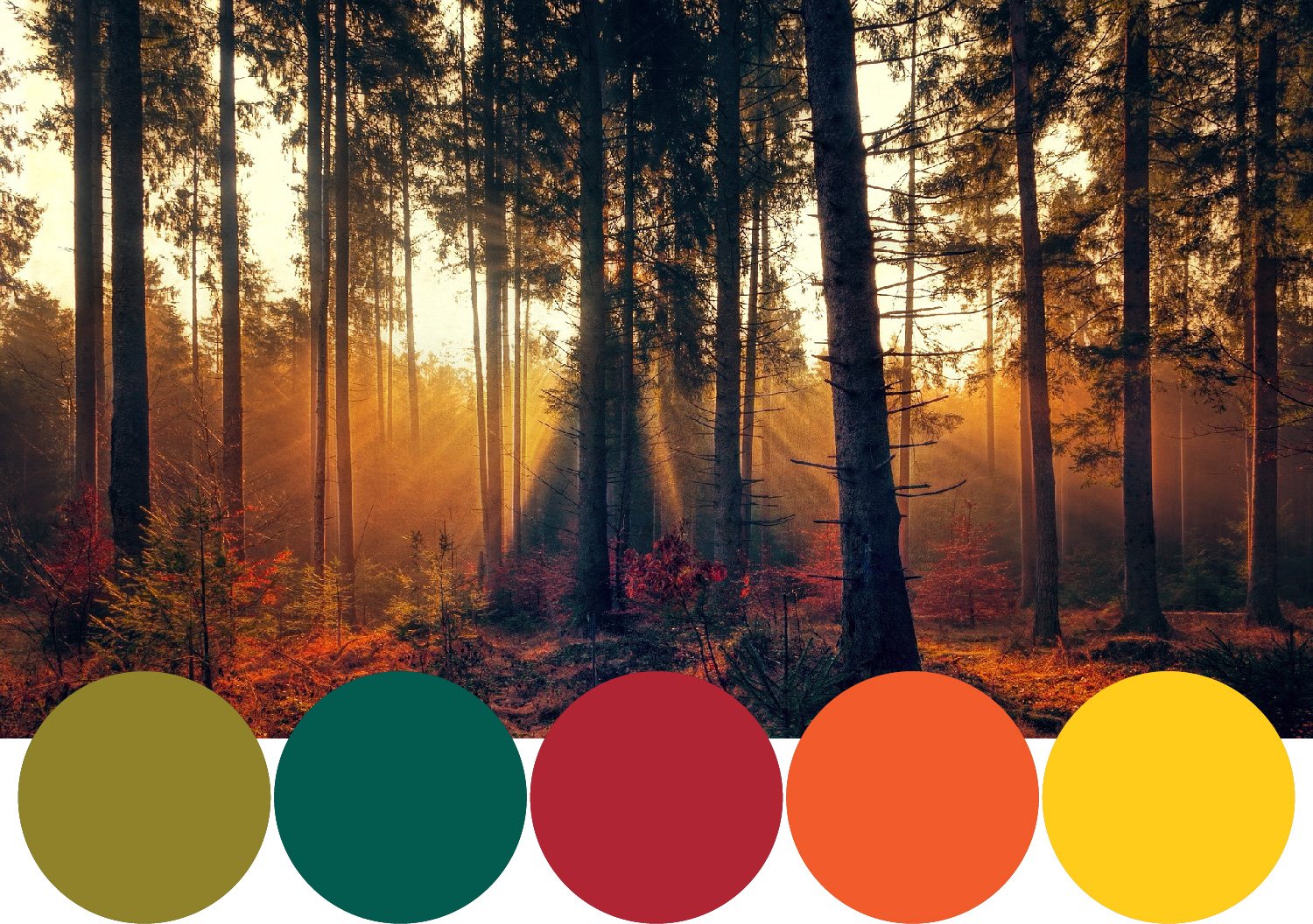
I want you to look at the opening photo again and pick five markers or pencils or the paint you would use to color this woodsy scene.
And don’t look at the blacks or deep dark grays.
Select the colorful colors you see.
Which greens would you use?
Which oranges would you use?
Which yellows or reds or browns would you use?
What colors do you see in this photo?
If you see more than five colors, pick six or seven but don’t do blending combinations or go overboard.
What are the major colors of this photo?
Pull them out and set them on the desk in front of you. Maybe snap a photo with your phone to record your choices or swatch them on paper. Note the color names and numbers so you can remind yourself about this experiment later.
Document the colors you see before moving on.
On the desk right now: 5 to 7 of the major fall colors you see in this photo.
Now here comes that big spacer to keep you honest…
I’ll see you and your markers after the big white jump, okay?
Are you cheating? Do you have your colors swatched?
Here’s another chance, another big white space.
Okay, this is what most of you are looking at on your desk right now.
YG95 - G28 - and an R that’s either 29 or 59 - YR07 - Y15
When you look at the photo, these are the colors you probably see.
There’s a nice olive green where the sun hits the small pine saplings to the left.
There’s a deeper spruce green in the center where the pines are not directly hit by sunbeams.
There’s a blazing scarlet and a bright clean orange on the dying leaves of the ground scrub and bushes.
And the sunbeams are pure golden yellow.
These are your standard autumn colors, right?
If I know you, you’ve been using similar colors ever since October hit. Sure, sometimes you’ll add V09 or a few reddish E’s for variety but this color palette is Fall’s home base for most card makers and coloring bookers.
You’ve been blasting all your autumn projects with these warm brights and throughly enjoying the fire of fall.
Except you’re wrong.
The colors you see in the photo are not the colors in the photo.
What’s really in the photo?
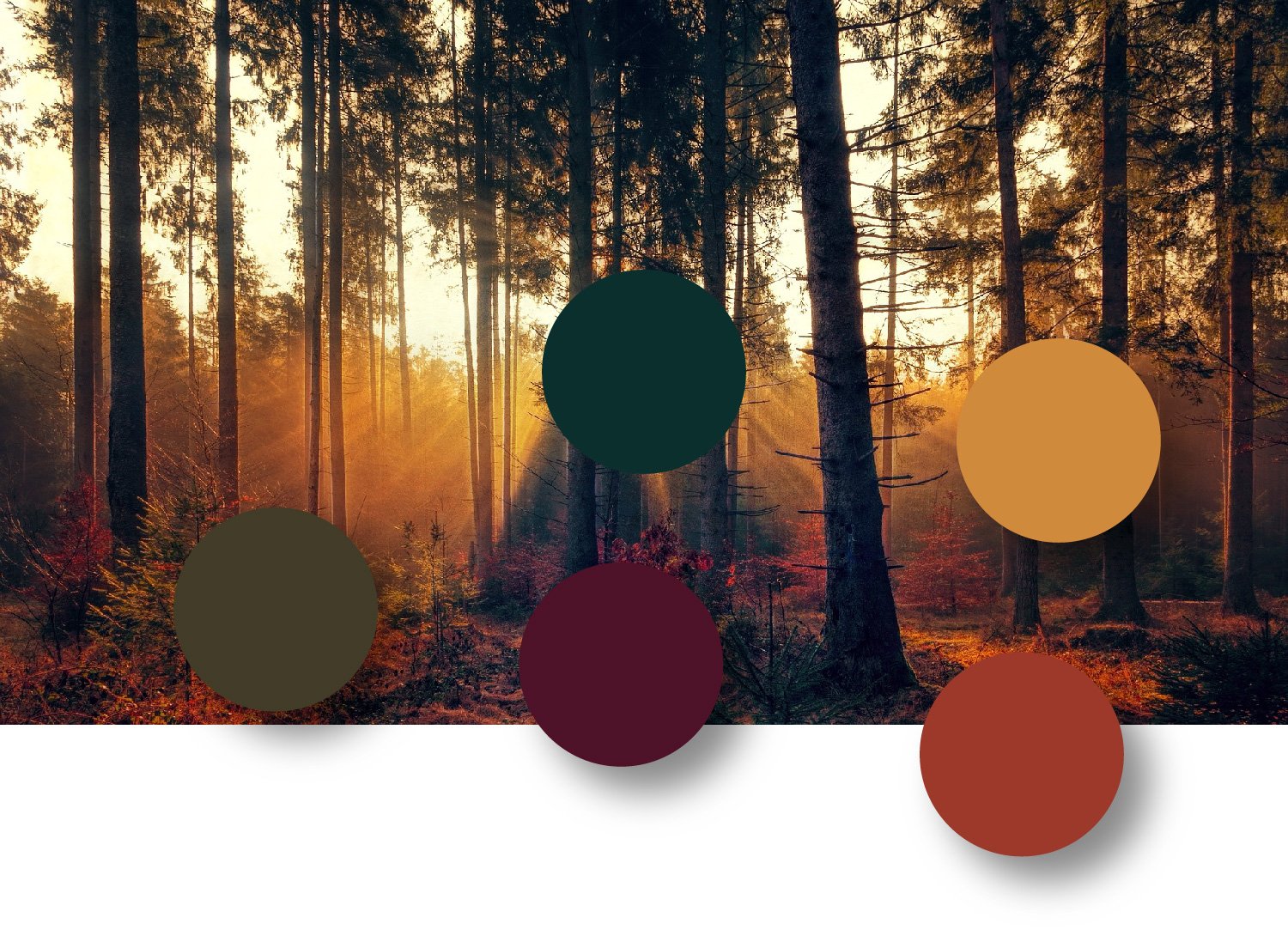
These are the actual colors in the photograph.
Which is a far cry from the clown palette on your desk right now.
Don’t believe me?
The olive green is not YG95. At it’s brightest green, where the pines are kissed by sunlight, the color is something more like YG99 mixed with E89.
The deeper pines between the sunbeams are not G28. They’re more of a BG79.9999999999999 (if Copic made such a color).
Your brilliant scarlet is actually closer to RV99. It’s not nearly as red as you thought.
The bright orange is E08.
And the pure sunshine? It’s YR23 at best.
The eye dropper tool does not lie. Your eyes though? They’re constant liars.
Your eyes tell you what you want to see.
You’re a big fan of the autumn Crayola kindergarten palette, so your eyes tell you what you want to see.
Right about now, you’re questioning everything you know about color, right?
Good.
You should.
It’s time for a gut check because you’ve been fooling yourself.
You’ve been using your childish October palette on cards and stamps recently, haven’t you?
And while they’re fun to color, you see the cartoonish look.
You thought it was your skill level, right?
If I was a better colorer, my coloring would look more realistic.
Psssttt… it’s not your coloring skill.
It’s the color.
Here’s your assignment for the week. As you drive around town, running errands, or perhaps a walk in the park— look closer at the colors of autumn.
Gut check yourself.
Are you seeing real color?
Or do you only see what you want to see?
Next week, we’ll talk about why our sense of color is skewed.
BTW: if you chose muddier, darker colors which are closer to the actual samples, congratulations! You’ve got good eyes and you’re a few steps ahead of the average student.
NEW VIDEO
Click to watch. If your device doesn’t like embeds, click here to watch at YouTube.
IF YOU LIKED TODAY’S ARTICLE & VIDEO, PLEASE SUPPORT FUTURE FREE LESSONS
NEW DIGITAL STAMP
Color Candy Corn with me. Stamp includes printable supply list.
Ads like this help offset the cost of free newsletters and videos:
SPOOKY COLOR
CURRENT PASSWORD: RubberDuckie
OCTOBER EVENTS
click to view details
HALLOWEEN COLORING
click for more info


