
Vanilla Beans: Pandora’s Box
Thanks for taking the jump to read today’s newsletter. If you landed on this page by accident, subscribe to the Vanilla Beans Newsletter here.


Paragraph spacing issues? Click here for spaces between the paragraphs.
Hello, spring!
We started the week with 85mph winds on Sunday which knocked out the electricity until late Monday.
Then on Wednesday, we had hard rains and flooding. Our backyard was under 2 feet of water at one point.
If this pattern holds, it’ll be blood and frogs this afternoon…

I purchase most of my art supplies from Dick Blick. Shop using my affiliate link to support this free newsletter. Thanks!
Over the last month, we’ve discussed the Test of a Quality Colored Pencil:
Is it available openstock?
Is the laydown generous and colorful?
Is the pencil hard or soft and do you have a balance of both?
Then last week, I covered email questions about the list so far.
Yes, we’re now weeks into this thing and I’m only just now, getting around to the point where you’d probably start.

PANDORA’S BOX
You heard about a new brand of colored pencil.
You look it up online. It’s getting positive reviews on YouTube and lots of stars at Amazon.
Research done, you order ‘em.
Then comes the nirvana glow when you finally open the box— and we’ve seen this moment in hundreds of Art Haul videos where the lucky girl lifts the lid and says…
“Such a beautiful spectrum of colors!”
Which seems like something smart people would say, unlike what you’re actually thinking:
“Me love rainbow good!”
The rainbow glow seems to be the universal test of quality, at least for colorists.
Open the box
Confirm there’s a rainbow inside
?
Make amazing art!
The rainbow test has always kinda puzzled me.
I mean, it’s not even much of a test.
It’s a box of pencils. Were you expecting an aardvark inside? Of course there’s a rainbow in the box.
It doesn’t have to be a good rainbow to pass the test.
Hang on, Amy! There’s no such thing as a bad rainbow!
Uh, yes. Yes, there very much is. You probably own several mediocre rainbows.
Don’t get me wrong, the rainbow test isn’t totally worthless. The problem is you’re too easily impressed by any ol’ Roy G. Biv assortment.
Over the next couple of weeks, we’ll look at the rainbow of pencils from an artist’s perspective.
Let’s pop the hood to see what’s really inside the box.

Okay, so this is a real brand presenting their rainbow…
The trick is to look beyond the rainbow.
All together, a rainbow is beautiful. We assume if the rainbow is pretty, then everything in the rainbow is useful.
Nope.
Every rainbow has flaws and holes. Let’s learn how to spot them.
At first glance, I’m spotting at least 6 problems. It’s not the worst assortment I’ve seen but I’d never buy this set, especially not if it was my only set.
Pretty rainbow, problematic collection.
Here’s the first thing I look for:
How many pointless colors are in the box?
By pointless, I mean pencils you’ll hardly ever use.
Fluorescents are the easiest pointless pencils to spot. Luckily, this box is neon-free.
See, I told you this set wasn’t all bad.
But they did waste spaces giving us gold and I assume one of the grays there is actually silver.
Ever use a metallic pencil? Didn’t work out the way you expected, right?
Metallics are difficult to use. If you practice good technique, meaning soft layers with barely any pressure— if used softly, silver should be named Dead Whale Gray and gold would be more accurately marked Baby Poop.
To see the metallic effect, you’ve got to press hard and burnish like Popeye after a can of spinach. Metallics only look metallic in a very thick layer and even then, most metallics aren’t very shiny.
Metallics and Neons are a waste of space.
Serious artists don’t need ‘em or want ‘em.
Okay, next problem. What’s another reason I’d never buy this set?
Squint your eyes so that the pencils go blurry and all you see is fuzzy stripes of color.
Which stripes pop out the most?
Almost everything in the bottom row, left half of the middle, and most of the top row, right?
That’s because cheap pencil companies know you well. You like bright colors. If that’s what you like, that’s what they’ll offer.
Now there’s a general rule in Color Theory, we’ve talked about it in this newsletter before…
Cool colors recede and warm colors advance.
Translated into everyday English, this means cool colors look distant while warm colors are all up in your bizness.
And almost everyone totally gets this wrong. You think “blue is cool so blue makes a good background but orange is warm so it’s a good color for the focal point”.
Which isn’t wrong but that’s not what the rule means.
Cool RED recedes and warm RED advances.
It’s not about the warm half of the color wheel versus the cool half.
It’s the warm half of the purples does versus the cool half of the purples. Warm green versus cool green. Warm yellow versus cool yellow.
Uh, Amy? Color theory is interesting but I think you’re wandering off topic?
Hang on, I’m about to strike.
Remember the rule: Cool colors recede and warm colors advance.
And keep in mind that the pencil companies know that bright colors sell.
Which colors naturally look brighter? The warm colors.
Now look at our set again and tell me what you see in each hue family:
Reds? All warm.
Yellows? All warm.
Green-greens? One cool, the rest are warm.
Blues? A lot of green-shifted blues. I’d call that warm.
The pinks are cool but they still pop because magenta is a naturally poppin’ color.
The purple section is a mess. I don’t know what’s going on there.
All the browns are warm.
Why is everything so warm? Because warm pops and that sells.
Well, you’re an artist Amy. Just mix a couple pencils to make the cool colors you need.
That’s not how it works.
I use cool red all the time. If I want cool red, what do I add to their warm red to make it cooler?
The red is warm because it contains some hidden yellow. If I add blue, especially one of their blues with hidden green in it, it’s gonna make mud. The magentas are weird so I’m not chancing one of them. Add purple? That plus the hidden yellow makes mud too.
I’m trained in color mixing and I don’t know what to do with this set! You wanna try?
They’ve skewed everything with secret warm ingredients. Every color mix you try is going to be 90% chance of mud.
Temperatures matter and it’s why I won’t touch this set.
We’re going to stay on this rainbow test for at least another week.
See if you can spot any other issues with this bad rainbow before I give you the answers.
And to summarize our progress so far, the Quality Test is:
Is this pencil available openstock?
Is the laydown thick, smooth, and generous?
Is the pencil hard or soft?
Are there pointless colors in the box?
Are there warm, balanced, and cool versions of every major hue?
IF YOU LIKED TODAY’S ARTICLE, SUPPORT FUTURE FREE LESSONS
NEW IN APRIL:
(click for more info)


THIS WEEK IN COLOR


CURRENT PASSWORD: RubberDuckie
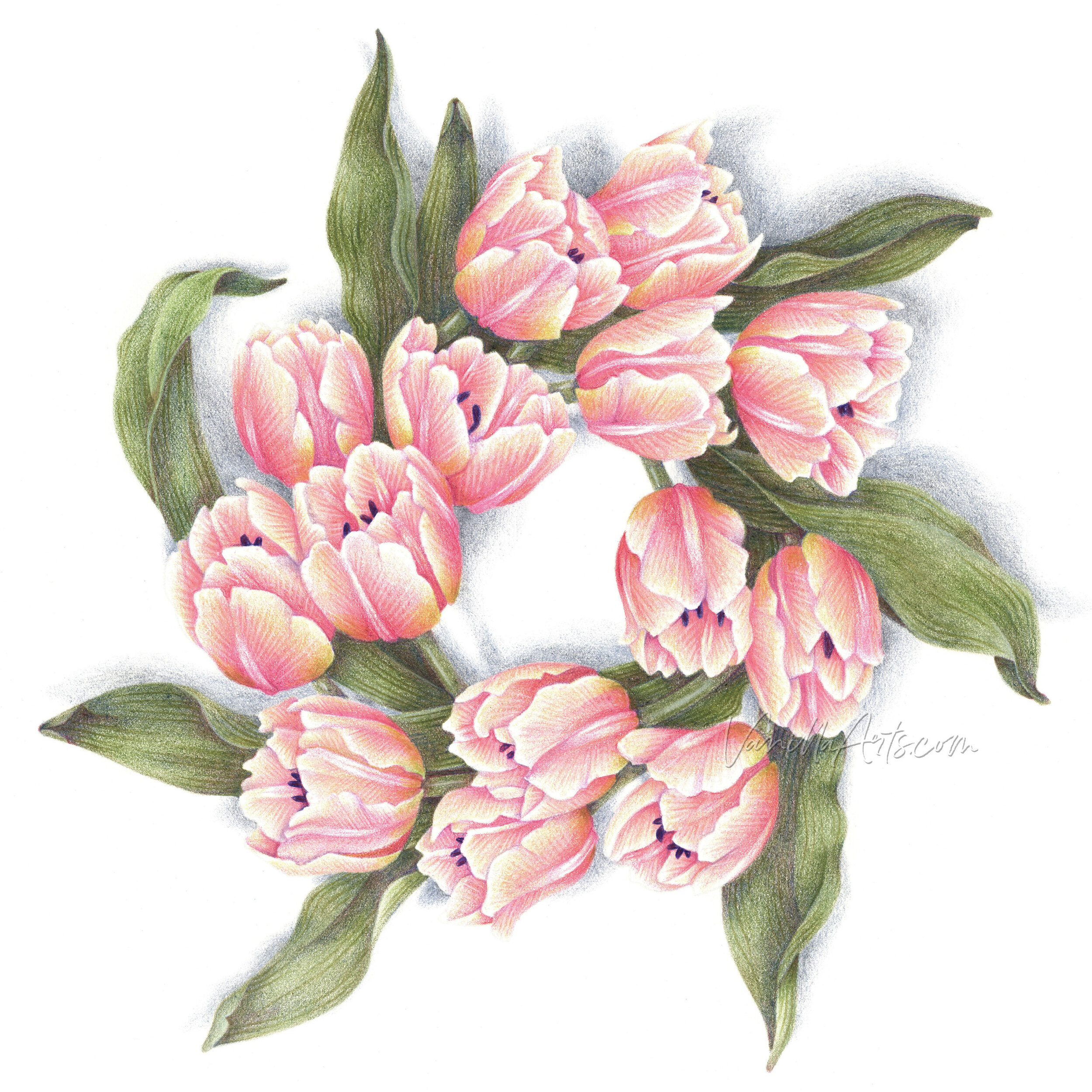
SPRING COLORING


COLORED PENCILS WITH WARM & COOL OPTIONS:
Affiliate links help support the free content here in Vanilla Beans


LOOKING FOR LAST WEEK’S BEANS?


