
Vanilla Beans: Doppelgangers
Thanks for taking the jump to read today’s newsletter. If you landed on this page by accident, subscribe to the Vanilla Beans Newsletter here.


Paragraph spacing issues? Click here for spaces between the paragraphs.
It’s a livestream weekend!
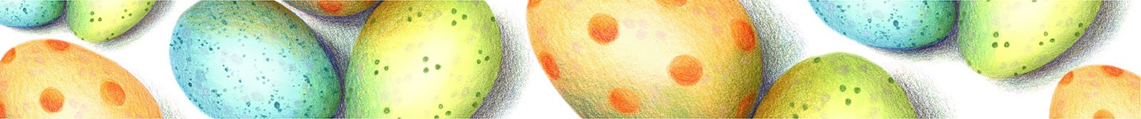
We colored Easter eggs in the Color Wonkstream yesterday and today, we’re coloring a sweet bunny rabbit in the UPstream today.
It’s not too late to join the fun!
Both membership groups have printables available all month long and the livestream recordings stay in an archive library for one year. Plus, the forum is always happy to talk about previous projects. You’ve got tons of time to learn and color with us.
Click the pic below for more info on the Spotted Egg lesson or Lynne’s Bunny.

I purchase most of my art supplies from Dick Blick. Shop using my affiliate link to support this free newsletter.


If this is your first newsletter or it’s the first you’ve opened in a while, welcome!
To catch you up, we’ve been discussing the Characteristics of a Quality Colored Pencil.
Last week, we talked about making sure every color family has a good balance of temperatures because we need both warm and cool reds, warm and cool greens, warm and cool yellows, etc.
This week, we’re diving deeper into the rainbow box to check for redundancy.

Doppelgangers
You open a new box of colored pencils and the choir behind you breaks into song.
Who doesn’t love a good rainbow?
Psssttt… that’s what the company is betting on.
They know you’ll be so blinded by all the Roy G. Biv-ishness that you won’t notice the Pandora’s Box of problems they just sold you..
Having a rainbow at your fingertips doesn’t guarantee a great coloring experience, especially when we’re working with cheap rainbows.
Too many people assume the rainbow is a universal test of quality.
Open the box
See a rainbow inside
?
Make amazing art!
How does that work exactly?

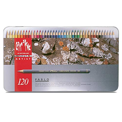
Okay, so here’s that same brand of cheap pencils we looked at last week. Before I said anything, you thought it looked like a pretty good set, right?
Then I pointed out the waste of space given to metallic gold and silver. Metallic pencils are always a party pooper.
But you’re holding out hope that you’ll be the first person to squeeze 24k gold from a pencil.
I guess we all need a dream.
Then I showed you how warm all the colors are which will make blending and color mixing a total pain in the keister.
And you kinda paused for a moment, because you probably never thought to look at the temperatures before.
Hmmmm… maybe that explains some of the problems I’ve been having…
But here’s the thing I noticed right off the bat and it really cheezed me off. Let’s see if you see it too.
How many colors do you see in this set?
Count ‘em.
It’s a set of 72 pencils, right? But that’s not what I asked.
I asked how many colors you see.
Try it again. How many colors are in the box?
I see 40.
Hold on, Amy! Are you blind?
Nope.
Bottom row. I see three red pencils. Three of the same red.
I see two orange pencils. The same orange in both.
There’s Orangish-Yellow and Yellowish-Orange. Which is which?
Then there’s four of the same darned yellow.
Almost every pencil in this set is laying right next its doppelganger. Some of ‘em have two or three twins.
Here’s what happened at the factory.
They bought a recipe for Ultramarine pencils and they made a bunch. Then they added a tiny bit of white and made Ultramarine Medium pencils.
They added a bit more white and made Ultramarine Medium-Light.
Add a little more to make Ultramarine Light-Medium.
And so on and so on and so on…
See it now?
It’s funny, there are 5,000 videos on YouTube right now where somebody buys a box of markers or pencils and what’s the first thing they color with them?
Swatches.
And you’ll hear them say “I want to see if the color inside matches the color outside”.
So you know darned well that cheap companies don’t spend a lot of time matching the exterior paint to the pencil color. We all know this. It’s a Top Ten pet-peeve for almost everyone.
Yet when I asked you to count colors, you counted the thing we all know we can’t rely on?
Look at the cores, not the paint.
Cores don’t lie.

But Amy, I see 7 different blue cores here and four different aqua cores. Maybe a couple of the grays are similar but give ‘em a break. They’re just providing options.
Okay, I cede the point.
But how many options do you need?

One pencil gives us a rather large range of blues.
Most of the time, I’m layering three or four colors— so honestly, you could hand me any of the first three blues and they’d all work the same.
There’s not enough difference to justify them all.
And I don’t know about you but I’d give half the Ultramarines for better variations like Slate, Indigo, and Periwinkle.
The blue world is too big and beautiful to waste 7 spaces on basic blue.
If you’re only giving me 72 colors, they’d better not be doppelgangers.
We’ll look for another flaw in the rainbow next week.
Here’s the Pencil Quality Test so far:
Is this pencil available openstock?
Is the laydown thick, smooth, and generous?
Is the pencil hard or soft?
Are there pointless colors in the box?
Are there warm and cool versions of every major hue?
How many repeats and near-repeats are in the box?
IF YOU LIKED TODAY’S ARTICLE, SUPPORT FUTURE FREE LESSONS


THIS WEEK IN COLOR


CURRENT PASSWORD: RubberDuckie
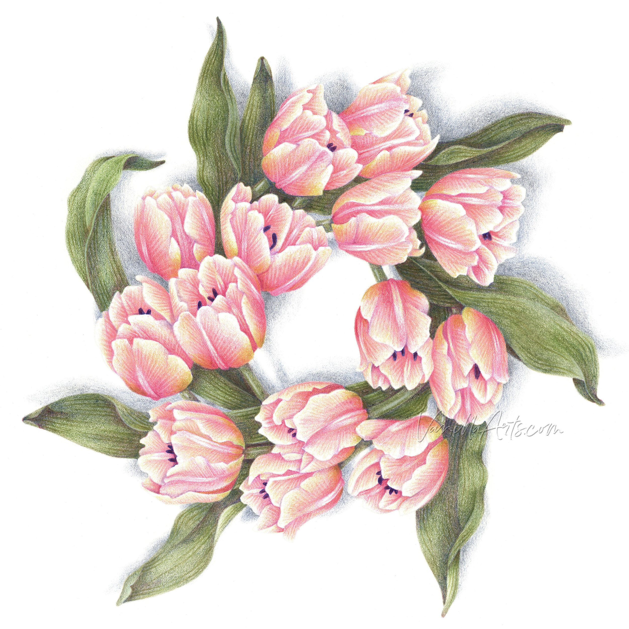
SPRING COLORING


COLORED PENCILS I TEACH WITH:
Affiliate links help support the free content here in Vanilla Beans


LOOKING FOR LAST WEEK’S BEANS?


