Vanilla Beans: Stealing Color
Thanks for taking the jump to read today’s newsletter. If you landed on this page by accident, subscribe to the Vanilla Beans Newsletter here.
If you’ve been with me a while, you know I’ve been going whole-hog on YouTube videos for just over a year now.
The videos are basically a visual version of things I’d normally discuss here in Vanilla Beans.
Sometimes I don’t or I can’t put everything in the video— either for time’s sake or because it’s just too much info to serve in one meal…
So I though it might be interesting to follow up here on a related topic.
Watch the video first (if you haven’t already) and I’ll place the Beans Extra below it.
Advertisements like this support free lessons here and at YouTube
NEW VIDEO
Click to watch. If your device doesn’t like embeds, click here to watch at YouTube.
TWINKLE, TWINKLE
In Realistic Gold, I covered my reasons for adding environmental color to gold, silver, brass, copper, or any kind of metallic object.
In the video, I talk a lot about metal surfaces being mirrors…
Which may lead you to think that the video only covers highly polished, super-shiny metal surfaces.
On the contrary, even matte metallic surfaces act like mirrors.
The pewter pitcher in the MayBells project shown here is a good example. Pewter is a softer metal and while Google tells me it can be polished to a mirror finish, I’ve only seen it in the duller, rustic state. My mother’s pitcher here isn’t quite matte, it’s more like a foggy bathroom mirror.
And yet even with the patina, I could still see greens from the Lily of the Valley reflected in it’s surface.
So yes, the rule of environmental color holds true, even when the metal isn’t high shine.
Next point… and this is really what I wanted to expand upon today…
And actually, I kinda briefly touched this same topic during the Santa Hat video (watch it here).
Environmental color determines my underpaint color.
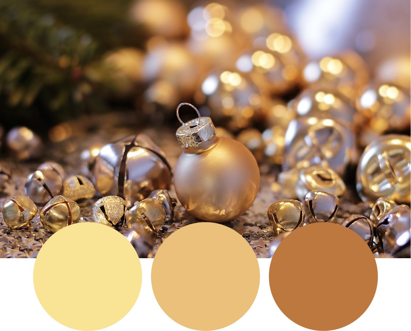
Okay, so let’s take today’s Color Photo of the Week and use it as an example.
If I were coloring this as a still life…
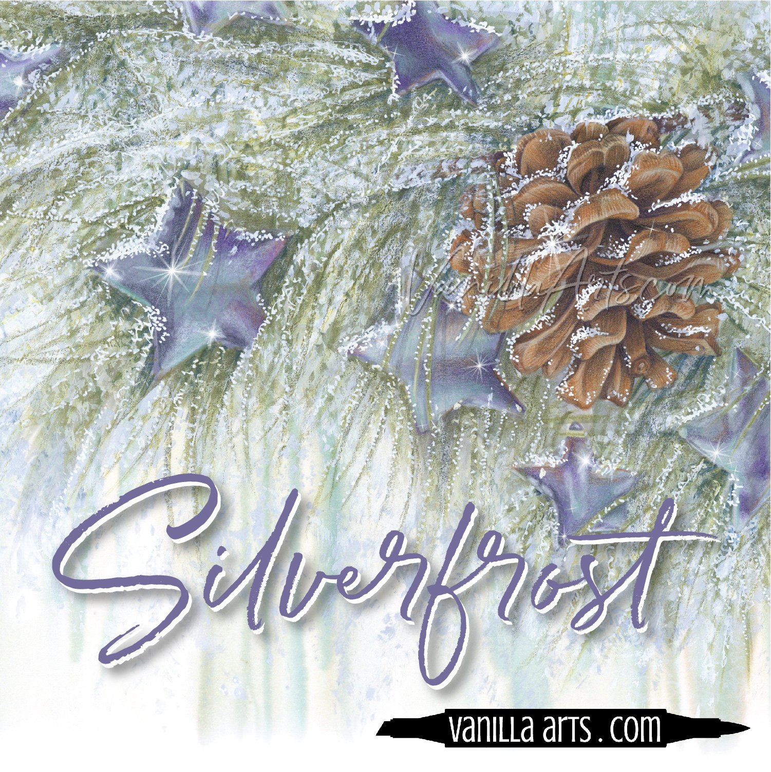
Or if I was using this photo as a color reference for my Golden Star project…
These are the three primary gold colors I see. The color of each dot was computer sampled from areas on the ornament but I see similar colors on the bells and on the sequin stars covering the table.
YR20 - YR21 - YR23 are close enough to work.
Now the question is, where do I find an underpaint color to darken the YR23?
One method would be to use a color wheel.
Golden yellow is a dirty version of yellowish-orange. If we locate it on the CMY color wheel and jump directly across, we’ll find the complement of gold.
This puts us on Indigo but it’s pretty close to the Violet slice of the pie. This means we’re looking for an Indigo which leans violet rather than a blue which leans green.
So to underpaint the gold, we could use indigo, blue-violet, or even a blue gray color.
This would work, but it’s not how I usually do things.
I prefer to steal color from another part of the image.
For instance, there’s a Christmas tree on the left side.
The large green dot is a computer sample of the evergreen color. It’s a touch too dark to work underneath YR23 so I’d step the Copic color lighter by several values until I have something more like the inner green dot.
This sage green would work beautifully as an underpaint color.
But this image is screaming out something different.
I’m not sure if you noticed it before but there’s a ton of lavender in this image.
The background is kinda blurry so I’m not sure what’s causing the lavender but look at the environmental lavender.
It’s everywhere!
How could I ignore such a lovely color?
After a little testing, I come up with BV000 as a gentle underpaint. If I wanted it a little stronger, I could use BV00.
Underpaint isn’t an exact science.
It’s always a test until you find something you love method.
I love to steal my colors but not every stolen color works. Sometimes you get a clunker, like a blue under pink that looks too purple to be shade but you’d be amazed how often my thief method works.
Give it a try sometime!
Advertisements like this support free lessons here and at YouTube
IF YOU LIKED TODAY’S ARTICLE & VIDEO, PLEASE SUPPORT FUTURE FREE LESSONS
NEW COLOR WONK
Twinkle, twinkle, little star…
MONTHLY MARKER + PENCIL LESSONS FOR INTERMEDIATES
Improve your coloring or just have fun with awesome projects and a supportive community.
THIS WEEK IN COLOR
CURRENT PASSWORD: RubberDuckie
UPCOMING EVENTS
click to view details
CHRISTMAS COLORING
click for more info


