Color Palette: Copic Marker + Colored Pencil Combination (Light Green, Baby Blue, Red Violet) Agave
Color Palette: Copic Marker + Colored Pencil Combination (Yellow Green, Blue, Brown) Blue Bunch
Alcohol Marker + Colored Pencils: 5 MORE Tips for Mixed Media Adult Coloring
MORE TIPS: HOW TO COMBINE ALCOHOL MARKERS WITH COLORED PENCILS
Have you ever thought about mixing alcohol markers with colored pencils?
The two mediums are very popular and it sounds like they could work together… but how hard is it?
In her latest FREE video, professional illustrator Amy Shulke shares five MORE tips for combining markers and pencils for amazing mixed media projects.
And hey, if you missed the first five tips, catch up here:
WATCH: FIVE MORE TIPS FOR MIXED MEDIA COLORING
with Copic Markers and Prismacolor Colored Pencils
(supply list at end of this article)
Video not playing?
If your device blocks embedded video, click here to watch at YouTube.
TIPS FOR MIXED MEDIA BEGINNERS
1. How much pencil should I use over the marker?
I cover this question in-depth in my latest YouTube video above.
Three of the five tips explain how I chose and use pencil colors over areas of marker.
Hint: It’s not what you think!
2. What’s the best pencil technique to use?
This is actually a great question because standard colored pencil technique doesn’t always work when coloring over markered areas.
In the video, two of the five tips cover special considerations and changes you’ll need to make to prevent the colored pencil areas from overwhelming the marker.
Basically, the way you normally build color and then finish areas during a typical pencil project, simply doesn’t work over markers.
LEARN MARKER + PENCIL COLORING TECHNIQUES
Marker with a dash of colored pencil…
The Blend - A 12 week online course for beginners/intermediates which focuses solely on smooth blending with Copic Markers. Learn to blend or improve your current blending technique with this intensive skill building approach to coloring.
Colored pencil with a touch of marker…
The Point - A 12 week online course for beginners/intermediates which focuses on efficient techniques for Prismacolor colored pencils. Learn to layer colors with confidence and artistry through this intensive skill building approach to coloring.
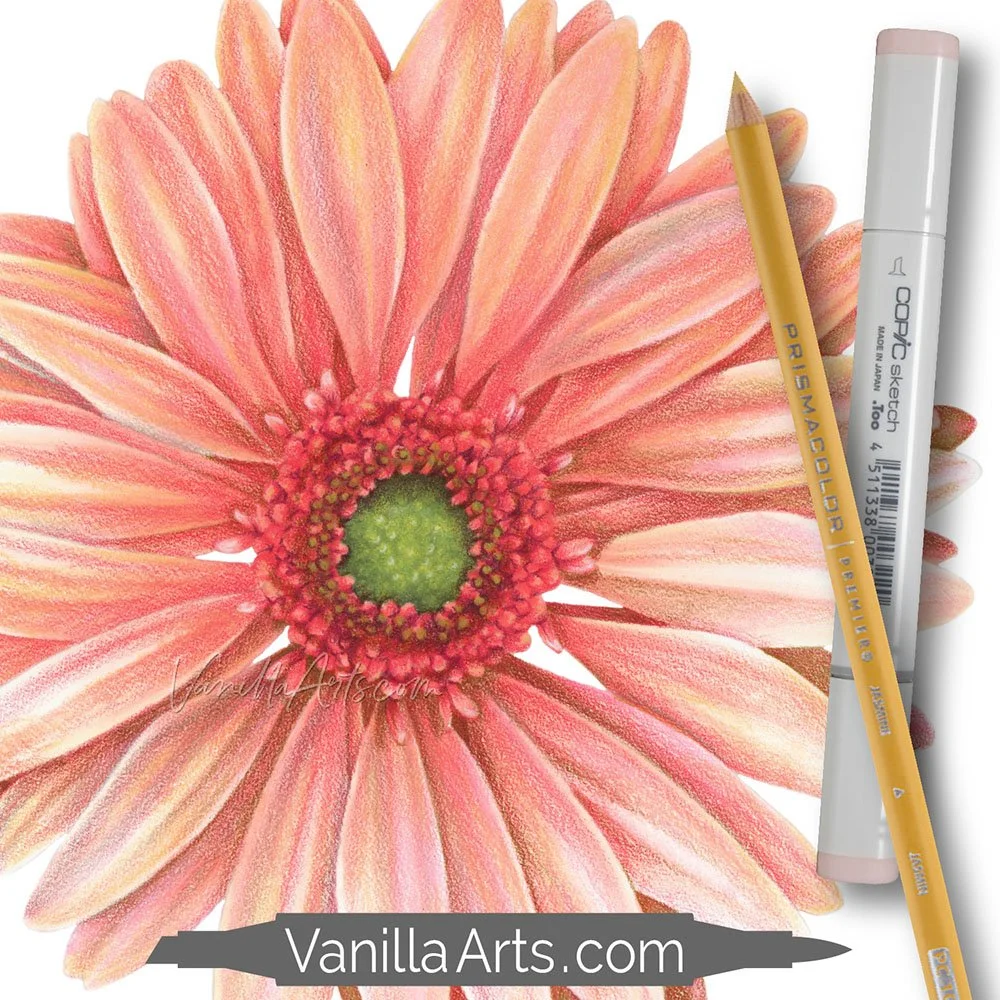
TECHNIQUES USED IN “CARMINE GERBERA”
The following techniques can be spotted in the 5 MORE MIXED MEDIA TIPS video:
I always color dark to light with markers and also again with the pencil layers. Light to dark is easier, uses less ink, and insures that my shade and shadows are the correct values to create depth, dimension, and realism.
Even though you see brownish tones in the shady areas of this daisy, there are no brown pencils or markers used. I created the shade with a green pencil, the same color seen in the center of the daisy. Borrowing colors from other areas of the same image insures the colors are correct without having to guess which dark marker or pencil would look best.
Just like the petal shade, the shade over the green center is not a dark green pencil— it’s magenta, borrowed from the petals.
Every petal uses the same markers and pencils but the ratio changes. Notice how the petals on the right are lighter and brighter than petals on the left. The change in overall value plus the ratio of marker to pencil adds interest and realism. When every petal looks the same, your daisy looks less realistic.
COLOR A CHEERFUL DAISY
Sunny Gerbera is part of my digital line art collection at Sketch-Garden.com
I design line art especially for marker, colored pencil, watercolor, and mixed media colorists. The spaces are wide open with no texture marks or funky shapes which look cool as a sketch but don’t quite make sense when coloring.
Thoughtfully drawn line art allows YOUR coloring to be the star of the show!


